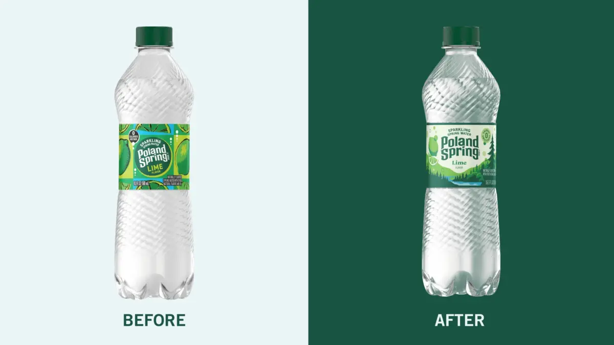
Poland Spring has been a staple of the Northeast since the nineteenth century, tracing its rich history back to 1845 and continuing to source its spring water directly from Maine to this day. For its popular sparkling water range, branding and design agency Interact has smartly brought that deep-rooted history back to the bottle. The redesign replaces the old, overwhelming wall of oversized fruit imagery with serene rolling hills, dense pine forests, and a winding blue spring. This new aesthetic is heavily inspired by vintage national park and travel posters, instantly evoking a sense of nostalgia and outdoor adventure.
In the updated packaging design, fruit becomes a playful, understated accent rather than the dominating main design element. Meanwhile, changing skies rendered in vibrant shades of lime, yellow, pink, and purple make the individual flavors exceptionally easy for consumers to distinguish on the shelf, all without losing that unmistakable, signature Poland Spring green that long-time buyers immediately recognize.
Overall, the comprehensive visual update taps directly into a growing trend of regional storytelling. This localized, narrative-driven approach is increasingly visible across the broader consumer packaged goods (CPG) space as brands look for authentic ways to connect with shoppers. However, what makes this specific refresh truly click is how confidently it celebrates the exact geographical origin of the water. While many competing sparkling water brands crowded onto store shelves rely heavily on competing through loud fruit graphics, bright artificial colors, and flavor-first messaging, Poland Spring leans instead into its authentic heritage and sense of place.
Dan Gladden, Executive Creative Director of Interact, discusses more about how the design came to life below.