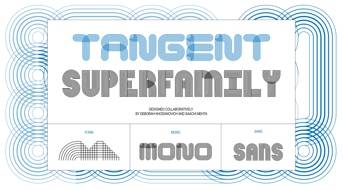
What begins as a simple classroom exercise can occasionally spiral into an expansive, multi-axis superfamily that challenges the boundaries of modular typography. For designers Deborah Khodanovich and Saachi Mehta, the journey of creating Tangent started inside Kelsey Elder’s Variable class at the Rhode Island School of Design (RISD). What started as a modest exploration of parts and pieces eventually transformed into a sophisticated, generative type system encompassing both Sans and Mono variants, driven by digital scripting, physical testing, and a shared obsession with the mechanics of human communication.
Written in their own collaborative voices, the story of Tangent’s evolution offers a rare look inside the contemporary type design process—revealing how two distinct creative practices collided to produce a living, breathing typographic system.
Pit Stop 1: (Crossed) Pathways
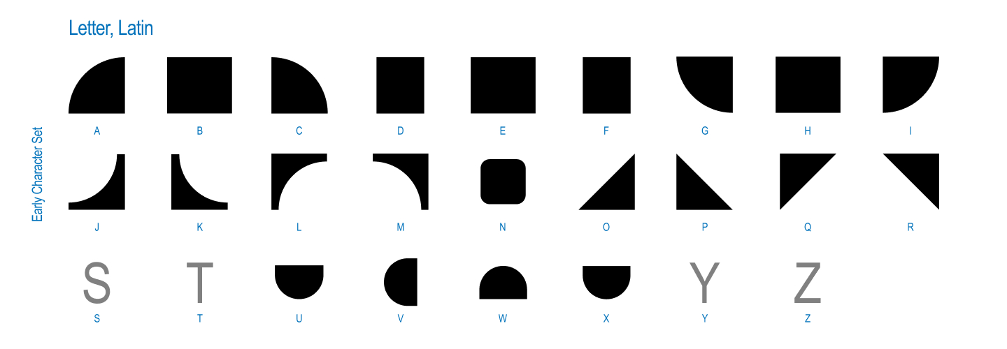
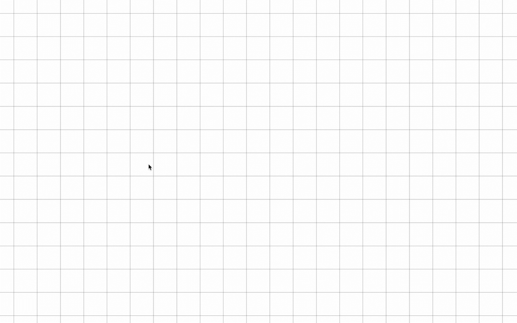
The genesis of the project can be traced directly back to an assignment titled Kit-Car, issued in Kelsey Elder’s class. The foundational brief drew inspiration from the ethos of Sister Corita Kent, encouraging students to observe the world around them, identify a source material made up of distinct shapes or parts, and break it down into modular components. Students were instructed to look closely at toys, patterns on family heirlooms, optical illusions, and everyday objects, using those fundamental shapes to construct a set of static glyphs.
Sister Corita Kent’s famous directive—to learn to see the world by looking at it one piece at a time—served as the guiding light for the entire project. For Khodanovich and Mehta, the goal from the outset was clear: they wanted to collaborate, which meant they needed a modular starting point that could easily be passed back and forth between their digital workspaces.
At the same time, both designers found themselves circling overlapping conceptual obsessions for their respective master’s theses. While approaching the subject from different directions, they were both fixated on stories, dialogue, gossip, and the organic ways in which ideas converse, connect, and evolve as they travel from one person to another. This thematic inquiry naturally raised a compelling design question: what would a typeface look like if every single glyph was inextricably connected to its neighbors?
To answer this, they began by drawing the simplest possible modules. Mehta gravitated toward the continuous, over-under twisted quality of ribbons, while Khodanovich was deep into custom path-drawing within the digital world of Animal Crossing. Though they were exploring different conceptual rabbit holes, they ultimately arrived at the same destination, finding inspiration in traditional textiles such as knitting, weaving, and embroidery.
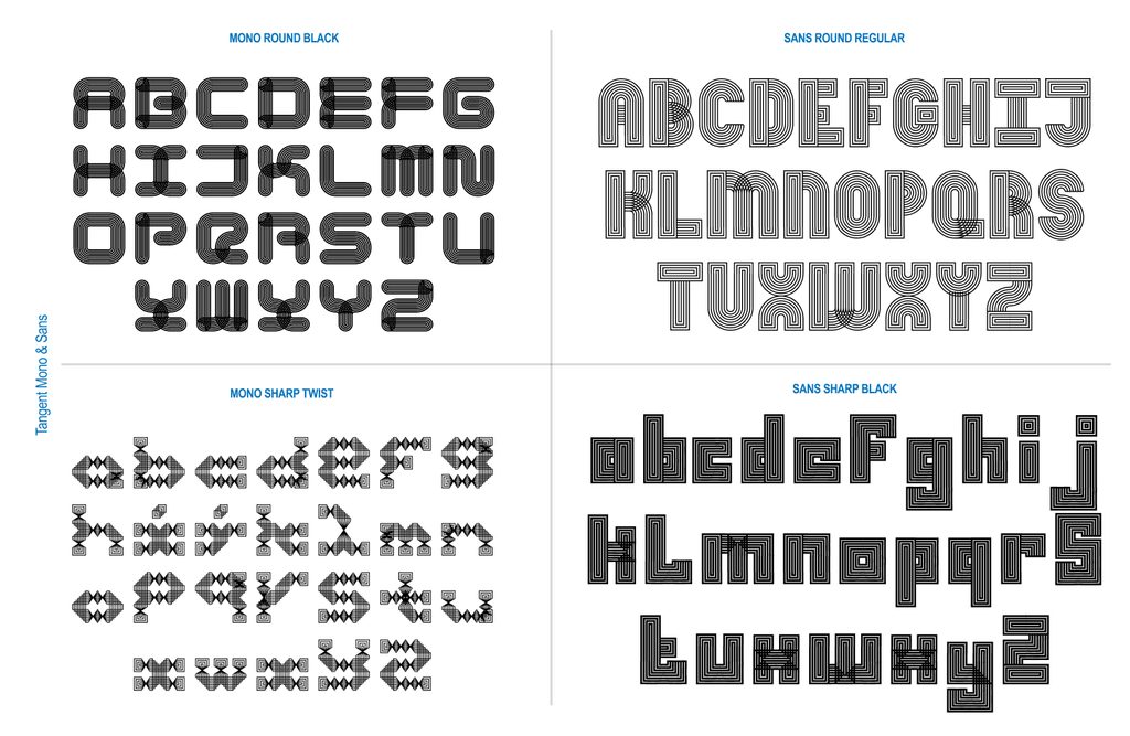
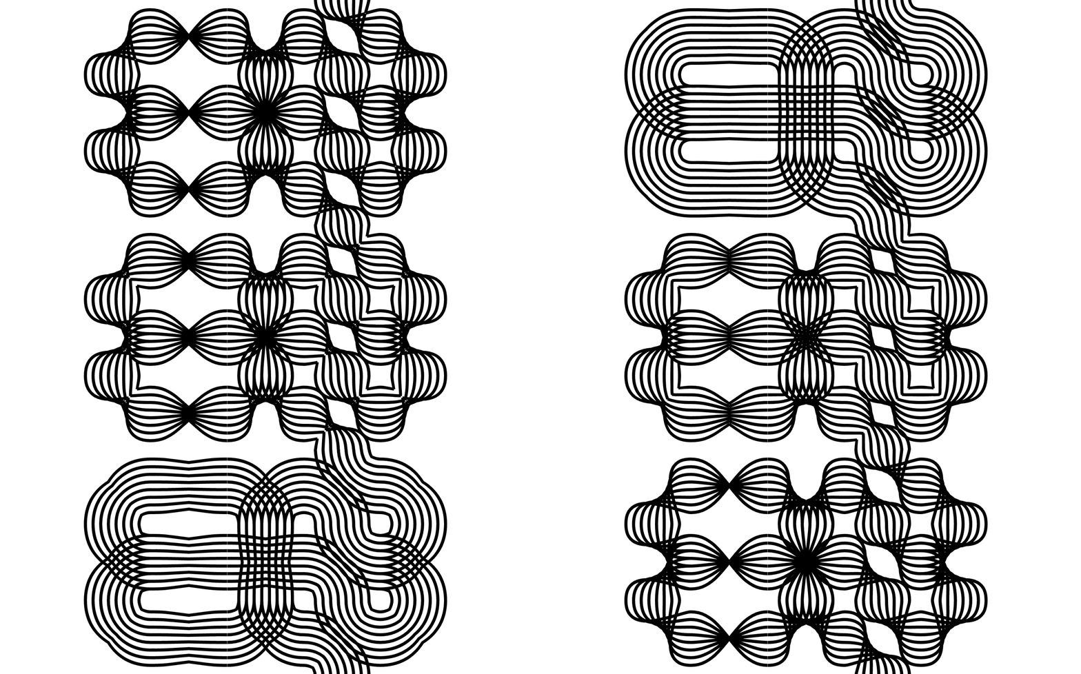
Moving swiftly from solid connected forms to layered strings of parallel lines, they envisioned paths that could weave in and out of each other like thread. This breakthrough yielded the very first version of the system: a single weight operating on a single axis. It was a completely modular, pattern-making font built on a core mechanic of interconnectedness and twists, whether round or square, untwisted or contorted.
The conceptual framework mirrored their thematic inquiries into oral storytelling. How does gossip transform and shape-shift? How do stories get twisted over time as they pass through dialogue from person to person? What lineages do conversations carve out as they evolve? Armed with these questions, they sat side-by-side on the same screen and scribbled on the same sheets of paper, attempting to establish an initial grid of parts that would lock together seamlessly. Once the connections worked, they took off running, each experimenting with how to make the structural twist function across the system.
Pit Stop 2: (Finding Our) Axes
Once a functional system was established, their instructor, Kelsey Elder, introduced a critical challenge: how does a person actually type with this? While a modular, twisting, connecting system is an exciting conceptual proposition, making it usable for someone outside the immediate design loop requires rigorous testing. Khodanovich and Mehta could use the system intuitively, but others found it far more opaque.
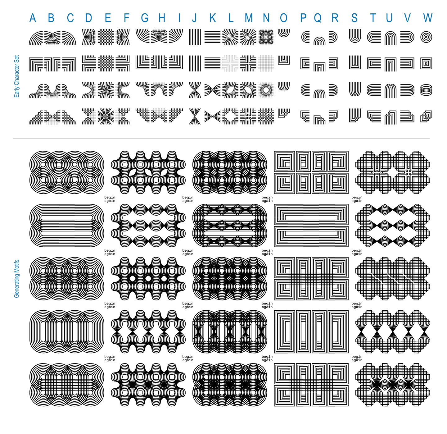
To bridge this usability gap, Elder suggested running keyboard mapping tests with their peers. By looking at digital video games and alternative input systems, the designers sought to determine the most intuitive ways to assign these connecting parts to standard keyboard keys.
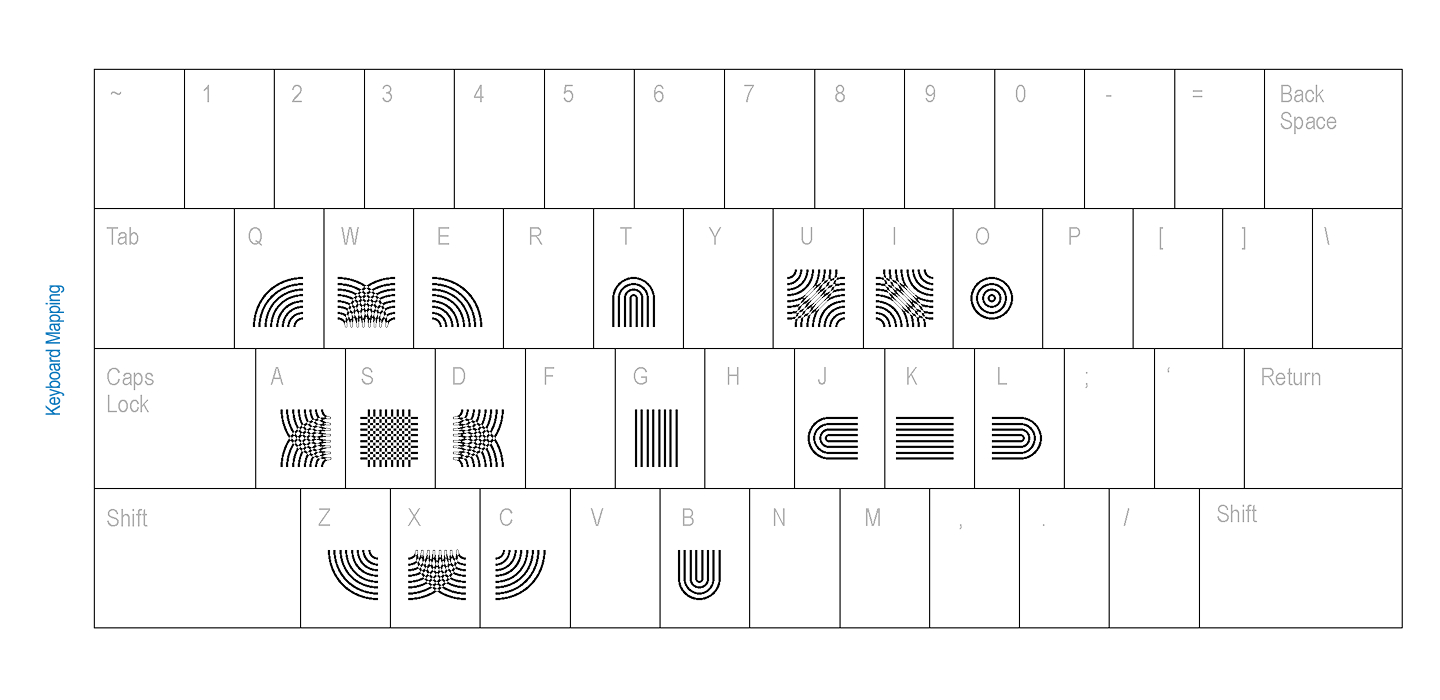
Parallel to their digital experiments, the duo also embraced physical prototyping. They manufactured custom rubber stamps and invited people to stamp the glyphs onto an extended physical grid, allowing participants to feel the modularity with their hands rather than experiencing it exclusively through a screen.
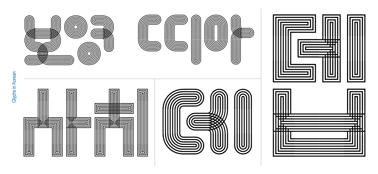
They also experimented with alternative modes of input, developing a Processing sketch that allowed users to draw their way into the system rather than relying on traditional typing. True to their environment, surrounded as they were by graphic designers, they watched people instinctively forge letters out of the modules without any prompting. The moment the modules were placed in human hands, users naturally defaulted to forming Korean and English characters.
Pit Stop 3: (Going off on a) Tangent
That instinctive leap toward letterforms marked a major turning point for the project. Recognizing that everyone who touched the system immediately reached for letters, the designers followed suit, supported by the context of their variable type class.
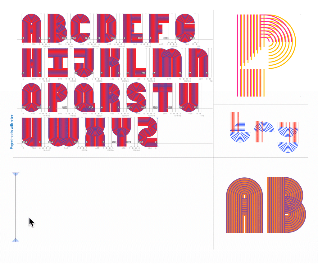
Expanding the scale of their grid, they began building out full alphabets complete with contextual alternates. They ran extensive color experiments and attempted to construct a sans-serif version. It was at this juncture that Tangent ceased to be merely an experimental modular framework and officially became a typeface.
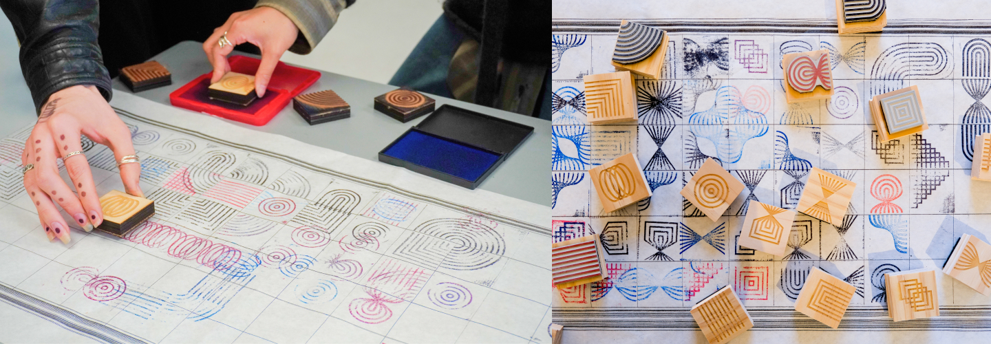
The evolution took another leap when Elder posed a fresh challenge: given that the entire system was inherently generative, why not ask a computer to generate every possible permutation?
Establishing strict rules for a 3-by-3 grid—every spot had to be used, all elements had to connect, a cap was placed on empty slots, and rotating pieces to cheat the system was prohibited—they turned to digital scripting. Khodanovich spent extensive hours working with AI coding tools like Claude to refine the script until it successfully generated 971 unique glyphs. True to their instincts as type designers, they immediately began seeing recognizable letters within the generated noise, an exploration that ultimately led to the development of the Mono version.
Pit Stop 4: (It takes a) Superfamily!
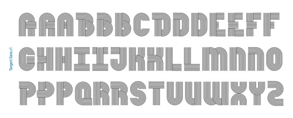
The iteration cycle did not stop there. Prompted once again by Elder to explore motion, the designers dove back into variable territory, building a comprehensive five-axis system spanning twist, weight, amplitude, stretch, and radius across both Sans and Mono variants.
Developing a complex variable superfamily presented significant technical hurdles. The designers frequently encountered moments of frustration when the font-production software, Glyphs, rebelled against their intricate workflows or refused to export the typeface properly. Having a collaborator proved essential during these bottlenecks; when one designer hit a wall of frustration, they would hand the file off to the other. With fresh eyes, the partner could untangle the technical snarls and solve the problem.
Because the project remained fundamentally generative, it accumulated a running backlog of potential axes and spinoff versions. Every time the creators felt the project was finished, new conceptual additions presented themselves.
The designers have opened the project up for public engagement, inviting fellow creatives to experiment with Tangent for posters, motion pieces, or other design interventions.
DEBORAH KHODANOVICH
Deborah Khodanovich (she/her) is a Toronto-born designer and educator based in Providence, Rhode Island, having recently completed her Master of Fine Arts in Graphic Design at the Rhode Island School of Design. Her practice explores gossip as a method of producing and sharing knowledge, examining information networks and intimacy as a design methodology. Working across typography, textiles, and books, she questions who gets to create knowledge, how it circulates, what gets valued or dismissed, and how ideas are attributed along the way.
SAACHI MEHTA
Saachi Mehta (she/her) works at the intersection of visual design, motion graphics, and systems, translating concepts into visual experiences across identity, environmental, and editorial contexts. She is drawn to building systems that hold together at any scale and has recently enjoyed teaching Motion Design at the Rhode Island School of Design, where she also received her Master of Fine Arts in Graphic Design. She has previously worked as a graphic and motion designer for the RISD Museum, Netflix, and HP, among other organizations.