The genesis of a typeface is rarely a straight line; more often, it is a winding journey of trial, error, critique, and unexpected inspiration. For type designer Alyona Korysta, the conceptual foundation for her latest project began to take shape in the autumn of 2024. At the time, she was completing an internship at a French type design studio in Paris. Surrounded by the rich visual history of the French capital and immersed in the daily study of typography, Korysta felt an escalating creative impulse to embark on an ambitious new typeface project of her own.
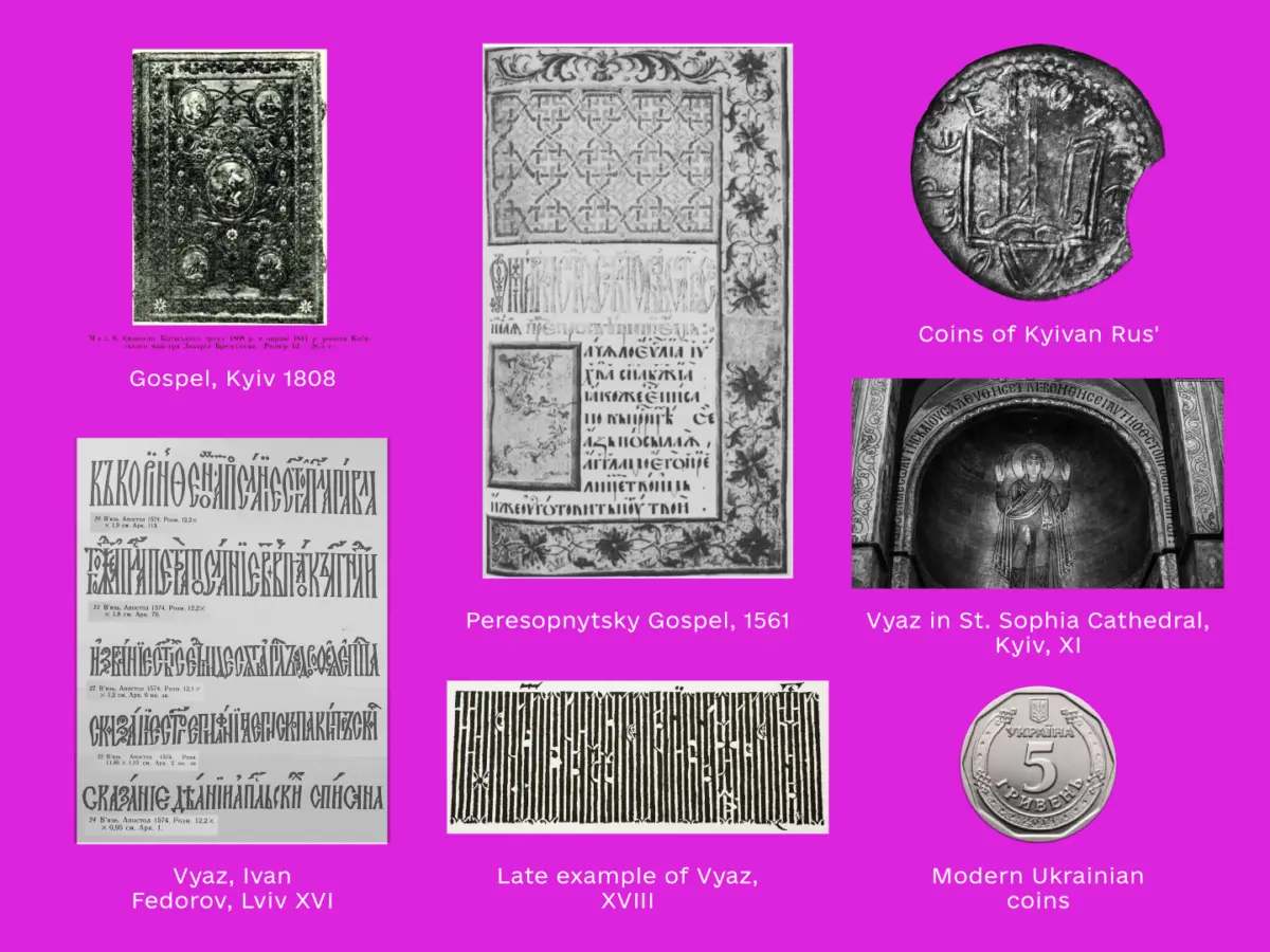
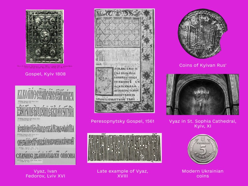
The initial brief for any typeface can emerge through a variety of distinct processes. In Korysta’s case, her vision was clear from the very beginning: she wanted to work on an experimental project that would establish a compelling dialogue between historical letterforms and contemporary typographic approaches. More specifically, she sought to explore Vyaz, an ornamental, tightly spaced writing style derived from Byzantine culture that historically played a significant role in the tradition of Ukrainian writing. In terms of overall aesthetic character, she was immediately drawn to something sharp, carved, and chiseled in its execution.
As she developed the idea further during her time in France, Korysta digitized an initial set of letters just as her internship was coming to a close. Gathering her courage, she decided to present her preliminary work to the studio team to ask for an honest critique. While she received several helpful comments, one piece of advice in particular left a lasting impression: "The logic is there, but it needs to be refined. Look at your ‘e’ and now at your ‘n’, how their weight is distributed. Once you resolve this, the system will work."
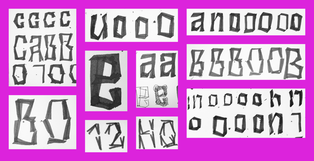
That interaction served as a critical turning point for the designer. It forced her to confront a blind spot in her process: at some point, working with rigid modules had taken over, and consistency across the character set had quietly slipped away. It reinforced a core tenet of design—that if rules are to be broken, it must be done intentionally, and typically, the dismantling of one system demands the establishment of another. This realization initiated a new phase of messy, hands-on explorations that are typical when a designer is striving to truly understand the underlying mechanics of a script.
Armed with a clearer sense of direction, Korysta moved into the next phase of development: digitizing various concepts, choosing a definitive path, experimenting with proportions, and evaluating which axes of the design to push. She weighed multiple possibilities, considering whether to craft a very heavy version with minimal counterspace, whether to incorporate optical sizes that varied the level of abstraction in the letterforms, or whether to push the overall width of the characters.
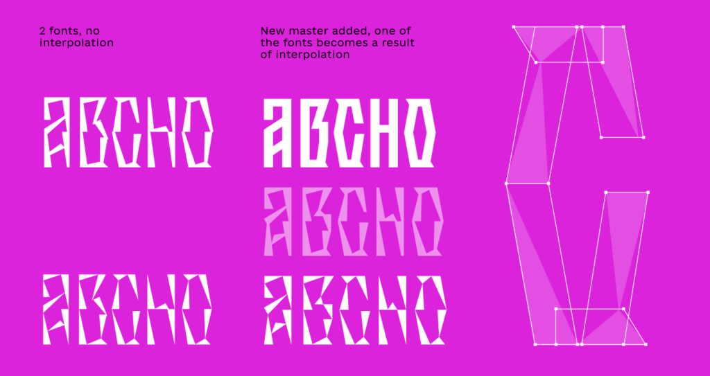
Following extensive experimentation, she concluded that working with optical sizes and pushing the level of abstraction offered the most compelling route toward her goals. Initially, she worked with two distinct fonts without interpolation. Yet, even as the pieces seemed to fall into place—with opportunities to continue refining the letterforms and expanding the character set—she remained unsatisfied. She found herself persistently questioning whether the design was truly finished and whether this was how the final typeface was meant to look. A sense of resolution remained elusive, prompting her to set the project aside for a few weeks to gain fresh perspective.
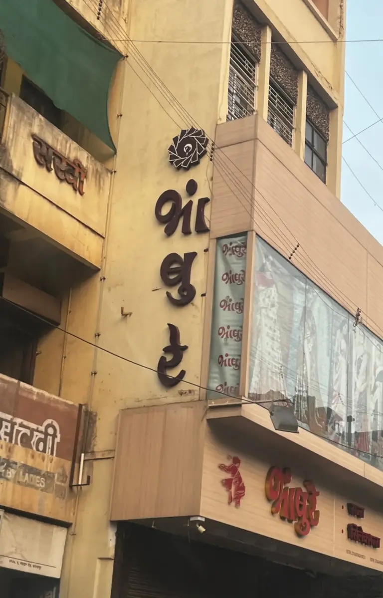
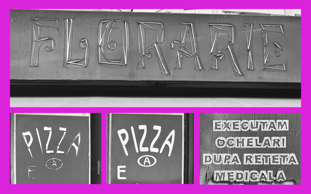
When she eventually returned to the project, Korysta revisited her reference board and earlier sketches, where the foundational concept of letter deconstruction had been present from day one. She also revisited a digital folder in her gallery titled "Letters from the streets," a personal archive of signage photographs she had taken over time, capturing PVC storefront letters that gradually delaminated under harsh weather conditions.
This archive provided the second major breakthrough—the missing piece of the puzzle. Korysta realized she needed to design an additional master constructed entirely of bars: free of distractions, featuring simple strokes drawn in a precise manner that would allow the complex shapes she had already envisioned to emerge organically.
This realization fundamentally shifted the project’s architecture. Instead of relying on two separate fonts, she transitioned to a variable typeface format. Witnessing the first variable test come to life marked an exhilarating milestone in the development cycle.
Re-engaging with her initial sources of inspiration also helped her solve a complex question regarding proportion. In the traditional Vyaz script, spacing is a foundational element responsible for much of its decorative quality. Specifically, the negative space between stems is designed to equal the width of the stem itself, creating a distinctive, barcode-like rhythm that Korysta was eager to preserve in her modern adaptation.
Naturally, this approach required precise optical compensations. "Rounded" letters necessitated careful adjustments, while more heavily deconstructed forms required more generous spacing to remain legible. Nevertheless, this established a solid baseline and a clear, systematic principle for spacing the entire character set.
From that point onward, the workflow settled into a more standard routine of designing, expanding the character repertoire, proofing, and iterating. Alongside general proofing, a vital component of the process involved continuously monitoring how the interpolation behaved. This required Korysta to regularly step back and review the vector drawings to keep unexpected distortions under control.
Eventually, the project reached a stage that required naming—a critical step, as a typeface cannot simply remain an anonymous working file. Looking back at her primary references, including historical manuscripts, coins, and the final attributes of her letterforms—which were highly decorative yet sharply chiseled—she sought a title that resonated with this heritage.
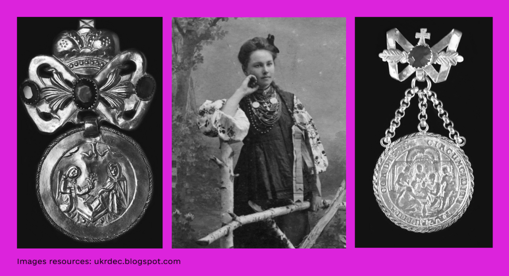
The answer emerged from traditional Ukrainian culture: the Dukat (or Dukach), a historic form of women’s metal breast ornamentation composed of a row of coins, typically centered around an embossed medallion. With a recent resurgence of interest in traditional Ukrainian dress, the Dukat has increasingly been incorporated into contemporary fashion. The name felt like an immediate and natural fit for the typeface. Much like recognizing instinctively whether a name suits a stranger, looking at her finished creation left no doubt that the typeface was, unquestionably, Dukat.
The creation of Dukat proved to be an exercise in carving and chiseling, shaping both the physical letterforms and the overarching conceptual framework in tandem. Embracing doubt, revisiting past decisions, maintaining the courage to pivot, and committing to rigorous experimentation were all integral to bringing the project to fruition. Now complete, the realization of Dukat has opened the door for future creative explorations.
The Dukat typeface is currently available for those interested in exploring the project further, with ongoing updates shared through professional design networks.