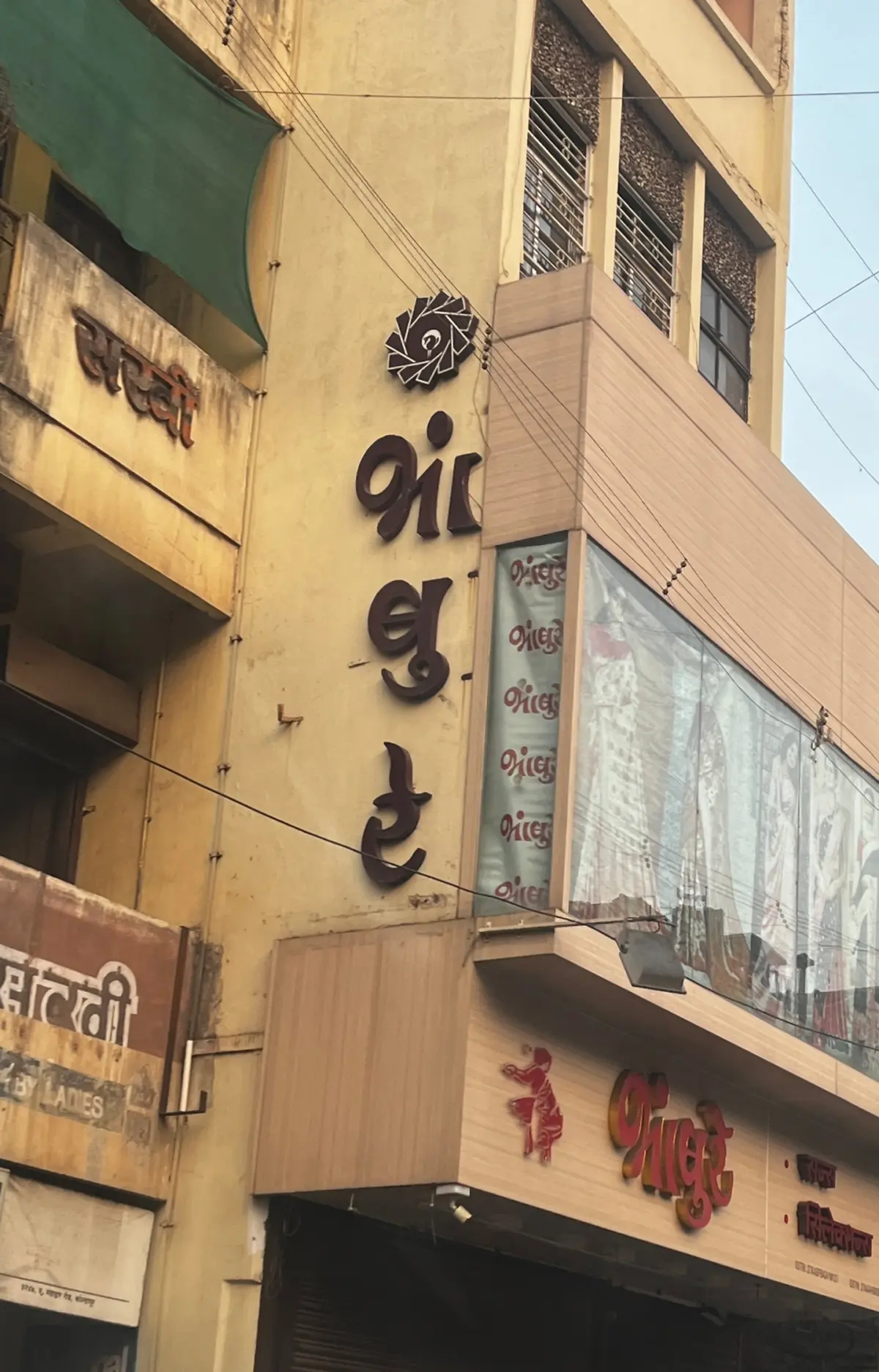
As South Asia continues to experience a rich, overlapping tapestry of languages across street signs, periodicals, and public ephemera, designers face a persistent typographic challenge. In a region where it is entirely common for everyday print to blend English with regional tongues like Marathi, Hindi, Sanskrit, or Nepali, the digital realm has long struggled to catch up. While physical, hand-painted, and built street signs have historically integrated Devanagari and Latin numbers or words with effortless grace, translating that seamless harmony into digital typesetting remains an uphill battle.
The friction stems from fundamental differences in script anatomy, reading mechanics, and a historical shortage of robust Devanagari fonts compared to the vast library of Latin typefaces available. For decades, multilingual typesetting has suffered from a knowledge gap that routinely forces non-Latin scripts to bend to the rules of Western typography. Experts and designers are now pushing for a deeper reckoning with these practices, aiming to establish standards that respect the distinct visual and structural nuances of both writing systems.
Understanding the Structural Divide Between Devanagari and Latin
The most successful applications of Devanagari—whether paired with Latin or standing alone—happen when the script is not forced into a Latinized mold. Mechanized composition tools and digital typesetting systems were originally built around alphabetic scripts, leaving Devanagari to constantly adapt or find creative workarounds just to remain legible.

Unlike the Latin alphabet, the Devanagari script is not strictly alphabetic. Instead, it consists of consonants and vowels that bind together to form complex phono-graphic graphemes. For instance, the consonant base combined with a specific vowel sign creates an entirely integrated unit, just as multiple consonants can merge into complex conjuncts. Because mainstream technology was engineered primarily for alphabetic structures, Devanagari has had to fight for correct rendering.
Compounding this structural difference is the complete absence of lettercases in Devanagari. While Latin typography relies heavily on a dynamic interplay between uppercase caps, lowercase letters, and small caps to establish visual hierarchy and contrast, Devanagari possesses only a single case. All shifts in contrast and weight must be managed within this limitation. Consequently, when Latin words are capitalized within a bilingual text, Devanagari can easily appear dense, uneven, or visually secondary, leaving it looking like an afterthought if designers merely match fonts without considering structural texture.
Navigating Matras, Shirorekha, and Optical Alignment
Another major hurdle in multilingual typesetting involves how the two scripts handle spatial alignment. Devanagari utilizes matras—vowel signs placed above and below the active letter area—which are often applied separately from the base characters. While these can functionally be compared to Latin ascenders and descenders, their placement changes the rules of optical alignment.

In Latin typography, the baseline and the x-height dictate alignment because the bulk of a letter’s weight falls between them. In contrast, Devanagari relies heavily on the shirorekha, or the continuous headline running across the top of the letters, to anchor optical weight. Designers frequently find that aligning the shirorekha with the Latin x-height yields better visual results than trying to match baseline coordinates blindly.
Furthermore, the structural contrast in Devanagari operates inversely to Latin. Because the script historically lacks traditional serifs, applying a formal Latin serif font can make Devanagari characters look unnaturally ornate or disjointed. While low-contrast serif fonts excel at long-form reading in Western languages, the same rule does not automatically translate across scripts.
Spacing and tracking present yet another layer of complexity. The shirorekha must generally remain connected unless broken intentionally for stylistic effect. Manual tracking or aggressive kerning can inadvertently fracture this headline, ruining the integrity of a word. When justifying text across both scripts, forcing Devanagari to match arbitrary Latin line lengths without accounting for the shirorekha inevitably leads to visual distortion, floating matras, and uneven density.

Achieving Typography Harmony Through Thoughtful Design
Addressing these disparities requires moving beyond simple font pairing and tackling the deeper issues of typographic color, weight, and cultural respect. Typographers emphasize that both scripts must be treated as equivalents, ensuring that neither language feels subordinate to the other.
When font-matching, selecting a unified family that natively supports both Devanagari and Latin is the most reliable approach. When that is not feasible, designers must carefully compare stroke weights, terminal shapes, and internal letter proportions, using visual anchors like the Latin letter "o" alongside comparable Devanagari letterforms to judge visual weight.
Creating hierarchy without cases, italics, or underlines demands a sophisticated understanding of a font’s weight distribution. While shifting the text scale can help align Devanagari with uppercase Latin, it is rarely sufficient on its own. Some designers turn to introducing a secondary font style within Devanagari to mirror the structural shifts seen in Latin italics or caps.

For long-form reading, left-aligned, ragged-right settings work well for both scripts because both are read from left to right. However, justifying Devanagari remains notoriously difficult due to the risks associated with altering letter spacing and breaking the shirorekha. Careful manual control over line spacing, or leading, is frequently required to maintain an even typographic texture across multilingual paragraphs.
Avoiding Cultural Missteps in Multiscript Design
As the industry grapples with these technical challenges, designers also warn against cultural misappropriation in the reverse direction. Just as "Latinizing" Devanagari is a design failure, attempting to "Indianize" the Latin script by arbitrarily slapping a shirorekha onto Western characters produces a bizarre, grotesque effect. Such gimmicks are not only visually jarring but also culturally insensitive, treating a vital structural element of Devanagari as a superficial decoration.
Multiscript design ultimately exists to expand access and communication for readers of all backgrounds. Working in languages one does not fluently read or write can introduce significant hurdles, requiring extra steps such as turning on advanced text rendering engines, studying historical precedents from hand-painted signage, and collaborating closely with native speakers for proofreading. By respecting the individual histories, mechanics, and visual textures of both scripts, designers can build typography that honors every language it serves.