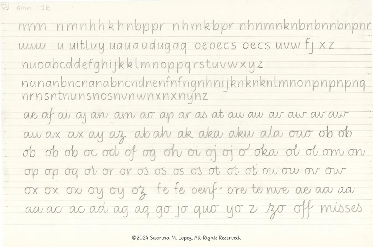
The intersection of typography, education, and historical research has yielded a comprehensive new tool for young learners. Type designer Sabrina Lopez has detailed the extensive research and multi-year development process behind "Didactica," a versatile superfamily of typefaces specifically designed for children’s literacy, educational materials, and didactic publishing.
Conceived to address the complex visual needs of children learning to read and write from kindergarten through the third year of primary school, Didactica bridges the gap between historical handwriting models and contemporary digital typography. The project required a deep dive into how letterforms are taught across different cultures, leading to a sprawling investigation that spans centuries of writing traditions.
What Should I Design Next?
The genesis of Didactica lay in a long-held ambition to create a design project centered around the graphic universe of handwriting. Lopez sought to develop a typeface tailored to childhood education—material that is playful, didactic, and educational.

The initial phase of the project began with a fundamental question: How do letters appear across the various stages of literacy acquisition, and what attributes must they possess? To be effective in early education, the letterforms needed to be easily recognizable, legible, and simple for young hands to reproduce on paper.
Research as a Point of Departure
To answer these questions and establish rigorous design parameters, Lopez dedicated weeks to researching handwriting instruction, historical documents, and modern global teaching practices. Key resources included Typotheque’s research study Modern Handwriting: A Historical Survey and Primarium, a contemporary global study documenting handwriting models taught in primary schools across more than 40 countries.
Utilizing the geographic data provided by Primarium, Lopez mapped out the various writing models currently in use worldwide, gaining a comprehensive overview of diverse pedagogical approaches. This global perspective helped shape the structural framework of the project, prompting a closer examination of how different regions support educators.

Particular attention was paid to the educational framework in Australia, which utilizes region-specific digital fonts alongside extensive support materials for teachers. These resources include practical guides for handling common writing errors, articles on the cognitive benefits of handwriting, and insights into the relationship between handwriting and a student’s self-esteem. A central tenet of this research is the conceptualization of writing as a system of physical movements. Consequently, Australian educational strategies emphasize live demonstrations of letter construction paired with "verbalization"—the practice of speaking aloud a description of the physical movements being executed.
Further historical grounding came from Tom Gourdie’s 1968 publication, The Ladybird Book of Handwriting, which outlines the Simple Modern Hand method. Originating in mid-20th-century Britain, Gourdie promoted italic writing through a progressive, staged approach that begins with unconnected letters and culminates in a partially connected cursive. Throughout the process, the structural integrity and formal qualities of the letters remain consistent, with changes limited to their connections. This philosophy led Lopez to explore the broader history of the Italic Revival in England.
In his essay A History of Learning to Write, typography scholar Ewan Clayton notes that mid-20th-century educators developed various italic-based programs branching from two primary historical starting points. The first draws from early 16th-century models—such as the work of Ludovico degli Arrighi in his 1522 treatise La Operina—producing angular and compact letterforms. The second looks toward the more expansive, rounded, and easily connected cursive parameters proposed by Giovanni Francesco Cresci in 1579, a group that includes the pedagogical work of Tom Gourdie.

Italy occupies a central place in this narrative, as modern cursive roots trace back to the Renaissance chancery hand and its subsequent transformations into the English round hand, which remained the dominant writing style until the mid-20th century. By tracing these 500-year-old trajectories, designers can better understand how tools, writing supports, teaching methods, and cultural contexts continually reshape letterforms over time.
Taking Shape
Armed with historical insights and pedagogical research, Lopez established the design space and functional rules for the Didactica family. The project was structured to include both an unconnected alphabet and a partially connected cursive counterpart, sharing consistent forms, structures, and proportions. Both versions are paired with simplified capital letters derived from Roman capitals, adjusted to feature a more restrained horizontal rhythm.
The complete superfamily is built upon two variable axes: a weight axis ranging from Light to Black, and an inclination axis offering vertical and italic options, with intermediate slants accessible through the variable font file.

Initial sketching relied on pencil and paper, adopting Gourdie’s methodology while developing original forms. Lopez drew lowercase letters with generous counterforms, wide spacing, and a monolinear weight, carefully balancing triangular and oval eyes while retaining the deep bifurcations characteristic of italic scripts. Experimentation with various guide heights, pencil hardnesses, and slant angles informed the development of both static and connected letter configurations.
Following the initial vectorization and refinement phases, vertical proportions were carefully calibrated. The x-height was made sufficiently generous without compromising the legibility of ascenders and descenders.
The rollout of the typeface occurred in stages. The non-connected version of Didactica was published first, followed a year later by the release of Didactica Cursive, completing the family for online distribution. Both Didactica and Didactica Cursive include color fonts featuring directional arrows to indicate suggested stroke movements, alongside baseline, x-height, ascender, and descender guide lines. Additionally, an alternative writing direction for left-handed students can be accessed by activating stylistic set 4, which adjusts the directional guidelines accordingly.

The Didactica superfamily is currently available through specialized typographic platforms including Typesenses and Typographer, part of The Type Founders ecosystem.
Beyond the Classroom
Although Didactica was conceived primarily for children’s educational media, its designer emphasizes that the typeface should not be restricted solely to publishing for youth. The clean, fluid, and highly legible forms—honed through rigorous educational research—render the family remarkably versatile for a wide range of contemporary visual communication projects.
For Lopez, the journey into educational typography has highlighted the enduring cultural value of handwriting as an essentially human gesture. As new technologies continue to emerge, the project serves as a reminder of the importance of preserving and understanding the mechanics of manual writing.