Once upon a time, YouTube was simply a quirky corner of the internet where people went to watch a cat play the keyboard, or to upload a home video of a child—perhaps still a bit dazed from dental anesthesia—having a profound existential crisis in the backseat of a family car. Those early days felt intimate, amateur, and wonderfully chaotic. In the dozen years since the platform was first created, however, it has evolved into something entirely different and infinitely more expansive. Today, YouTube has transformed into an all-encompassing digital universe—a sprawling hub for competitive gamers, live-streamers, music videos, vloggers, major Hollywood celebrities like Dwayne "The Rock" Johnson, breaking news broadcasts, record-shattering pop hits like "Despacito," feature-length films, and whatever eccentric, internet-breaking spectacles creators manage to conjure up.
While the service itself has grown up dramatically, maturing into the undisputed heavyweight of online video, the applications and website hosting it largely lagged behind. Both the desktop site and the mobile app could frequently feel cluttered, heavy-handed, and unhelpful, presenting users with an overwhelming amount of navigation menus and secondary clutter rather than focusing on what matters most: the videos themselves. YouTube recognized this widening gap between its content and its interface, rolling out a totally redesigned platform designed to modernize the experience. Whether users choose to watch videos on the primary website or through the mobile application on their smartphones, they will now encounter a YouTube that looks significantly cleaner, simpler, and far more focused. In both ecosystems, the platform has taken careful stock of how modern audiences consume video and built a fresh service engineered around those habits.
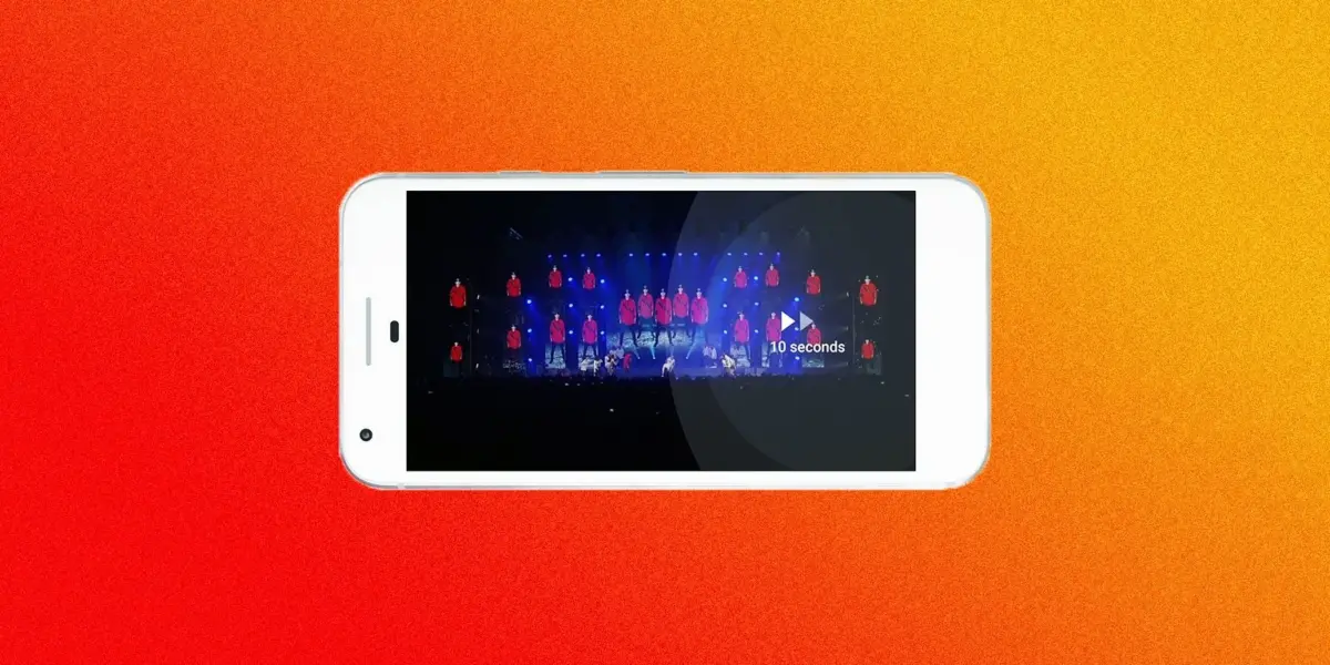
Consider the evolution of the mobile app. The newly updated version trades away the heavy, prominent red borders of the past in favor of clean white lines and minimalist space, making video thumbnails and the content itself the absolute focal point of the user experience. Beyond visual polish, the application introduces functional improvements long requested by users. Viewers can now speed up or slow down a video directly from their mobile devices—a capability that was previously restricted to desktop browsers—and can easily skip backward or forward by simply double-tapping on the sides of the video screen.
Furthermore, the mobile application finally addresses one of the most persistent frustrations of modern smartphone videography: the vertical video. Acknowledging that users capture and watch vertical footage constantly—and that vertical video is a completely legitimate format despite traditional cinematic purism—YouTube has finally adapted its player to display these videos properly. Gone are the intrusive letterboxes and stark black side bars. Instead, the video player now expands to fill the phone screen naturally. Even when watching standard widescreen content outside of full-screen mode, the player dynamically shifts to accommodate whatever size video is playing, breaking away from the rigid lock of the traditional 16:9 aspect ratio. This redesigned approach recognizes that people create and consume video in a multitude of different ways, and it grants users as much control and flexibility as possible over their viewing environment.

Accompanying the revamped mobile app is a brand-new icon that streamlines the company’s visual identity. Since its earliest days, the platform’s logo featured the black text "You" followed by the white word "Tube" enclosed inside a rounded red rectangle resembling an old television screen. The updated logo modernizes this branding by separating the company’s most iconic signifier—a bright red play button—and placing it neatly alongside the bold, clean typography of the word YouTube.
On the desktop side, the redesigned platform focuses more on refining the overall aesthetic than entirely rewriting the user experience. Rather than the traditional white content boxes layered over a stark gray background, users are now given a choice between a crisp, clean white display and a sleek new dark, cinematic theme. Both options incorporate simplified, modern typography that helps the entire page breathe a little better than it did previously. The new look draws heavy inspiration from Google’s established Material Design guidelines, creating a cohesive visual language across Google’s broader ecosystem of products.
The underlying philosophy driving the entire redesign is simple: to take YouTube out of the user’s experience on YouTube. The platform aims to ensure that viewers are entirely immersed in the video they are watching, rather than being distracted by the surrounding user interface or the complex recommendation engine working behind the scenes—or, for that matter, feeling self-conscious about the massive server load generated by racking up a fortieth consecutive view of Taylor Swift’s "Look What You Made Me Do." These comprehensive changes represent a genuine step forward in achieving that goal. The redesign sweeps away the digital cruft, makes diverse video formats feel native to the application, and even assists users in discovering new content to watch. Pausing to throw on the new Dark Theme while watching dramatic music videos makes the viewing experience feel notably more cinematic.
Behind these visible interface improvements, YouTube notes that the new products are constructed upon a newly engineered technical framework. This underlying architecture is designed to enable the engineering team to develop and deploy new features even faster in the future. Given how rapidly the landscape of online video continues to shift, such agility is essential. People are constantly inventing new ways to record, stream, watch, comment, and search for content across the web. Ultimately, YouTube can only maintain its status as the biggest titan in online video as long as its technology and design can keep pace with the ever-changing habits of its audience.