The landscape of modern web development continues to evolve rapidly as browser vendors, specification authors, and community developers introduce new standards, experimental features, and refined user interface patterns. In the latest edition of What’s !important (#18), the web development community highlighted a wide array of emerging techniques, experimental browser features, and architectural debates spanning CSS layout systems, state management, user interface interaction models, and native browser APIs.
From ergonomic enhancements to tooltip interaction models and native location management to advanced grid calculations and proposed selector syntax, these community updates showcase how the web platform is expanding its native capability set while moving away from heavy JavaScript reliance.
Refining Tooltip Ergonomics with Interaction Delays and Interest Invokers
User interface interactions frequently rely on tooltips to provide secondary contextual information without cluttering the primary layout. However, the timing dynamics of tooltips present persistent usability challenges. Front-end developer Abhishek Jakhar recently examined the underlying mechanics of effective tooltip design, emphasizing that tooltips require an intentional delay before appearing, followed by an immediate dismissal once the interaction concludes.
The rationale behind an initial entry delay is straightforward: preventing accidental activations as a user moves their mouse pointer across the viewport. Without a brief delay, moving the cursor across interactive elements triggers a cascade of unexpected visual popups, creating unnecessary visual noise and distracting the user. Conversely, once a user moves their pointer away from an active target, the tooltip should disappear instantly to clear the interface for subsequent actions.
While Jakhar provided practical implementation strategies for managing these timing state machines, an important edge case exists: target region sizing. When an interactive hover target is exceptionally small, minor cursor movements can cause unintended pointer exits. In these specific scenarios, applying an immediate dismissal policy can cause tooltips to flicker or close prematurely while the user is still attempting to interact with the target. Maintaining a brief delay on departure for small targets mitigates this issue and ensures a smoother user experience.
Responding to Jakhar’s exploration, web developer Chris Coyier highlighted an emerging, native CSS solution leveraging "interest invokers." This experimental specification introduces two declarative CSS properties designed specifically to control interaction timing: interest-delay-start and interest-delay-end.
Rather than relying on complex JavaScript event listeners, timer intervals, or intricate CSS transition delays on pseudo-classes, interest invokers allow developers to define hover and focus interest timing natively within stylesheet rules. At present, Google Chrome is the only browser engine offering implementation support for interest invokers. However, developers can adopt this capability today through progressive enhancement, delivering fine-tuned native timing mechanics to supported browsers while ensuring base functionality remains accessible across all client environments.
<geolocation> and How to Use It Today
Managing geographic location data on the web platform has historically presented technical challenges for developers. The underlying mechanics of location determination rely on complex hardware integrations, coordinating telemetry from orbital GPS satellites, local Wi-Fi networks, and cellular towers to triangulate user positions. Beyond the hardware abstraction layer, the traditional JavaScript Geolocation API often introduces friction around user permissions, handling asynchronous authorization states, and managing permission status changes after an initial choice has been registered.
To address these pain points, a native <geolocation> HTML element has been introduced to simplify location access patterns within standard web markup. While the element streamlines user consent flows and hardware access requests, it introduces distinct platform constraints, particularly regarding user-agent styling restrictions designed to preserve security and UI consistency across application interfaces.
+-------------------------------------------------------------------+
| Chrome Permission Dialog Example                                  |
|                                                                   |
| [ Site wants to know your location ]                              |
| (•) Allow this time   ( ) Allow on every visit   ( ) Don't allow   |
+-------------------------------------------------------------------+
Because native support for the <geolocation> element is currently confined to Google Chrome, developer documentation provided via Piccalilli outlines strategies for integrating the element into production workflows today. By pairing the modern <geolocation> HTML element with legacy JavaScript Geolocation API fallbacks, developers can construct robust, progressively enhanced workflows. Under this implementation model, modern browsers take advantage of the streamlined HTML-driven permission handling, while unsupported platforms seamlessly default to traditional API calls, granting immediate utility without sacrificing cross-browser compatibility.
MicroLighter: A ::highlight()-Based Syntax Highlighter
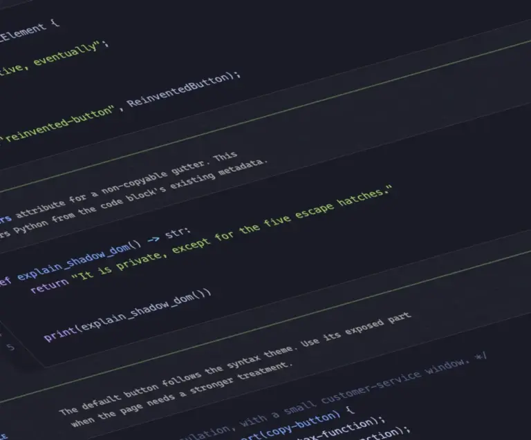
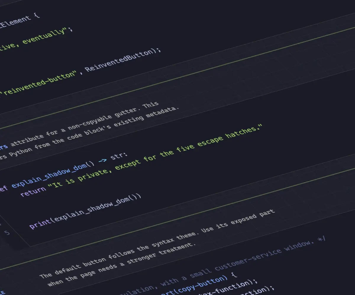
Code syntax highlighting on the web has traditionally required heavy DOM manipulation. Legacy highlighting libraries scan raw text content, parse token streams, and wrap code segments in thousands of nested inline HTML elements—such as <span> tags—to apply syntax-specific color schemes via standard CSS classes. This approach inflates the Document Object Model (DOM) node count, increases memory consumption, and triggers costly layout recalculations during client-side rendering.

To solve this inefficiency, web developer Dave Rupert created MicroLighter, a compact syntax highlighting utility built atop the browser’s native Custom Highlight API and the CSS ::highlight() pseudo-element.
The Custom Highlight API allows developers to programmatically define text ranges across existing DOM text nodes and map visual styles directly to those ranges without modifying the underlying HTML markup. By assigning CSS highlight names to identified code tokens, MicroLighter applies rich syntax styling while maintaining a clean, unencumbered DOM structure.
Developer Geoff Graham discussed the implications of MicroLighter on CSS-Tricks, emphasizing how the utility demonstrates the practical real-world performance benefits of the ::highlight() specification, establishing a blueprint for high-performance text decoration on the modern web platform.
How to Get CSS Grid Information Into CSS Variables
CSS Grid Layout has transformed multi-dimensional web page architecture, yet accessing calculated layout metrics directly within CSS stylesheets has historically required JavaScript layout calculations. Front-end specialist Temani Afif demonstrated a declarative methodology to extract real-time grid dimensions and cell positioning metadata directly into CSS custom properties (variables).
Afif’s technique exposes key visual metrics—such as total row counts, total column counts, and individual cell coordinate indexes along the horizontal (X) and vertical (Y) axes—and stores them as custom property values. This allows child elements to query their precise positional coordinates within the parent layout system natively.
+-------------------------------------------------------------------+
| CSS Grid Layout Coordinate Mapping                                |
|                                                                   |
|  [Cell X:1, Y:1]  -->  [Cell X:2, Y:1]  -->  [Cell X:3, Y:1]      |
|         |                     |                     |             |
|  [Cell X:1, Y:2]  -->  [Cell X:2, Y:2]  -->  [Cell X:3, Y:2]      |
+-------------------------------------------------------------------+
Currently, this approach operates under a specific structural condition: the target grid layout must feature columns of equal width. Despite this constraint, ongoing evolutions in CSS layout engine specifications suggest these requirements may broaden over time.
Building upon this mathematical grid mapping, Afif demonstrated a practical extension of the concept: calculating hover proximity strictly within CSS. By combining cell coordinate variables with modern CSS mathematical functions, stylesheets can determine the visual distance between a user’s cursor position and surrounding grid items. This makes it possible to create dynamic pointer-tracking and proximity-based visual feedback effects entirely within native CSS, bypassing traditional JavaScript event listener overhead.
Dark Mode: Two-State or Tri-State?
The architectural design of dark mode color scheme toggles remains a subject of active discussion among front-end engineers, focusing on whether user interface controls should follow a binary or tertiary state model.
Web standards researcher Lea Verou advocates for a streamlined two-state toggle mechanism. In this paradigm, the control provides a direct binary selection between light and dark themes, prioritizing UI simplicity and reducing interface complexity for the user.
Conversely, web developer Bramus makes the case for a tri-state dark mode architecture. Bramus argues that user interface toggles should explicitly expose three distinct operational modes:
- Light: Forces a light color scheme regardless of system settings.
- Dark: Forces a dark color scheme regardless of system settings.
- System: Dynamically tracks the underlying operating system theme preferences via the
prefers-color-schememedia query.
Offering a middle ground in this architectural debate, developer Vale.Rocks introduced an "auto-until-overridden" two-state model. Under this hybrid workflow, the application defaults automatically to matching the operating system’s current theme preference. The explicit toggle remains a binary switch; however, engaging the switch records a user preference override that bypasses system-level changes until cleared. This approach balances the structural simplicity of a two-state control with the flexibility of system tracking.

An Introduction to the Class Prefix Selector
Targeting HTML elements based on class naming patterns is a common requirement in modular CSS frameworks, utility-first styling workflows, and component architectures. Today, developers targeting group classes based on shared prefixes must rely on attribute selectors. Bramus highlighted a formal specification proposal designed to simplify this pattern: the CSS class prefix selector.
The proposed syntax introduces a wildcard matching pattern applied directly to standard class selectors:
.something-*
  /* Applied to any class beginning with 'something-' */
This dedicated selector syntax replaces cumbersome, higher-overhead attribute selector patterns currently required to achieve similar class-matching logic:
/* Legacy attribute selector patterns */
[class^="something-"]
  /* Matches class attributes starting with "something-" */


[class*=" something-"]
  /* Matches class attributes where "something-" follows a space */


[class*="something-"]
  /* Matches "something-" anywhere inside the class attribute string */
Standard attribute selectors suffer from structural matching pitfalls. For example, using a broad substring attribute match like [class*="something-"] risks inadvertently matching unintended class strings, such as my-something-xxx. Additionally, attribute selectors present performance trade-offs because browser rendering engines parse full string values within the DOM attribute list rather than using optimized class-index lookups.
While the class prefix selector is not yet supported in consumer browser engines, front-end commentators—including Geoff Graham—note that its clear syntax, reduced performance footprint, and direct alignment with established developer patterns make it a strong candidate for rapid standardization and browser vendor adoption.
Feature Detection with the named-feature() Function
In another contribution to platform feature analysis, Bramus highlighted the introduction of the @supports named-feature() conditional function. While the standard @supports rule allows developers to test browser parsing capabilities for specific CSS property-value combinations, it historically struggles to verify complex rendering behaviors or experimental engine implementations that share standard syntax definitions.
/* Example named-feature query block */
@supports named-feature(anchor-transform)
  /* Styles applied only if the engine handles transforms on anchor positioning */
Available in Google Chrome, the named-feature() extension enables granular feature query capabilities. Developers can programmatically verify whether a client browser engine supports specific capabilities that were previously difficult to detect—such as validating whether an engine properly evaluates visual CSS transforms when applied to anchor-positioned layout elements. By expanding the capability of conditional @supports queries, named-feature() helps developers write safer progressive enhancements without resorting to user-agent string parsing or complex feature-detection scripts.
How to Balance Wrapped Flex Items Across Rows or Columns
Following the widespread adoption of text-wrap: balance for headline typography, Google Chrome has introduced support for layout balancing within CSS Flexible Box Layout via the flex-wrap: balance property value.
Front-end author Ahmad Shadeed published a detailed technical evaluation of flex-wrap: balance, explaining its visual mechanics and practical user interface applications. When flex container items wrap across multiple lines, standard engine rendering algorithms push remaining items to subsequent rows based strictly on available inline space. This often leaves the final row containing a single item or an visually awkward distribution of elements.
+-------------------------------------------------------------------+
| Unbalanced Flex Items (Standard Wrap)                             |
| +------------+  +------------+  +------------+  +------------+    |
| | Item 1     |  | Item 2     |  | Item 3     |  | Item 4     |    |
| +------------+  +------------+  +------------+  +------------+    |
| +------------+                                                    |
| | Item 5     |                                                    |
| +------------+                                                    |
+-------------------------------------------------------------------+
| Balanced Flex Items (flex-wrap: balance)                          |
| +------------+  +------------+  +------------+                    |
| | Item 1     |  | Item 2     |  | Item 3     |                    |
| +------------+  +------------+  +------------+                    |
| +------------+  +------------+                                    |
| | Item 4     |  | Item 5     |                                    |
| +------------+  +------------+                                    |
+-------------------------------------------------------------------+
By applying flex-wrap: balance, the browser layout engine redistributes wrapping items across available rows or columns to equalize visual density and item counts per line. This prevents asymmetrical card distributions, isolates visual orphans in navigation bars, and creates balanced grid-like behaviors within dynamic multi-line flex containers without requiring complex grid definitions or explicit breakpoint adjustments.
Looking Ahead
The continuous evolution of CSS and core web platform APIs demonstrates a clear industry trend toward native, low-overhead declarative solutions for long-standing web design challenges. By shifting UI timing logic, location handling, syntax highlight styling, and dynamic layout calculations directly into native platform specifications, developers can construct faster, more resilient web applications. As browser vendors continue testing and shipping these capabilities, progressive enhancement remains the primary strategy for integrating these modern standards into production web applications today.