The rapid evolution of web technologies continues to reshape how front-end engineers build modern user interfaces. As browser vendors introduce native solutions for long-standing UI patterns, techniques that once required heavy JavaScript libraries are increasingly shifting into declarative HTML and CSS. The latest release of the community digest What’s !important (#18) highlights significant advancements across browser engines, novel CSS specifications, and creative community-driven standards.
From refined hover ergonomics and declarative location permissions to lightweight syntax highlighting and experimental selector logic, this synthesis of recent front-end development explores the key concepts, standards updates, and technical methodologies driving modern web development.
Refining UI Ergonomics: Delayed and Instant Tooltip Behaviors
User experience design frequently encounters friction in basic interactive components, particularly tooltips. Standard tooltips often suffer from poor visual ergonomics: popping up instantly when a user merely passes the mouse cursor across an interactive trigger, or lingering unnecessarily when the user moves away.
Front-end developer Abhishek Jakhar recently examined the mechanics of optimal tooltip behavior, advocating for a hybrid timing model: tooltips should feature an initial display delay upon hover, followed by an immediate, instant disappearance when the pointer exits the trigger area. The initial delay prevents unintended UI popups during rapid cursor movements across the viewport. Conversely, once the user intentionally inspects an element and moves away, the prompt should clear instantly to avoid obscuring adjacent content.
Jakhar demonstrated how to engineer this dual timing behavior. However, practical implementation reveals a subtle edge case: when a hoverable target is extremely small, slight cursor shifts can inadvertently trigger a mouseout event, causing the tooltip to disappear prematurely. In such specific component contexts, maintaining a brief exit delay remains necessary to preserve usability.
Building on Jakhar’s concepts, Web development advocate Chris Coyier highlighted a modern CSS-native approach leveraging the proposed "interest invokers" specification. This platform primitive introduces dedicated CSS properties designed to handle interactive delays natively:
interest-delay-start: Controls the programmatic pause required before an element transitions into its active interest state.interest-delay-end: Manages the duration before the interest state is relinquished upon cursor exit.
Currently supported experimentally in Chromium-based engines like Chrome, interest invokers provide a declarative, performance-optimized method for managing popups and tooltips. By applying progressive enhancement, developers can implement these native properties today, delivering enhanced timing behavior in supported browsers while falling back gracefully in legacy environments.
<geolocation> and how to use it today
Integrating user location into web applications has historically presented technical and architectural challenges. The traditional JavaScript Geolocation API relies heavily on underlying platform hardware—triangulating coordinates via GPS satellites, local Wi-Fi networks, and cellular towers. Furthermore, managing programmatic permission states, handling user rejections, and providing fallback user interfaces often require extensive custom code.
The introduction of the experimental HTML <geolocation> element aims to simplify this workflow by replacing complex JavaScript authorization flows with a declarative element. However, shifting location requests directly into HTML markup introduces key considerations, particularly regarding security and styling constraints.
To prevent malicious design practices such as clickjacking or UI spoofing, user agent specifications enforce strict styling restrictions on the <geolocation> element. Browsers restrict custom CSS adjustments to key layout properties, ensuring that native permission prompts and button indicators retain recognizable, tamper-proof system styling.
+-------------------------------------------------------------+
|  chrome.example.com wants to know your location             |
|                                                             |
|  [ Allow while visiting site ]  [ Only this time ]  [ Don't ]|
+-------------------------------------------------------------+
Because native browser execution for the <geolocation> element is currently confined to Chrome implementations, adopting the feature requires a hybrid deployment model. Developers can leverage progressive enhancement by implementing the declarative <geolocation> tag as the primary interface while fallback scripts query the standard Geolocation API in unsupported browsers. This dual approach allows engineering teams to deploy modern native elements immediately without compromising cross-browser compatibility.
MicroLighter: a ::highlight()-based syntax highlighter
Client-side syntax highlighting traditionally incurs significant DOM overhead. Legacy highlighting tools parse raw code strings and wrap every token, keyword, and string literal in nested HTML markup (such as <span> tags). For large code blocks or real-time documentation portals, this approach inflates DOM node counts, increases memory consumption, and degrades rendering performance.
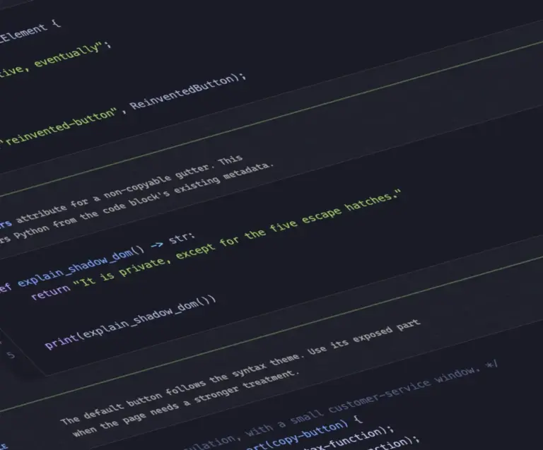
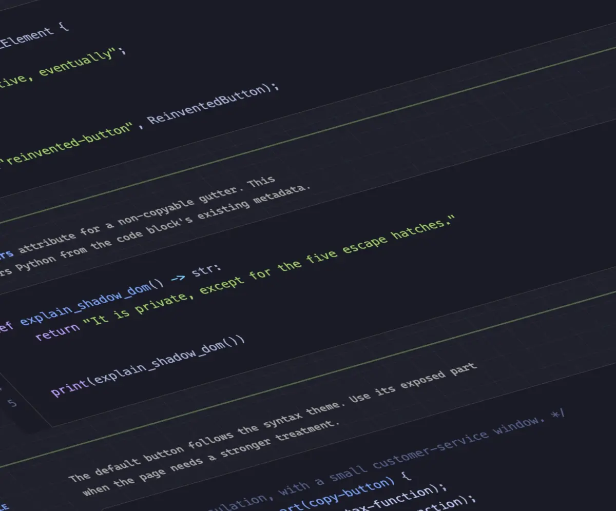
Engineer Dave Rupert introduced a modern solution to this problem with MicroLighter, an ultra-lightweight syntax highlighter built upon the CSS Custom Highlight API (::highlight()).

Unlike traditional DOM manipulation methods, the Custom Highlight API allows developers to style arbitrary text ranges programmatically without modifying the underlying HTML structure. By pairing JavaScript range detection with the native CSS ::highlight() pseudo-element, MicroLighter applies syntax coloring directly at the browser rendering layer.
Key advantages of the ::highlight() architecture include:
- Zero DOM Mutation: Code blocks remain clean text nodes, drastically reducing layout recalculations and memory usage.
- Enhanced Accessibility: Screen readers and assistive technologies read clean, continuous text strings rather than fragmented tree structures.
- Styling Flexibility: Theme colors, font weights, and text decorations are defined cleanly in CSS stylesheets rather than embedded inline.
Web developer Geoff Graham, alongside Rupert, detailed how MicroLighter simplifies front-end architecture. By moving document parsing out of the DOM manipulation pipeline, the Custom Highlight API demonstrates how modern CSS primitives can replace heavy JavaScript rendering tasks.
How to get CSS grid information into CSS variables
CSS Grid Layout provides powerful two-dimensional layout capabilities, yet communicating dynamic grid dimensions back to styling rules has historically required custom JavaScript calculations. Frontend engineer Temani Afif addressed this limitation by demonstrating a technique to expose CSS Grid metrics directly into CSS custom properties (variables).
Afif’s method allows stylesheets to track structural grid metadata, including:
- The absolute number of calculated rows and columns in a grid container.
- The exact positional index coordinates (x and y locations) of individual child grid cells.
Currently, this mathematical mapping requires that grid columns share equal fractional or explicit widths. However, as the CSS Values and Units specifications continue to evolve, these constraints are expected to loosen.
+-------------------+-------------------+-------------------+
| Cell (X: 1, Y: 1) | Cell (X: 2, Y: 1) | Cell (X: 3, Y: 1) |
+-------------------+-------------------+-------------------+
| Cell (X: 1, Y: 2) | Cell (X: 2, Y: 2) | Cell (X: 3, Y: 2) |
+-------------------+-------------------+-------------------+
A compelling application of this technique is determining hover proximity across a grid layout. By injecting positional coordinate variables into CSS calculations, stylesheets can dynamically adjust styles based on the distance between the mouse cursor and neighboring cells. This allows developers to build responsive grid hover interactions using native CSS logic rather than continuous JavaScript event listeners.
Dark mode: two-state or tri-state?
The architectural design of color scheme toggles remains a subject of active debate among front-end engineers. As operating systems and web browsers offer built-in dark mode preferences, developers face choices regarding how user preference overrides should be implemented.
Web standard advocate Lea Verou supports a streamlined two-state model (Light / Dark). Verou argues that explicit binary choices reduce interface complexity, simplify state persistence, and prevent UI ambiguity.
Conversely, developer Bramus Van Damme makes the case for a tri-state model (Light / Dark / System Default). Bramus highlights that explicit tri-state toggles grant users full agency, enabling them to align an application with their operating system settings or explicitly lock in a preference regardless of system-level schedule changes.
Offering a middle ground, engineer Vale.Rocks introduced an "auto-until-overridden" two-state architecture. In this design:
- The interface initially mirrors the user’s system OS preference automatically without manual configuration.
- If the user interacts with the two-state toggle, the application registers an explicit preference, overriding the system default from that point forward.
This dynamic approach balances convenience with explicit user control, illustrating how design systems continue to refine dark mode state management.
An introduction to the class prefix selector
Managing utility-first CSS frameworks and structural design systems often requires matching dynamic or grouped class names. Currently, targeting partial class string patterns requires CSS attribute selectors:

/* Target classes starting with a specific string */
[class^="something-"]
  /* Style rules */


/* Target classes containing space-delimited prefixes */
[class*=" something-"]
  /* Style rules */


/* Target classes containing a substring anywhere */
[class*="something-"]
  /* Style rules */
While functional, attribute selectors force browser style engines to execute substring evaluation against raw DOM strings, which can introduce performance overhead in complex applications.
To address this, Bramus detailed a proposal undergoing discussion within the CSS Working Group: the class prefix selector (.something-*).
/* Proposed native class prefix syntax */
.something-*
  /* Style rules */
The proposed selector provides a cleaner syntax designed for native style matching. By allowing style engines to perform targeted class-list indexing rather than arbitrary string parsing, the class prefix selector promises improved rendering performance and cleaner codebase maintainability for modern design systems.
…and the named-feature() function
Feature queries via @supports have long allowed developers to write defensive CSS by testing whether a browser supports specific property-value pairs before applying styling rules:
@supports (display: grid)
  /* Modern layout styles */
However, standard feature queries cannot evaluate subtle engine implementation details or specific edge-case behaviors. To bridge this gap, Bramus highlighted Chrome’s implementation of the @supports named-feature() function.
The named-feature() function allows developers to query precise, underlying browser engine capabilities that were previously undetectable. For example, developers can verify whether an engine correctly applies CSS transform matrices to elements positioned using CSS Anchor Positioning specifications.
By expanding the precision of capability testing, named-feature() strengthens progressive enhancement workflows, enabling developers to target specific rendering behaviors reliably across dynamic browser environments.
How to balance wrapped flex items across rows or columns
In responsive typography, the text-wrap: balance property—explained in depth by web platform advocate Stephanie Stimac—transformed visual design by automatically balancing line lengths across multi-line text elements, eliminating orphaned words on trailing lines.
Chromium engines have expanded this balancing capability to multi-row flexbox layouts with flex-wrap: balance.
Front-end developer Ahmad Shadeed detailed how flex-wrap: balance redistributes flex items dynamically across wrapped rows or columns. In standard multi-row flex containers, wrapped items frequently leave a single orphaned element spanning an entire final row.
Standard Flex Wrap (Unbalanced):
[ Item 1 ] [ Item 2 ] [ Item 3 ]
[ Item 4 ]

Balanced Flex Wrap (flex-wrap: balance):
[ Item 1 ] [ Item 2 ]
[ Item 3 ] [ Item 4 ]
Applying flex-wrap: balance instructs the browser’s layout engine to equalize item counts and dimensions across all active rows. This native balancing logic optimizes grid-like card layouts, tag groups, and media galleries, delivering visual symmetry without complex layout calculations or custom script intervention.