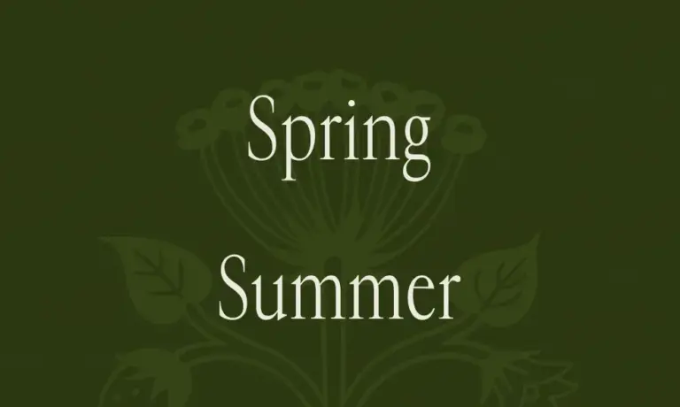
In the contemporary landscape of graphic design and digital media, the creation and appreciation of typography continue to serve as a vital cornerstone for visual communication. Recently, the prominent international platform Alphabettes highlighted a compelling exploration into the world of letterforms through a feature dedicated to the Tikte typeface. Published by designer and contributor Paula Mastrangelo, the piece adds to an ongoing global dialogue surrounding contemporary type design, lettering arts, and the meticulous craftsmanship required to bring new alphabets to life.
The feature, which made its appearance on the platform, directs attention toward the intricate nuances of the Tikte typeface, capturing the attention of typographers, type designers, and design enthusiasts alike. Alphabettes, known widely as a collaborative platform celebrating the work of women and minority genders in lettering, typography, and type design, frequently serves as a hub for deep dives into creative projects that push the boundaries of visual expression. Through Mastrangelo’s contribution, the community is invited to examine not just the aesthetic outcome of a typeface, but the conceptual and practical considerations that shape modern letter design.

Type design is an exacting discipline that bridges art, history, and technology. Every typeface tells a story, conveying tone, emotion, and historical context long before a reader processes the literal meaning of the words on a page or screen. Projects like Tikte represent the dedication required to design coherent, functional, and visually striking character sets. Mastrangelo’s spotlight on the typeface underscores the significance of ongoing experimentation within the field, where designers continually find new ways to manipulate curves, strokes, spacing, and proportions to craft unique visual voices.
The broader conversation surrounding typography on platforms like Alphabettes often touches on the deep affection creators hold for their craft—a sentiment frequently captured by community tags such as letterlove and loveletters. This passion is essential for type designers, who often spend months or even years refining a single family of fonts. Kerning, hinting, legibility across various scales, and language support are just a few of the technical hurdles that designers must navigate. By bringing visibility to projects like Tikte, writers and creators like Mastrangelo help foster a deeper appreciation for the labor-intensive processes hidden beneath the surface of everyday reading material.
As the design community continues to evolve, the sharing of diverse perspectives and specialized projects remains vital. The feature on the Tikte typeface fits seamlessly into the broader editorial framework of Alphabettes, which regularly balances technical critique with artistic celebration. Readers navigating through the site’s archives can find a rich tapestry of content ranging from historical lettering studies to cutting-edge digital type experiments. Each post contributes to a collective archive that documents the state of the art in typography and supports the professional growth and visibility of its contributors.

The continuous flow of content on Alphabettes ensures that designers have access to continuous inspiration and critical discourse. Articles focusing on specific typefaces like Tikte serve as essential touchstones for practitioners looking to understand current trends and methodologies in the field. By highlighting these creative endeavors, authors like Paula Mastrangelo ensure that the stories behind innovative typefaces are documented, shared, and appreciated by a wider audience of design professionals and enthusiasts.