Fresh off landing two more prestigious Main Title Emmy nominations for their widely praised work on Peacock’s Ponies and Young Sherlock, creative director Ronnie Koff and the acclaimed design studio Imaginary Forces are back in the spotlight. This time, Koff is mining deep drama, raw texture, and visceral emotion from abstract expressionism to set the tone for HBO’s intense new legal drama, WAR.
Rather than relying on the conventional visual tropes typically associated with the legal genre—such as wood-paneled courtrooms, imposing law books, rows of attentive attorneys, or the stoic architecture of the justice system—Koff and his team chose a radically different path. They wanted the sequence to feel like conflict distilled to its most elemental, unfiltered form. By focusing on the raw friction that occurs when two opposing forces inevitably collide, the creative team crafted an opening title sequence that acts as a physical manifestation of the show’s underlying themes.
“We wanted the sequence to feel like conflict distilled to its most elemental form,” explains Ronnie Koff, reflecting on the conceptual development behind the project. “Instead of showing lawyers, courtrooms, or traditional imagery from the legal world, we visualized what happens when two opposing forces come up against one another.”
This conceptual framework guided every creative decision made in the studio. The team began conceptualizing the two opposing sides of a legal battle not through characters or case files, but through the kinetic energy of combatants. They drew inspiration from the squared circle, viewing the legal adversaries almost like two professional boxers sizing each other up in a ring. One side advances with intent, the other responds with calculated resistance, and the two crash together, separate, and circle back for another round of confrontation. Once the team started channeling that kind of human intention and kinetic momentum into the application of paint on canvas, the abstraction suddenly unlocked a powerful narrative.
The choice of abstract expressionism as a visual language was both deliberate and deeply thematic. By stripping away literal depictions of a courtroom battle, Koff tapped into a style of art renowned for its raw psychological resonance.
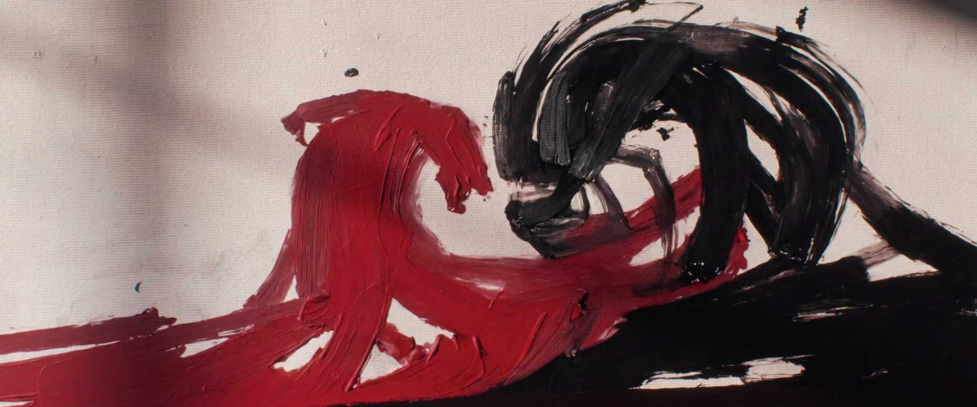
“There’s something beautiful about abstract expressionism because you can feel aggression, tension, and emotion without being told exactly what you’re looking at,” Koff notes, elaborating on why the artistic movement fit the tone of HBO’s new series. “That felt like the right language for War. The title sequence isn’t illustrating the conflict—it becomes the conflict.”
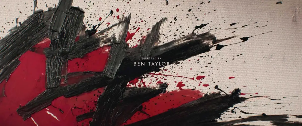
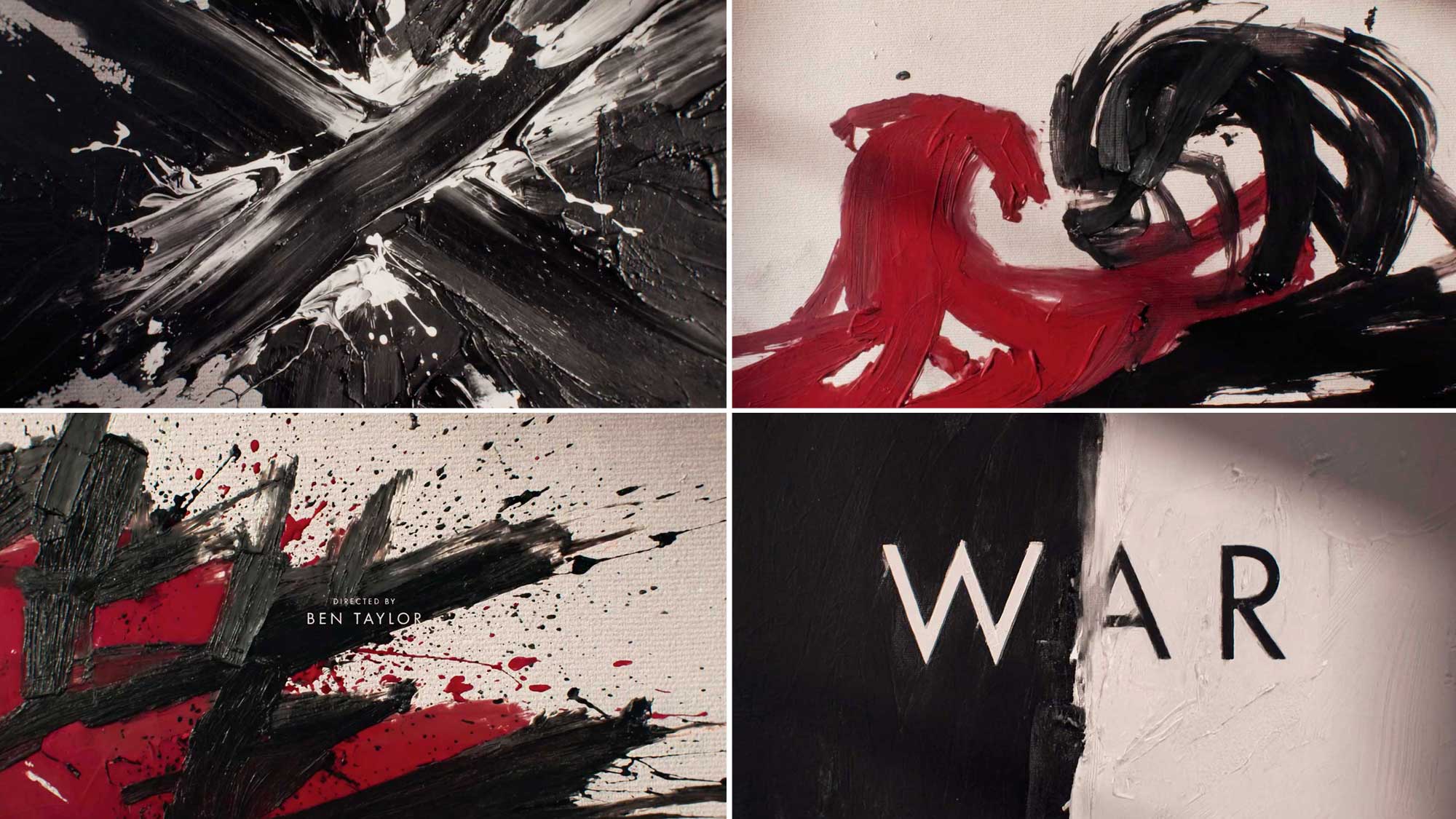
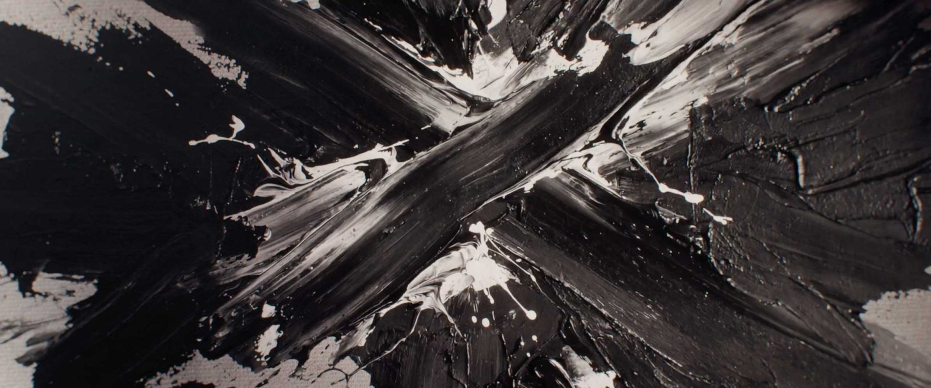
The resulting visuals are striking and unapologetically tactile. Frames from the sequence reveal heavy, deliberate brushstrokes, dramatic splatters of deep crimson paint contrasted against stark black lines, and textured canvases that evoke a sense of physical struggle. In one prominent frame, thick black and white brushstrokes converge to form an imposing, jagged X shape across the screen. In others, aggressive splashes of red bleed into stark monochrome compositions, capturing the unpredictable violence of legal warfare before a single line of dialogue is spoken. The typography of the series title, WAR, stands centered in clean, commanding capital letters against backgrounds split vertically by stark tonal contrasts, anchoring the chaotic beauty of the brushwork with structural clarity.
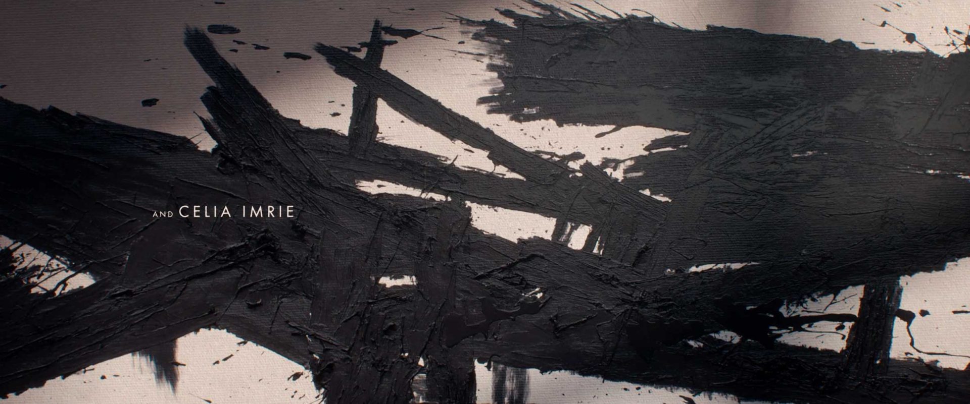
Bringing this ambitious vision to life required a tightly coordinated effort from a seasoned team of artists and producers at Imaginary Forces. The production credits highlight a multidisciplinary approach, with creative direction led by Ronnie Koff, art direction by Henry Chang, and design work by Kathy Liang. The complex interplay of paint and motion was executed by painter and animator Drew Tyndell, while editor Lexi Gunvaldson shaped the rhythm and pacing of the sequence. The production was steered by producer Christina Hwang and executive producer Renée Robson, working in close collaboration with the network team at HBO.
As WAR prepares to make its debut, the opening title sequence stands as a testament to the power of design to transcend literal storytelling. By leaning into the unpredictable, emotive qualities of abstract expressionism, Ronnie Koff and Imaginary Forces have successfully transformed the traditional legal drama intro into an avant-garde battlefield, proving once again why the studio remains a leading force in television design.