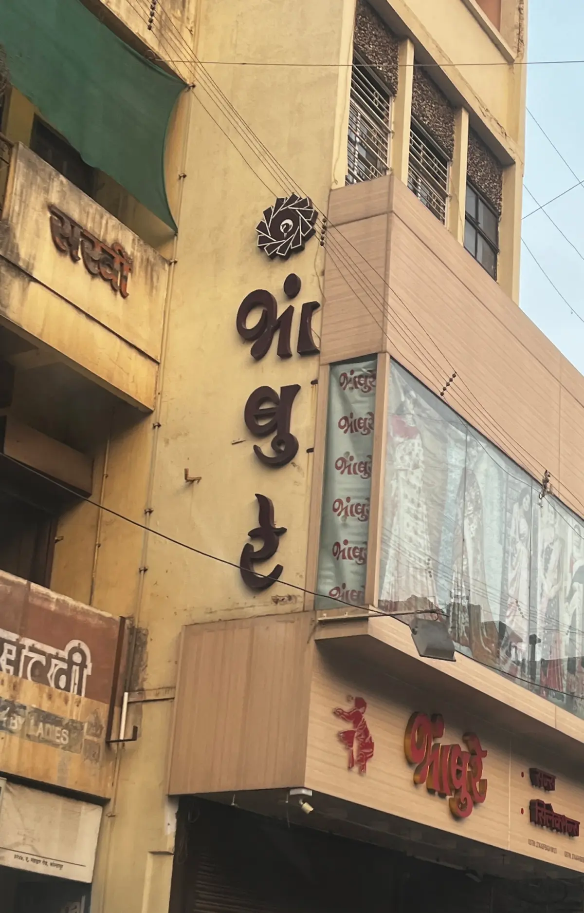
The vibrant visual landscape of South Asia is defined by a rich tapestry of multilingual expression. In countries like India, it is commonplace for street signs, government notices, periodicals, and everyday printed ephemera to display two or three languages simultaneously—frequently pairing English with a regional tongue, or weaving multiple regional languages together seamlessly. For generations, traditional sign painters and master calligraphers have navigated this intricate linguistic environment with remarkable fluency, creating hand-painted Devanagari lettering that gracefully integrates Latin numbers and words. However, translating this organic coexistence into the realm of digital typesetting has proven to be a complex and persistent challenge.
Evolved from the ancient Brahmi script, Devanagari serves as the foundational writing system for major languages such as Marathi, Hindi, Sanskrit, and Nepali, holding a vital place across South Asia and beyond. Despite its cultural prominence, technological advancements in Devanagari type design have historically progressed at a slow pace, with modern digital adaptations only recently gaining momentum.
The core difficulty in digital typesetting stems from fundamental differences in script anatomy, reading direction, structural behavior, and a historical shortage of well-crafted Devanagari fonts compared to the vast library available for Latin. Too often, digital workflows suffer from systemic knowledge gaps, defaulting to the convenience of forcing non-Latin scripts to adhere strictly to Latin typesetting principles. Experts emphasize that achieving true typographical harmony requires looking past these shortcuts, respecting the rich scribal history of Devanagari, and developing thoughtful guidelines that honor the distinct nuances of both writing systems.

Understanding the Basics of Devanagari in Contrast to Latin
The most successful applications of Devanagari—whether used independently or paired with Latin—occur when the script is allowed to maintain its natural integrity rather than being forced into a Latinized mold. Because mechanized composition tools and modern digital software were originally engineered around alphabetic writing systems, Devanagari has long had to adapt to foreign technological frameworks just to render and read correctly.
To understand why traditional rules of Latin typography fail when applied blindly to Devanagari, typographers must examine the structural differences at the core of each script. Unlike Latin, which is strictly alphabetic, Devanagari consists of consonants and independent or dependent vowels. Vowels are attached to consonants to form complex combinations of letters, creating what scholar Bapurao S. Naik defined as phono-graphic graphemes. For instance, combining the consonant la with the e vowel sound creates a unified phonetic unit, just as two separate consonants can merge into a complex conjunct.
Another major structural divergence lies in the use of typographic cases. While the Latin script relies heavily on case variations—such as small caps blending into body text or towering uppercase headers—to establish visual contrast and hierarchy, Devanagari possesses only a single case. Consequently, typographers working with Devanagari must achieve all visual weight, contrast, and hierarchy within the constraints of a single case.

When capitalized Latin words are placed alongside Devanagari, the resulting texture can easily appear uneven, dense, or disjointed, often making the regional script look like an afterthought. Simple font matching, researchers note, is rarely enough to bridge this aesthetic gap.
Matras, Alignment, and Structural Anatomy
In Latin typography, the baseline and the x-height serve as the primary anchors for optical alignment, as the majority of a letter’s visual mass falls squarely between them. Devanagari, however, relies on an entirely different anatomical architecture. The script features matras—vowel signs and diacritics—that sit above and below the active letter area. While these can loosely be compared to Latin ascenders and descenders for spatial planning, matras are frequently applied separately rather than being permanently fused to the core letterforms.
Instead of the baseline carrying the primary optical weight, the prominent horizontal headline known as the shirorekha serves as the anchor of the Devanagari script. When pairing the two scripts, typographers find that aligning the shirorekha with the Latin x-height yields much better visual stability than attempting to align baseline structures directly. The x-height proper does not exist in Devanagari; instead, the visual mass rests heavily between the continuous shirorekha and the base line.

Furthermore, the mechanics of contrast and serifs operate in reverse. The traditional letter construction contrast in Devanagari differs fundamentally from Roman serif models, meaning that adding formal Latin-style serifs to Devanagari characters often makes them look awkwardly decorative. While low-contrast serif styles are a staple of long-form Latin reading, applying the exact same logic to Devanagari can severely impair legibility.
Tracking, Spacing, and Textural Density
Because the shirorekha is such a dominant structural element in Devanagari, it must remain continuously connected across a word unless a deliberate stylistic choice dictates otherwise. This physical requirement changes how typographers must approach tracking and spacing. Manual tracking adjustments must be executed with extreme caution to prevent accidental fractures in the shirorekha.
Similarly, text justification presents unique hurdles. While justification in Latin relies on standard word spacing, character tracking, and traditional hyphenation, hyphenation is not traditionally practiced in Devanagari. Forcing Devanagari text into arbitrary Latin line lengths or applying automated letter-spacing without considering the shirorekha can easily result in broken words, misplaced matras, and uneven paragraph textures.

Maintaining an even typographic color across long-form paragraphs requires careful management of line spacing. Devanagari typically demands more vertical room than Latin due to its upper and lower matra zones. Relying on automated leading often leads to cramped, illegible blocks of text, requiring typographers to manually fine-tune leading to achieve uniform density.
Guidelines, Font Matching, and Hierarchy
Effective multilingual typesetting goes far beyond simply selecting two fonts from the same digital foundry. It demands a deliberate effort to ensure that all scripts receive equal visual weight, importance, and respect while maintaining optimal readability.
The most foolproof approach to font matching is selecting a unified type family specifically engineered to support both Latin and Devanagari. When this is not an option, typographers must carefully evaluate stroke weight, terminal shapes, and contrast types. Comparing the visual volume of a Latin lowercase ‘o’ with a corresponding Devanagari character can offer valuable insight into whether two independent fonts will sit comfortably side by side. Designers must also evaluate internal letter spaces and side-bearings to ensure the overall typographic texture remains balanced at both macro and micro levels.

Creating hierarchy without the benefit of uppercase variations or italics requires a deep understanding of font weight distribution. When pairing a sentence-case Latin font with Devanagari, the ascenders and descenders often harmonize naturally with the upper matras and lower ukars. Conversely, pairing an all-caps Latin heading with Devanagari can create an overly heavy, top-heavy imbalance unless the scale and optical alignment are adjusted accordingly. In some cases, introducing a secondary indigenous font style within Devanagari can help replicate the distinct emphasis provided by italics or uppercase forms in Latin.
Avoiding Stylistic Missteps
As digital type design continues to evolve, industry experts strongly caution against extreme stylistic appropriations. Just as "Latinizing" Devanagari strips the script of its cultural and structural integrity, attempting to "Devanagarize" the Latin script—such as arbitrarily slapping a shirorekha onto Roman letters or artificially curling Latin terminals—produces a distorted, gimmicky effect. Such practices not only fail to achieve typographic harmony but can also be perceived as culturally disrespectful.
True multiscript typography must honor the historical and cultural connotations of every language involved. When working across unfamiliar linguistic boundaries, digital designers are encouraged to consult native speakers for proofreading and cultural validation, ensuring that the final output remains accurate, readable, and respectful to the communities it serves.