Despite achieving near-universal browser support, CSS Container Queries remain surprisingly underutilized across the modern web development landscape. For years, component-driven responsive layout capability sat at the absolute top of web developer wishlists. However, empirical industry data reveals a striking disconnect between developer awareness and real-world implementation, driven largely by persistent misunderstandings about how the specification fundamentally operates compared to traditional media queries.
Data from the State of CSS survey underscores this adoption gap: while approximately 86% of web developers report being aware of container queries, only 41.4% actively incorporate them into production codebases. This disparity exists despite container size queries boasting roughly 94% browser support across all major rendering engines. Addressing developers at SmashingConf Amsterdam, prominent CSS educator Kevin Powell emphasized that adoption has been unexpectedly sluggish, noting that many engineers continue to treat container queries as mere drop-in replacements for standard media queries rather than leveraging their distinct architectural purpose.
The core issue stems from visual and syntactic similarity. Because @container rules visually resemble @media rules, developers frequently assume they serve identical functions. In reality, while media queries evaluate the global browser viewport, container queries evaluate the immediate structural context surrounding an individual component.
/* Traditional Media Query evaluating global viewport width */
@media (min-width: 1024px)
  .card
    display: flex;
When developers write traditional media queries, they are asking the browser a singular question: How wide is the screen right now? While this approach succeeds at broad layout orchestrations, it fails when applied to modular, reusable components.
Container Queries Look Inward
For decades, web developers have relied on the viewport as a broad proxy for layout decisions. Media queries fostered the illusion that screen width alone dictates how individual user interface elements should adapt. However, this reliance creates severe architectural friction in modern component-driven applications.
Consider a standard card component programmed via media queries to display horizontally whenever the viewport exceeds 1024 pixels. If that same component is placed inside a 300-pixel-wide sidebar or grid column on a desktop monitor with a 1920-pixel display, the media query still executes because the viewport condition is satisfied. Consequently, the component attempts to render a wide horizontal layout inside an exceedingly narrow parent container, resulting in broken layouts, cramped text, and unexpected horizontal overflow.
As Kevin Powell noted when evaluating layout mechanics, traditional media queries are fundamentally limited in scope because they lack awareness of internal component environments. Most developers assume media queries know significantly more about layout constraints than they actually do.
Container queries solve this architectural flaw by shifting the responsive calculation inward. Instead of querying the screen dimensions, a container query asks: How much space is available for this component in its specific parent context right now?

/* Container Query setup assessing immediate container space */
.card-wrapper
  container-name: card;
  container-type: inline-size;


@container card (min-width: 450px)
  .card
    display: flex;
    flex-direction: row;
Under this model, the layout adapts exclusively according to its immediate wrapper context. If the parent container provides at least 450 pixels of inline space—meaning horizontal space in standard left-to-right writing modes—the card displays horizontally. If the available space falls below that threshold, regardless of whether the screen is a mobile phone or a 4K monitor, the component gracefully falls back to its default stacked display.
"Macro" Layout Vs. "Micro" Layouts
To utilize both tools effectively, front-end engineers must differentiate between "macro" and "micro" layout architectures.
Media queries remain the primary tool for macro layouts, observing outward user context and global document structure. They are uniquely suited for top-level page structures, full-screen headers and footers, primary grid systems, user color scheme preferences via prefers-color-scheme, and hardware interaction capabilities such as touch interfaces. These properties represent broad truths about the overall application context.
Container queries, conversely, excel at micro layouts. They govern the self-contained elements operating inside the macro framework. Cards, widgets, input forms, dynamic navigation items, and embedded media modules benefit directly from container queries because their internal structure must fluidly adapt to whatever spatial allocation they receive.
Relying purely on screen breakpoints forces artificial layout assumptions. Web research tracking device fragmentation across the modern web identified over 120,000 data points yielding more than 2,300 unique viewport sizes. Attempting to manage modern design systems by targeting explicit viewport widths is mathematically unsustainable. Modern component reusability dictates that content dimensions, rather than display hardware, should determine layout shifts.
Beyond size queries, the CSS containment specification also introduces container style queries. While size queries evaluate available spatial dimensions, style queries respond to a container’s computed CSS properties. Style queries remain experimental across browser vendors, but technical analyses, such as Juan Diego’s review for Smashing Magazine, highlight their potential for applying conditional component themes directly through contextual property states.
Example: Fluid Typography Inside A Component
Managing fluid typography highlights the functional differences between media query units and container query units. Developers historically scaled font sizes dynamically by pairing CSS math functions with viewport units such as vw (viewport width) or vh (viewport height).
/* Typography scaling strictly tied to global viewport width */
.card-title
  font-size: clamp(100%, 1rem + 2vw, 24px);
While viewport-based fluid typography operates predictably on full-bleed hero sections, it breaks when components move into constrained sub-layouts. A card heading scaled via vw units will render excessively large if placed inside a narrow multi-column sidebar on a widescreen display, because the typography calculation responds to the widescreen dimensions rather than the sidebar’s constraints.

Container queries introduce dedicated relative length units—including cqi (container query inline size), cqw (container query width), and cqb (container query block size). One cqi unit equals 1% of the container’s inline size. By integrating container query units into the native CSS clamp() function, typography scales natively relative to its container:
/* Fluid typography responding directly to container width */
.card-title
  font-size: clamp(1rem, 0.5rem + 3cqi, 2rem);
This ensures that the title’s scale remains visually proportional to its immediate container, maintaining typographic harmony regardless of where the element is rendered in the DOM.
Example: Flexbox Wrap Detection
Container queries can also assist with internal flexbox state detection. While Flexbox natively handles content wrapping via flex-wrap: wrap, standard CSS lacks a native pseudo-class or media feature (such as a hypothetical :wrapped selector) to detect when flex items break onto a new line.
Historically, catching wrap events required JavaScript implementations utilizing ResizeObserver to monitor DOM node dimensions dynamically. However, nesting container queries inside individual flex items provides a pure CSS alternative for detecting wrapping states.
By configuring flex items as containers and combining them with flex-grow: 1, the flex items automatically expand to fill available row space once a wrap occurs. This expansion alters the item’s internal inline size, triggering nested container query styles.
/* Flex parent wrapper */
.flex-layout
  display: flex;
  flex-wrap: wrap;


/* Register each flex item as an individual container */
.flex-item
  container-type: inline-size;
  flex: 1 1 390px; /* Expands to fill row; wraps below 390px */


/* Default card presentation for restricted inline widths */
.card
  display: flex;
  flex-direction: column;
  background: #f4f4f4;


/* Styles applied when the item expands after wrapping */
@container (min-width: 600px)
  .card
    flex-direction: row;
    align-items: center;
    background: #e2f0d9;
When screen constriction forces a flex item onto a new line, flex-grow: 1 expands the item across the full available row width. That sudden increase in inline size crosses the @container (min-width: 600px) threshold, allowing the component to re-style itself automatically without relying on JavaScript event listeners.
Container Queries Do Have Side Effects
While container queries address longstanding responsive design challenges, they introduce structural rules and limitations that developers must account for to avoid layout issues.
1. Elements Cannot Query Themselves
A container query requires an ancestor-descendant relationship to evaluate dimensions. An element designated as a container cannot simultaneously evaluate its own dimensions and apply conditional styles to itself.

/* INVALID IMPLEMENTATION: Creates an infinite layout loop */
.card
  container-name: card;
  container-type: inline-size;


@container card (min-width: 400px)
  .card
    display: flex;
If a browser allowed an element to query its own size to alter its own display properties, it would trigger infinite circular calculation loops (e.g., changing from block to flex changes the element’s width, which invalidates the container query condition, resetting the element back to block). To prevent this, container logic requires an explicit outer parent wrapper:
/* VALID IMPLEMENTATION: Querying an ancestor element */
.cards-wrapper
  container-name: cards;
  container-type: inline-size;


@container cards (min-width: 400px)
  .card
    display: flex;
2. Full Block-Size Querying Can Collapse Containers
Setting container-type: size instructs the browser to monitor both inline and block (height) dimensions. However, doing so forces the browser to calculate the container’s height independently of its child contents to prevent circular layout dependencies.
/* Risk of layout collapse */
.hero-banner
  container-type: size;
Unless .hero-banner explicitly specifies a fixed height, min-height, or aspect-ratio, its computed height instantly collapses to 0px, disregarding any nested child elements inside. For standard UI elements, developers should default to container-type: inline-size, reserving full size containment for scenarios where fixed-height bounds are explicitly guaranteed.
3. Inability to Read CSS Custom Properties in Query Definitions
Unlike standard CSS declarations, container query breakpoint conditions cannot currently read CSS custom properties (variables) defined on the DOM tree:
:root
  --breakpoint-lg: 1600px;


/* INVALID IMPLEMENTATION: CSS Variables are not permitted here */
@container (min-width: var(--breakpoint-lg))
  .card
    display: flex;
Because custom properties inherit down the DOM cascade, allowing a container query threshold to depend on a cascading variable creates potential cyclic evaluation conflicts, as styles applied within the container rule could alter the custom property value itself.
Architectural Decision Framework
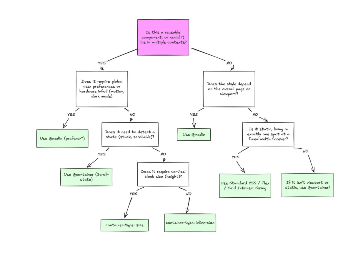
Container queries are not intended to replace media queries entirely; rather, they serve complementary roles within modern CSS architecture. Choosing between them comes down to contextual scope:
- Reach for Media Queries when managing macro design states, including main page grids, top-level application shell navigation, device orientation changes, accessibility features (such as
prefers-reduced-motion), and global display themes. - Reach for Container Queries when constructing reusable, modular components—such as UI cards, data tables, inline forms, or media lists—that must render predictably regardless of whether they are inserted into a main content section, a modal window, or a sidebar layout.
By aligning query choices with layout scope, engineering teams can build resilient design systems that adapt dynamically to available space across all viewing contexts.