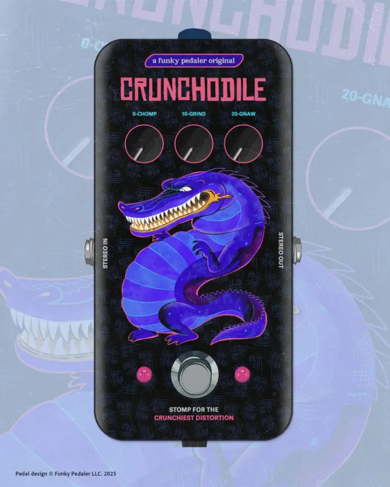
Alphabettes, the globally recognized platform celebrating and championing the work of women in lettering, type design, and typography, has officially debuted a striking new header design created by Samar Zureik. Published on October 1, 2026, the update marks a fresh aesthetic chapter for the organization, reinforcing its ongoing commitment to visual excellence and community representation within the type community.
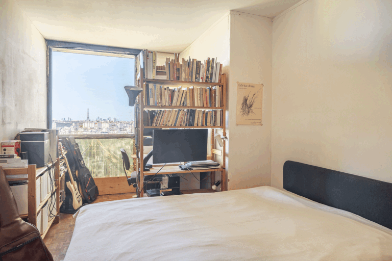
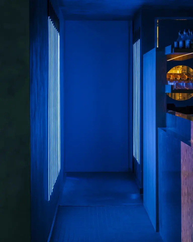
The newly unveiled header artwork, meticulously crafted by Zureik, serves as the visual anchor for the platform, greeting visitors across multiple responsive formats and resolutions. Known for its vibrant community of professionals, hobbyists, and scholars dedicated to type and lettering arts, Alphabettes continues to provide a vital space for professional development, critique, and connection. This latest design refresh highlights the platform’s dynamic nature and its dedication to showcasing contemporary talent from within its own network.
The launch of the header design has immediately drawn attention from the broader typography and design sectors, sparking conversations across the site and its associated tags. Community members and visitors engaging with the October 1 update have pointed to categories such as "Header" as well as core thematic tags including "lettering," "letterlove," "loveletters," "type design," "typeface," and "typography." These tags encapsulate the core passions of the Alphabettes network, where discussions range from historical type preservation to cutting-edge digital typeface creation and bespoke lettering projects.

Samar Zureik’s contribution builds upon a rich tradition of collaborative visual storytelling at Alphabettes. Over the years, the platform has frequently featured artwork, banner designs, and curated headers created by its diverse membership, turning the website itself into an evolving gallery of typographic exploration. The new header seamlessly integrates modern design sensibilities with the playful yet professional reverence for letters that defines the community.
In tandem with the visual update, the platform’s continuous archive highlights the deep interconnectedness of contemporary design discourse. Readers navigating the site’s recent entries can explore related discussions, such as previous technical and artistic explorations like the "Tangent Superfamily," demonstrating the breadth of subjects covered by contributors. From deep dives into type mechanics to creative lettering showcases, the platform remains an essential digital destination for those passionate about the shape of written communication.
As the community responds to the new aesthetic direction, the comments section and interactive spaces of Alphabettes remain active. Visitors and contributors are invited to share their thoughts, engage with the author’s work, and participate in ongoing dialogues regarding the future of type design and the vital visibility of women shaping the industry. With security measures like Akismet ensuring a streamlined and spam-free environment for feedback, the conversation surrounding Zureik’s design and the broader mission of the platform continues to thrive.