Introduction
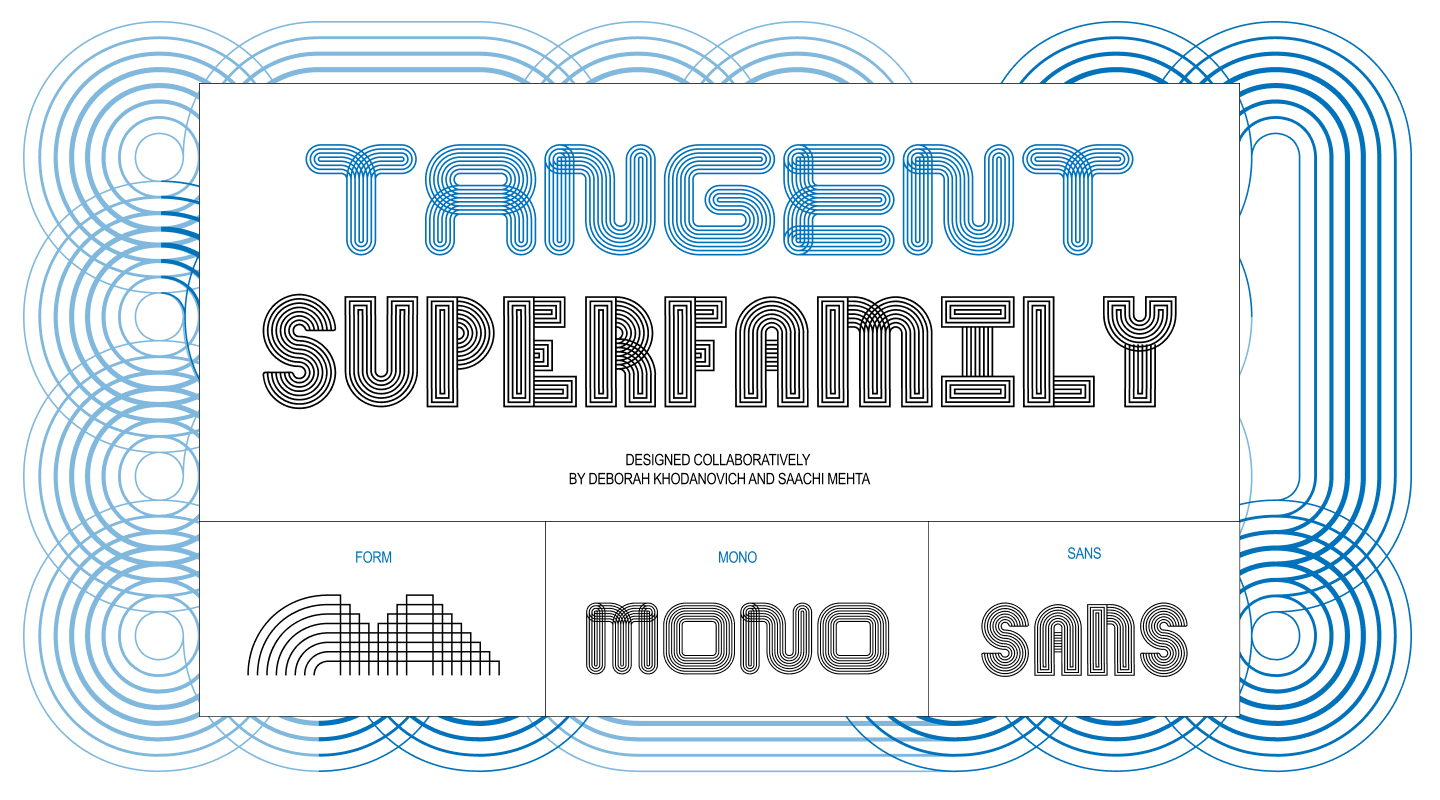
In the rapidly evolving world of digital typography, true innovation often happens at the intersection of unexpected disciplines. For designers Deborah Khodanovich and Saachi Mehta, the creation of their expansive variable superfamily, Tangent, began not with rigid grids or traditional foundry tools, but with an exploration of storytelling, textiles, and the fluid, shifting nature of human dialogue. Developed initially as part of an academic assignment under the guidance of Kelsey Elder at the Rhode Island School of Design (RISD), Tangent has since grown from a modest modular experiment into a sophisticated, multi-axis variable type system spanning both Sans and Mono variants.
Reflecting on their collaborative journey, Khodanovich and Mehta recount how a simple prompt to observe the world one piece at a time blossomed into a complex digital and physical exploration of form, generative scripting, and communal typography.
Pit Stop 1: (Crossed) Pathways
The genesis of Tangent traces back to Kelsey Elder’s Variable class and a specific assignment titled Kit-Car. The brief drew inspiration from the artistic philosophy of Sister Corita Kent, encouraging students to observe the world around them, identify fundamental shapes in everyday objects, toys, or family heirlooms, and build components to construct static glyphs. Corita Kent’s guiding maxim—“learn to see the world by looking at the world one piece at a time”—served as the conceptual compass for the entire undertaking.
From the outset, Khodanovich and Mehta intended to collaborate, which required establishing a modular foundation that could be easily passed back and forth between them. Coincidentally, both designers were already converging on a shared thematic obsession from different angles: stories, dialogue, gossip, and the manner in which ideas converse, connect, and evolve from one person to another.
This conceptual framework immediately raised a compelling design question: what would a typeface look like if every single glyph remained structurally connected to its neighbors? To answer this, the duo began sketching the simplest possible modules. Mehta found herself drawn to the continuous, over-under twisted quality of ribbons, while Khodanovich explored custom path-drawing mechanics within the video game Animal Crossing.
Despite exploring different conceptual rabbit holes, both designers arrived at the same destination, heavily influenced by textiles such as knitting, weaving, and embroidery. They quickly transitioned from solid, connected forms to layered strings of parallel lines capable of weaving in and out of each other like thread. This breakthrough established the foundation of multiple strokes in parallel.
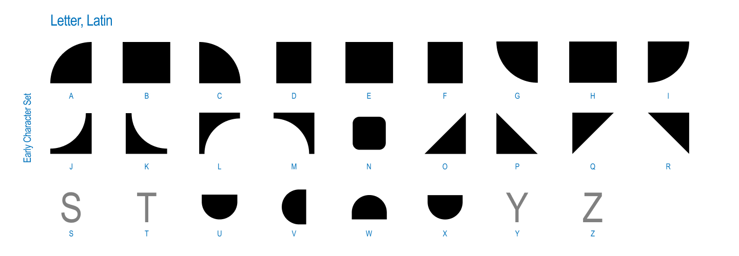
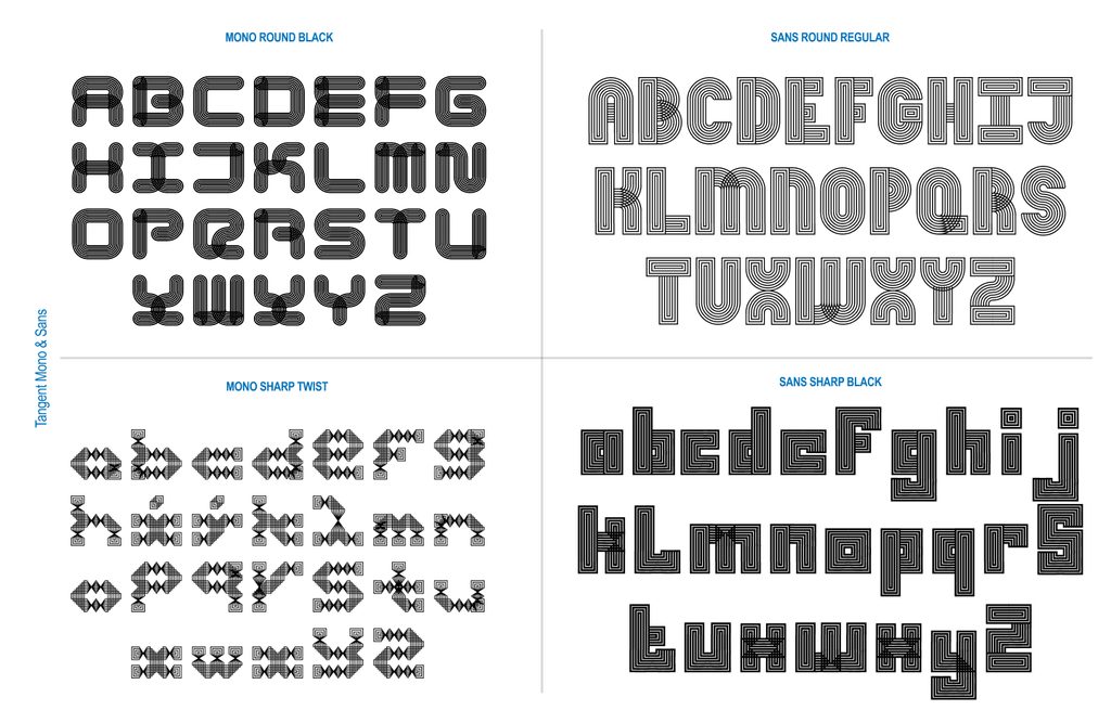
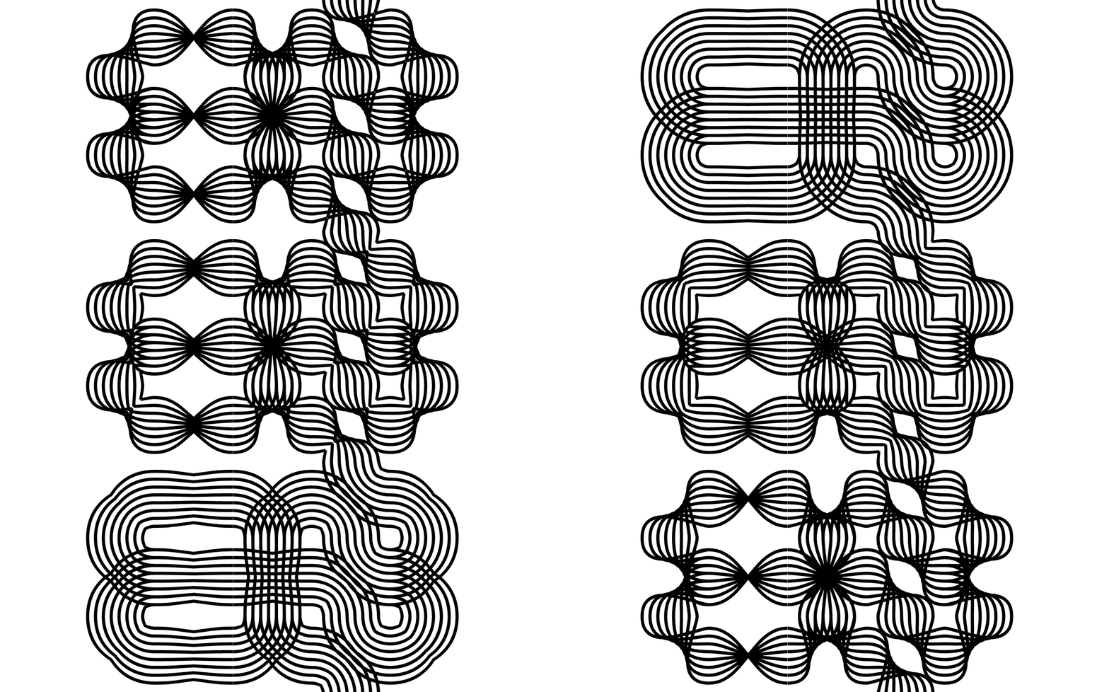
That initial weaving concept solidified into the first functional version of the project: a single weight, single axis, pattern-making font governed by a completely modular system that always connected to itself and featured distinct twists. Whether round or square, twisted or untwisted, this core mechanic dictated everything that followed.
Underpinning the visual mechanics was a deeper conceptual inquiry into oral storytelling: How does gossip transform and shape-shift? How do stories get twisted over time when passed through dialogue from person to person? What paths and lineage do conversations carve out as they evolve? Working side by side on the same screen and sharing physical sketches, the creators refined their initial grid of parts until the interlocking elements finally clicked into place.
Pit Stop 2: (Finding Our) Axes
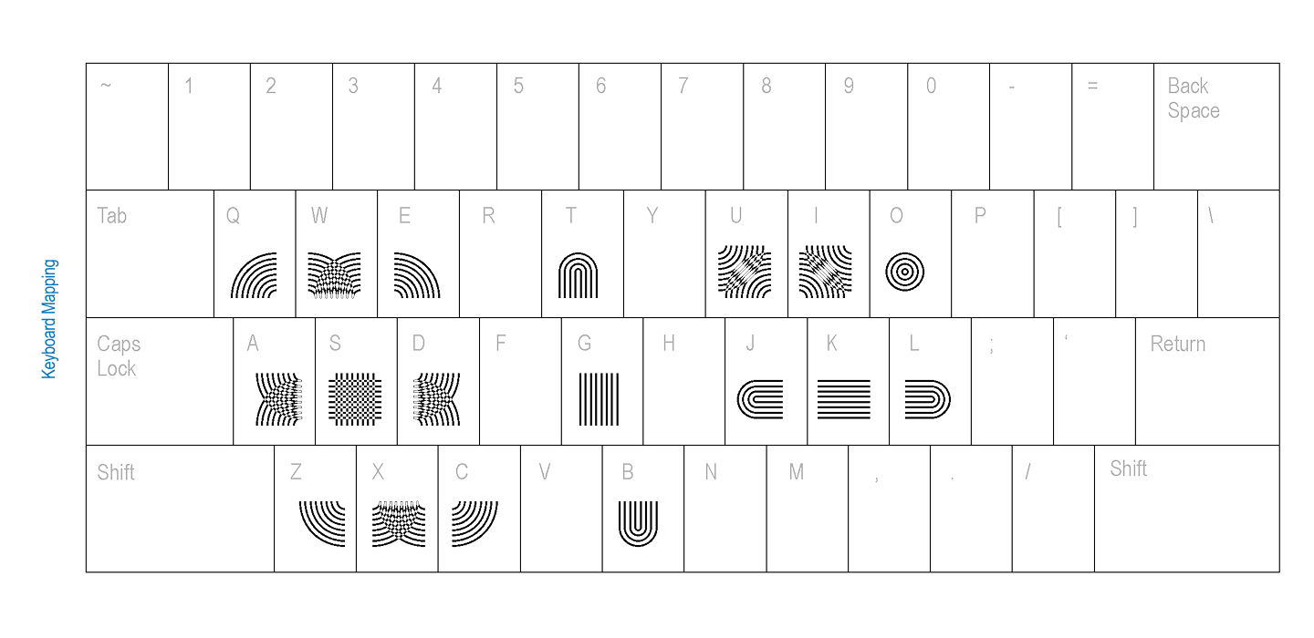
Once the initial system proved viable, instructor Kelsey Elder posed a crucial practical challenge: How does a user actually type with this? While a modular, twisting, connecting system functioned intuitively for its creators, making it accessible to others required rigorous testing. Elder suggested running keyboard mapping tests with peers to determine the most intuitive ways to assign connecting parts to keys, drawing inspiration from digital games and interactive systems.
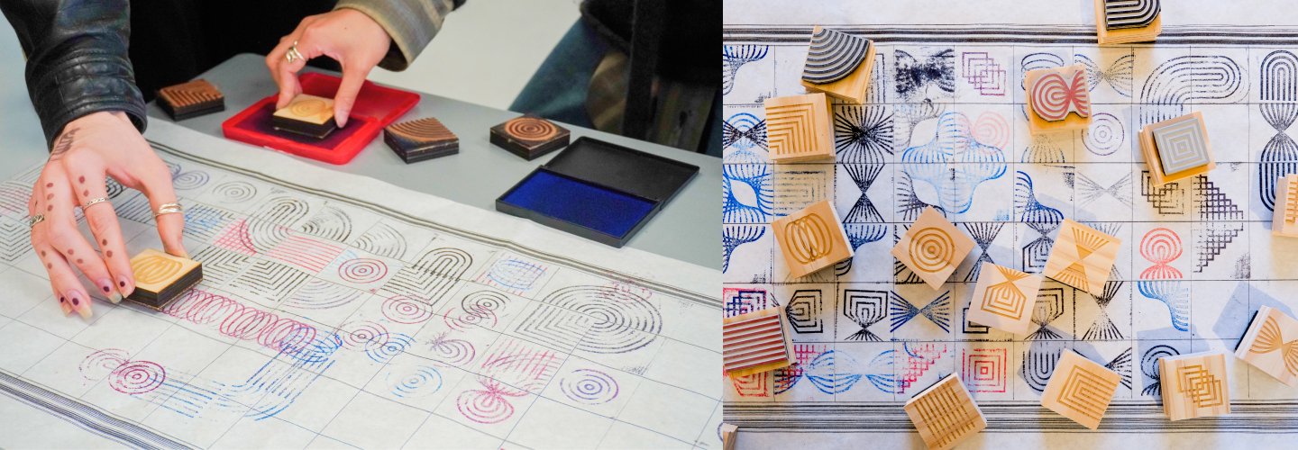
In addition to digital mapping, the designers took a tactile approach. They manufactured physical rubber stamps, inviting people to stamp the glyphs onto an extended grid. This allowed participants to physically experience the modularity of the system rather than interacting with it exclusively on a screen. They also experimented with alternative input methods, developing a Processing sketch that allowed users to draw their way into the system instead of traditional typing.
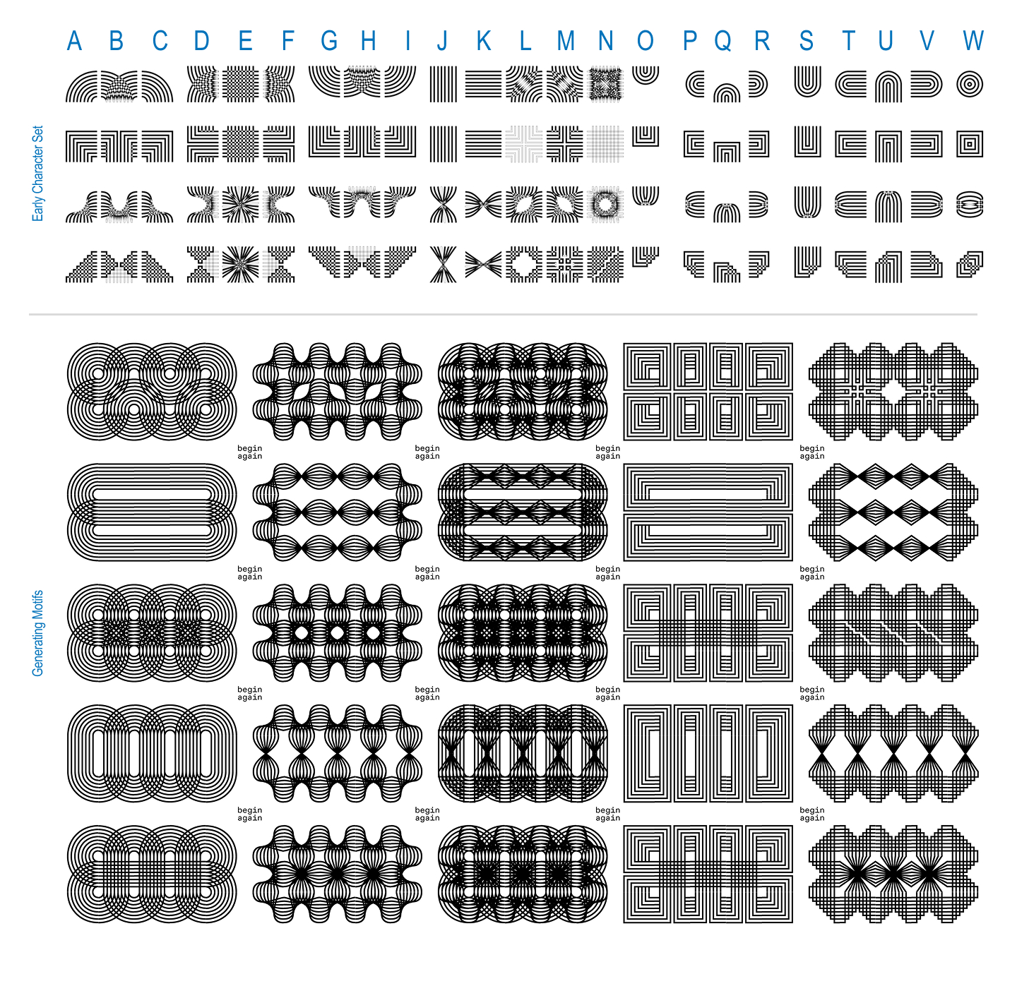
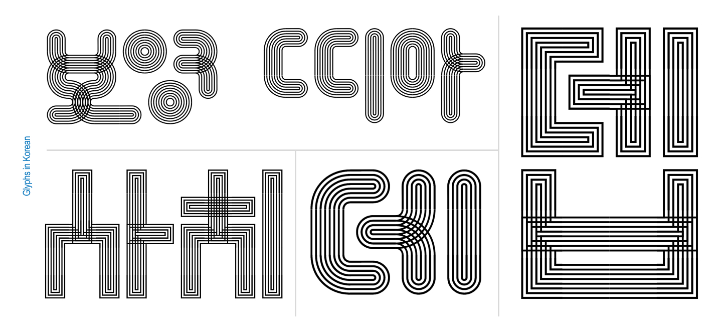
Surrounded by graphic designers, the creators observed an immediate, instinctive behavior: whenever people were handed the modules, they naturally began constructing recognizable letterforms. Without any prompting, participants defaulted to building both English and Korean characters out of the abstract components.
Pit Stop 3: (Going off on a) Tangent
The observation that users naturally gravitated toward letterforms marked a major turning point for the project. Capitalizing on the context of a variable type class, Khodanovich and Mehta expanded the underlying grid and began building out full alphabets complete with contextual alternates. They conducted color experiments and developed a sans-serif iteration, transforming Tangent from a purely modular pattern-making system into an actual typeface.
The evolution took another leap forward when Elder challenged the duo to leverage the generative nature of the system by asking a computer to compute every possible permutation. Establishing strict rules—a three-by-three grid, every spot utilized, mandatory connections, a strict cap on empty slots, and no cheating via piece rotation—Khodanovich collaborated with the AI assistant Claude to write a functional script. The script successfully generated 971 unique glyphs. True to their background as type designers, the pair immediately began discerning letterforms within the generated noise, an exploration that ultimately led to the creation of the Mono variant.
Pit Stop 4: (It takes a) Superfamily!
With the sans-serif and monospace variants established, Elder introduced yet another challenge: introducing motion. This prompt returned the designers directly to the realm of variable typography. Together, they engineered a comprehensive five-axis system encompassing twist, weight, amplitude, stretch, and radius, implemented across both the Sans and Mono versions of the typeface.
Building a five-axis variable superfamily was no small feat. The designers frequently encountered technical frustrations when the font-development software, Glyphs, rebelled against their complex workflows or refused to export the files. Having a collaborator proved invaluable during these moments of technical impasse. When one designer hit a wall with the software, they simply passed the file to the other. Operating with a fresh pair of eyes, the incoming collaborator invariably found a solution to the technical hurdle.
The project has proven so inherently generative that the creators maintain a running log of potential new axes and spinoff versions for future expansion. Convinced that the system still holds untapped potential, Khodanovich and Mehta continue to brainstorm additions to the superfamily.
Looking ahead, the designers have issued an open invitation to the design community. They encourage anyone interested in experimenting with Tangent—whether for posters, personal projects, or creative explorations—to reach out to receive the font files. Furthermore, they are actively seeking commercial opportunities for brands and identities seeking a distinct, story-driven typographic voice.
About the Creators
Deborah Khodanovich
Deborah Khodanovich (she/her) is a Toronto-born designer and educator based in Providence, Rhode Island, having recently completed her Master of Fine Arts in Graphic Design at the Rhode Island School of Design (RISD). Her academic and creative practice explores gossip as a method for producing and sharing knowledge, closely examining information networks and intimacy as design methodologies. Working fluidly across typography, textiles, and books, her work interrogates systemic questions regarding who is permitted to create knowledge, how information circulates, what gets valued or dismissed, and how intellectual attribution is maintained.
Saachi Mehta
Saachi Mehta (she/her) operates at the intersection of visual design, motion graphics, and complex systems, translating conceptual ideas into immersive visual experiences across brand identity, environmental graphics, and editorial contexts. Drawn to building resilient design systems that function harmoniously at any scale, she has also spent time teaching Motion Design at the Rhode Island School of Design, where she earned her MFA in Graphic Design. Her professional background includes graphic and motion design work for organizations such as the RISD Museum, Netflix, and HP.