Type designer Sabrina Lopez has always wanted to create a font rooted in a rich graphic universe and a deeply compelling subject: handwriting. The result of this ambition is Didactica, a comprehensive superfamily designed specifically for children, aimed at playful, didactic, and educational materials.
In conceptualizing the project, Lopez began by examining how letters look and function across the various stages of literacy learning, from kindergarten through the third year of elementary school. She considered what these letterforms needed to be: effortless to recognize, read, and write.
Research as a Point of Departure
To answer her foundational questions and establish the parameters of her design, Lopez dedicated several weeks to research. She immersed herself in historical and contemporary documents on handwriting and its pedagogy. Key resources included the Typotheque research project Modern Handwriting: A Historical Survey and Primarium, a contemporary study mapping the handwriting models taught in primary schools across more than 40 countries.

Utilizing Primarium, Lopez mapped out geographic variations in active writing models, gaining a global perspective on diverse educational approaches. This research helped resolve questions surrounding the mechanics of learning to write. She isolated representative examples from various regions, noting the highly developed educational system in Australia, which utilizes specific digital typefaces for different regions of the country. Beyond regional fonts, Lopez found significant value in the pedagogical support offered to Australian educators, which includes practical guides, troubleshooting tips for common mistakes, articles on the cognitive benefits of handwriting, and insights into how writing impacts student self-esteem.
A central concept in this educational material is viewing writing as a system of movements. Consequently, these programs emphasize live demonstrations of letter construction, incorporating "verbalization"—the practice of speaking aloud the physical movements required to execute each stroke.
Tom Gourdie’s book The Ladybird Book of Handwriting serves as a key reference for Australian educators, with his Simple Modern Hand method forming the basis of official literature. During the 1960s in England, Gourdie promoted the use of italic scripts through a progressive, staged teaching method starting with disconnected letters and culminating in a partially connected cursive. Throughout the stages, the letters retain their core structural and formal qualities, with connections forming the primary distinction. Lopez drew upon Gourdie’s concepts, looking to England to study the broader Italic Revival.

In his essay A History of Learning to Write, typographer and educator Ewan Clayton explains that around the mid-20th century, several educators developed programs based on italic scripts. Clayton categorizes these programs based on their historical starting points. Some draw from early 16th-century models, resulting in angular and compact letterforms such as those by Arrighi in his 1522 work La Operina. Others look to more expanded and cursive forms inspired by Giovanni Francesco Cresci in 1579, characterized by rounded, slanted, and easily connected shapes—a category that includes the work of Tom Gourdie.
Italy holds a foundational place in this history, as cursive script traces its roots to Renaissance-era models. The Italian chancery hand evolved through successive transformations to form the basis of the English script, which remained the predominant writing style until the mid-20th century. Tracing this 500-year evolution demonstrates how tools, writing surfaces, pedagogical methods, instructors, and societal contexts continually shift, altering letterforms over time.
Taking Shape
Drawing from her historical research, Lopez established the design space and rulebook for the Didactica family. She set out to design both a disconnected alphabet and a partially connected cursive alphabet, ensuring they shared similar forms, structures, and proportions. Both styles are paired with simple capitals based on Roman uppercase letters, featuring reduced dynamism in their horizontal proportions.

The complete typeface family operates across two primary axes: a weight axis ranging from Light to Black, and a slope axis offering vertical and italic options, with intermediate slants accessible via variable font technology.
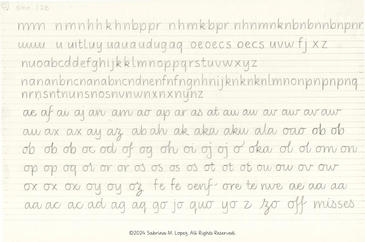
Initial sketching relied on a pencil-and-paper methodology inspired by Gourdie’s pedagogical approach, though Lopez applied her own distinct letterforms. She drew lowercase characters with wide counterforms, generous spacing, and a monolinear structure. Her goal was to find a balance between triangular and oval eyes while maintaining deep bifurcations, a hallmark gesture of italic scripts.
After testing various guide heights and pencil hardness grades, Lopez experimented with vertical and slanted letters—forms that require distinct physical movements and writing speeds—as well as both isolated and connected strokes. She ultimately selected the most successful shapes for vectorization and refinement. During this digital phase, she fine-tuned vertical proportions, ensuring the x-height was generous enough for clarity without compromising the legibility of ascenders and descenders.

After months of development, the non-connected version of Didactica was published. A year later, the cursive counterpart was added, completing the digital superfamily online.
Both Didactica and Didactica Cursive include color fonts featuring directional arrows that indicate suggested stroke movements for letter construction, alongside guide lines aligning with the baseline, x-height, ascenders, and descenders. An alternative directional set tailored for left-handed writers can be accessed by activating stylistic set 4 in supporting applications. The Didactica superfamily is available commercially through Type Senses and Typographer, part of The Type Founders.
Although conceived primarily for children’s educational materials, Didactica’s design parameters do not restrict it to a single genre. Its clean, fluid, and highly legible forms—honed through rigorous pedagogical research—lend the typeface versatility across a wide range of visual communication contexts. For Lopez, the project has provided a rewarding entry point into the world of education, reinforcing her belief that handwriting remains a fundamental and vital human gesture worth preserving alongside modern technological advancements.