Paint trends are traditionally declared long before the average homeowner ever picks up a brush or steps foot into a hardware store. Year after year, major paint manufacturers and color forecasters announce their anticipated "Colors of the Year," while interior designers make their own bold predictions about what aesthetic shifts are coming next down the pipeline. These announcements generate massive amounts of media attention, setting the tone for commercial design, retail displays, and home renovation media.
Yet, these declarations usually focus on the end of the journey—the final cans of paint purchased or the triumphant reveals featured in glossy shelter magazines. But what happens when you look not at what people ultimately say they like or eventually buy, but at the tentative colors they consider, compare, and test along the way?
That exact question forms the premise behind the inaugural Samplize American Paint Color Report, a comprehensive data-driven analysis that examines millions of paint samples ordered across the United States during the first six months of 2024, 2025, and 2026. Rather than relying on speculative surveys or retail checkout tallies, the dataset spans orders across major industry heavyweights including Benjamin Moore, Farrow & Ball, and Sherwin-Williams. By tracking these orders, Samplize gained a unique window into which specific hues homeowners evaluate side by side on their walls before making a final financial and aesthetic commitment.
Makenna Lutz, partnerships lead at Samplize, explains that analyzing this crucial sampling stage reveals three vital insights into consumer behavior: the full shortlist of colors a person actually weighed, which specific shades get tested directly against each other, and how those curated shortlists manage to span across different competing paint brands rather than staying loyal to just one manufacturer.
Across millions of analyzed samples, one overarching shift immediately stands out from the data. Warm colors have grown nearly three times faster than cool colors over the observed three-year period. Today, warm tones account for a commanding 69.4% of everything tested on the platform, climbing steadily up from 64.3% just two years earlier. To put this consumer preference into further perspective, half of all American paint shortlists now contain no cool colors at all, compared with 43% at the very beginning of the study’s timeframe.
While it would be easy for casual observers to interpret this massive movement as simply another predictable swing back toward pale beige and creamy off-whites, the underlying data actually suggests something far more nuanced and complex.
The genuine surprise was in the split by depth, notes Lutz, highlighting that industry analysts initially expected the warming trend to manifest primarily as a lightening of interior spaces. However, the data proved otherwise. Warm hues outgrew cool hues at every single depth level, and the deepest warm tones actually grew the fastest of all, expanding roughly six times faster than deep cool tones.
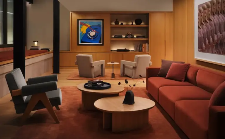
This means that while homeowners are undeniably abandoning sterile grays and icy blues, they are not universally retreating into timid, washed-out neutrals. Instead, a fascinating dichotomy is taking shape across American households. At one end of the design spectrum are delicate blush-toned plasters and warm creams, exemplified by popular selections like Farrow & Ball’s Setting Plaster, Benjamin Moore’s Proposal, and Sherwin-Williams’ Malted Milk. At the complete opposite end of the spectrum is Benjamin Moore’s Classic Burgundy, which ranks as one of the absolute darkest colors included in the entire study and yet grew at a remarkably comparable pace.
This data indicates that homeowners have not necessarily lost their appetite for dark, dramatic interiors; rather, the underlying temperature of that drama is fundamentally changing. The moody, dramatic charcoal grays and midnight blues that dominated the previous decade are steadily giving way to rich, warm, and enveloping darks.
Brown shades reinforce this broader shift, growing faster than any other single color family tracked in the report. Brown tones now appear in 13.4% of all shortlists, up significantly from 9.2%. Interestingly, the specific colors driving this notable growth are not hyper-saturated chocolate browns or rustic terracotta tones. Instead, the heavy lifters are muted greiges, warm grays, and stone-like shades, such as Sherwin-Williams’ Warm Stone and Urbane Bronze, Farrow & Ball’s London Clay, and Benjamin Moore’s Smokey Taupe. These choices reflect a desire for grounded, earthy sophistication without the starkness of traditional cool neutrals.
Meanwhile, green appears to have firmly and permanently settled into the mainstream American palette. After rising sharply in popularity over recent years and subsequently holding steady at that higher baseline, green now appears in a robust 34.6% of shortlists. The greens being tested cover a wide yet cohesive range, spanning from delicate sages and mossy undertones to much deeper botanical and forest greens.
The underlying behavioral patterns observed in the report also suggest that color temperature may ultimately matter much more to consumers than individual color families alone. Two-thirds of all analyzed shortlists contain colors drawn from only one temperature group. Specifically, half of all shortlists are entirely warm, while only about a third of consumers bother to mix warm and cool shades together during the evaluation phase.
Furthermore, there are clear signs that the warming palette is becoming progressively more colorful as time goes on. Pink and red are currently emerging as the fastest-growing color families, albeit from smaller initial starting points. Concurrently, the warm-and-deep combination has established itself as the single fastest-growing pairing of temperature and depth in the dataset.
None of this implies that burgundy is destined to become the next ubiquitous beige, nor does three years of sampling data guarantee what American walls will look like several years from now. Interior design is famously cyclical and responsive to cultural shifts. However, the data proves that the ongoing design shift is not simply a lazy retreat toward lighter, quieter neutrals. From soft plaster pinks and weathered stone browns to deep, brooding reds, Americans are actively exploring warmth across every corner of the color spectrum.