The genesis of a typeface is rarely a straight line, but for designers Deborah Khodanovich and Saachi Mehta, it began as an intricate exercise in modularity, textile-inspired geometry, and the unpredictable evolution of human communication. What started as a modest student assignment in Kelsey Elder’s Variable class at the Rhode Island School of Design (RISD) quickly snowballed into an ambitious, multi-axis generative superfamily known as Tangent.
The project reflects a rare synergy between two distinct creative minds who arrived at the same conceptual destination from entirely different paths. As Khodanovich and Mehta recount the development of their collaborative work, the narrative of Tangent unfolds not merely as a technical feat in font engineering, but as a deep exploration into how ideas—much like gossip and oral storytelling—twist, morph, and connect as they pass from person to person.
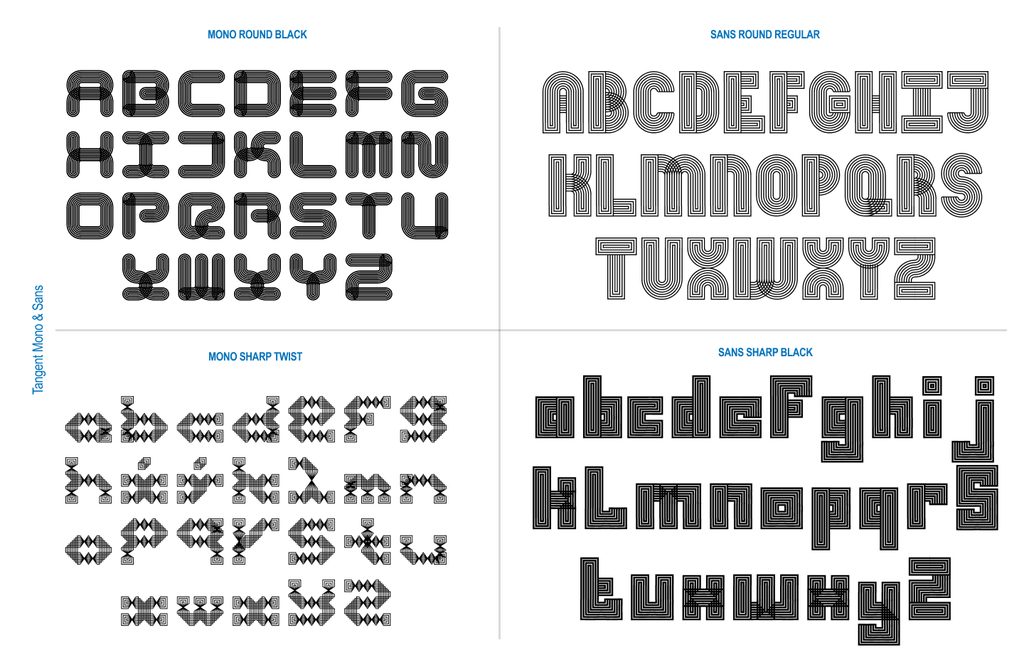
Pit Stop 1: Crossed Pathways and Modular Foundations
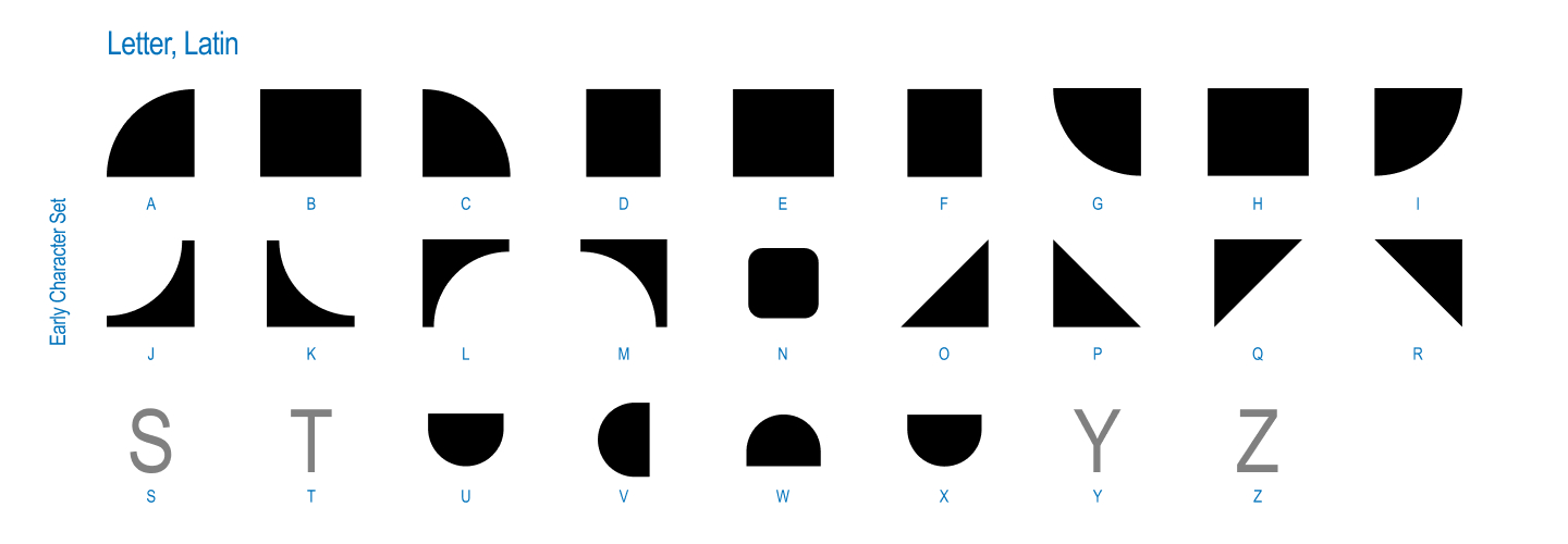
The project originated from a specific class prompt titled Kit-Car, heavily inspired by the philosophy of Sister Corita Kent. The brief encouraged students to observe the world one piece at a time, finding forms in everyday objects, toys, optical illusions, and domestic patterns. Kent’s guiding maxim—“learn to see the world by looking at the world one piece at a time”—served as the conceptual anchor for the entire undertaking.
Both designers knew early on that they wanted to collaborate, a decision that necessitated a modular starting point. They needed a system that could be physically or digitally passed back and forth between their workstations. At the time, Khodanovich and Mehta were individually circling parallel obsessions for their thesis research: the mechanics of dialogue, gossip, and how narratives converse and evolve.
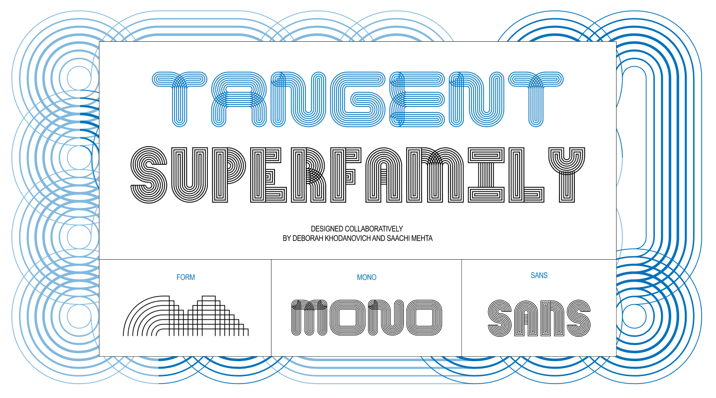
This conceptual inquiry yielded a fundamental design question: what would a typeface look like if every single glyph remained perpetually connected to its neighbors?
To answer this, they began drawing the simplest possible modules. Mehta found herself drawn to the continuous, over-under twisted quality of ribbons, while Khodanovich was deep into custom path-drawing within the video game Animal Crossing. Despite exploring different aesthetic rabbit holes, they landed on the same rich source of inspiration: textiles, including knitting, weaving, and embroidery.
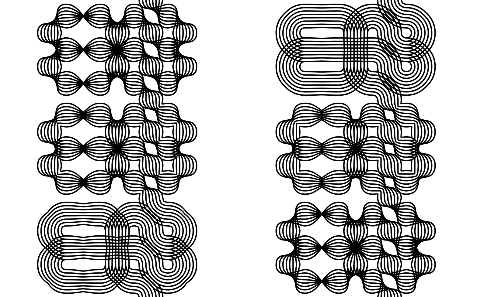
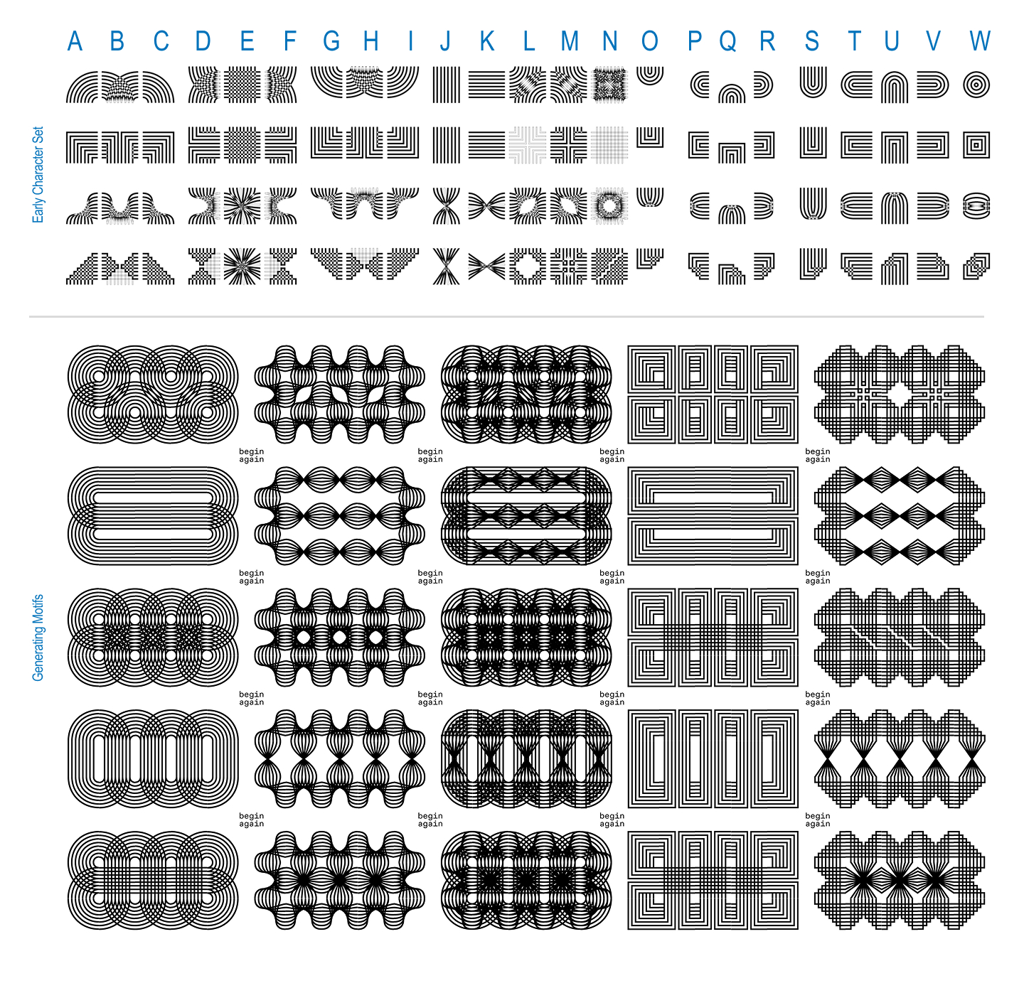
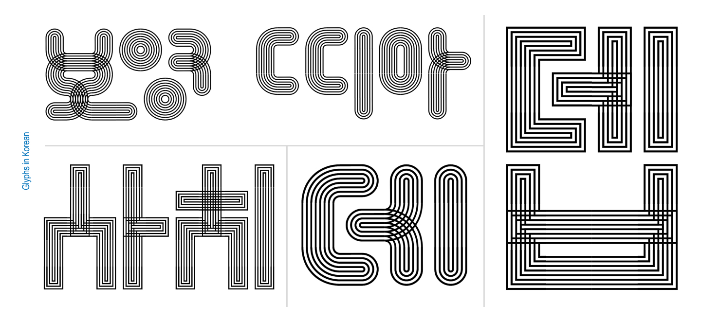
Moving away from solid, connected shapes, they began experimenting with layered strings of parallel lines that could weave in and out of one another like thread. This breakthrough birthed the first true version of Tangent: a single-weight, single-axis modular system that always connected to itself and featured signature twists. It operated fundamentally as a pattern-making font governed by a straightforward mechanic—round or square, twisted or untwisted.
Working simultaneously on the same screen and sketching side by side, the duo established an initial grid of parts. Once those components locked into place, the collaboration accelerated, with both designers pushing to make the fluid twist mechanism function seamlessly.
Pit Stop 2: Finding Axes and Testing Human Intuition
Once the foundational system was operational, instructor Kelsey Elder posed a crucial design challenge: how does a human actually type with a modular, twisting, and connecting system? While Khodanovich and Mehta understood the internal logic intuitively, translating that complexity into a usable format for outsiders required rigorous user testing.
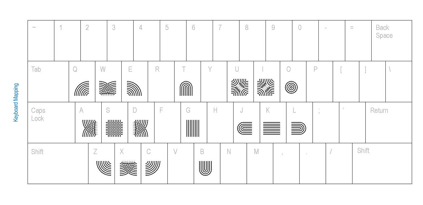
Elder suggested conducting keyboard mapping tests with their peers. By looking at digital gaming interfaces and other interactive systems, the designers sought the most intuitive ways to assign connecting parts to standard keys.
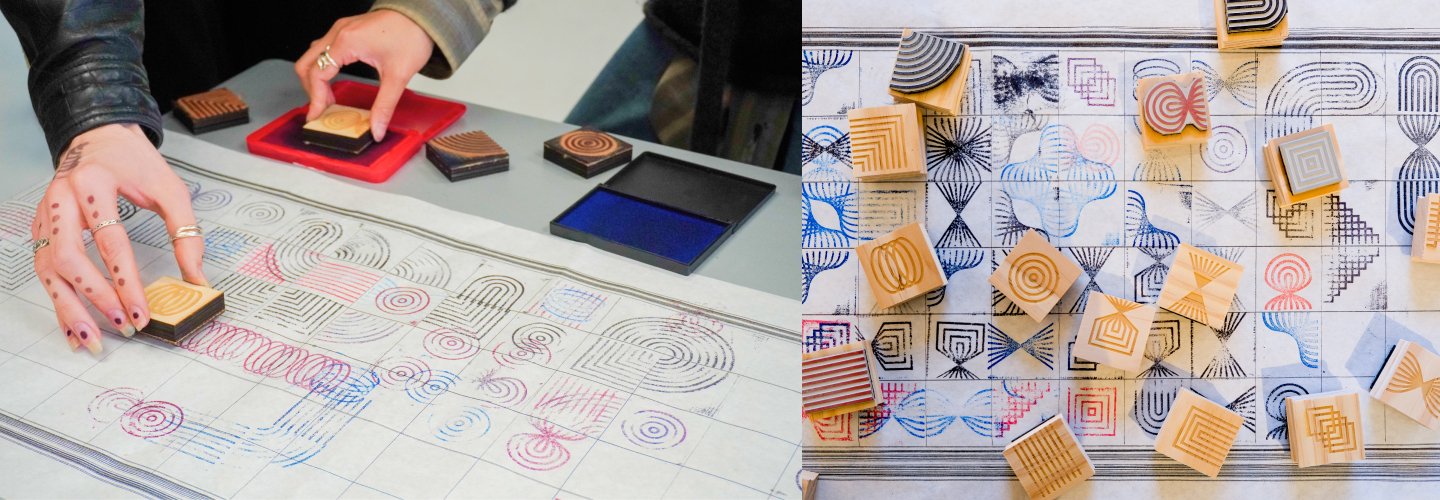
Parallel to digital testing, the duo embraced physical exploration. They manufactured custom rubber stamps, inviting people to stamp glyphs onto an extended grid. This tactile exercise allowed participants to feel the modularity in their hands rather than viewing it purely through a screen interface.
They also experimented with alternative input methods, developing a Processing sketch that allowed users to draw their way into the system rather than relying on traditional typing mechanics. Surrounded by fellow graphic designers, an organic pattern quickly emerged: without any explicit instructions, people naturally began forming English and Korean letterforms the moment they interacted with the modules.
Pit Stop 3: Going Off on a Tangent Into Full Typography
Observing their peers naturally gravitate toward legible characters marked a major turning point for the project. Encouraged by the context of a variable typography class, Khodanovich and Mehta expanded their grid dimensions and began constructing full alphabets equipped with contextual alternates. They tested vibrant color schemes and even developed a sans-serif variant. At this juncture, Tangent ceased to be merely a modular experiment and officially transformed into a fully realized typeface.
True to its generative nature, the project soon expanded into computational territory. Prompted by Elder to explore the boundaries of generative systems, the designers asked a computer to generate every possible permutation under a strict set of rules: a three-by-three grid where every spot had to be utilized, all parts had to connect, empty slots were strictly capped, and rotating pieces to bypass rules was forbidden.
Khodanovich collaborated extensively with the AI tool Claude to refine the scripting process, ultimately producing 971 unique glyphs. True to their instincts as trained type designers, they immediately began discerning letterforms within the computational noise, a process that ultimately led to the development of Tangent Mono.
Pit Stop 4: Building a Superfamily
The evolution of Tangent reached a new plateau when Elder introduced movement into the equation. Propelled back into the realm of variable typography, the designers engineered a comprehensive five-axis system incorporating twist, weight, amplitude, stretch, and radius, implemented across both the Sans and Mono iterations.
Managing the technical workflow in Glyphs proved to be an exercise in patience. The complex architecture frequently resisted export, leading to moments of intense frustration. However, the collaborative nature of the project provided a built-in safety net. When one designer hit a technical wall, they simply transferred the file to the other. Operating with a fresh pair of eyes, the second designer could invariably diagnose and resolve the issue.
The inherently generative trajectory of the project means that Tangent continues to expand. The creators maintain an active running list of potential new axes and spinoff variations, proving that the superfamily is capable of growing far beyond its original academic parameters.
Reflecting on the completion of their MFA programs in Graphic Design at RISD, Deborah Khodanovich, a Toronto-born designer and educator based in Providence whose practice examines gossip and knowledge structures through typography and textiles, and Saachi Mehta, a visual, motion, and systems designer with professional experience spanning the RISD Museum, Netflix, and HP, leave Tangent open to the broader design community.
Inviting fellow creatives to experiment with posters and typographic tests, the duo encourages anyone interested in utilizing the font files—or seeking out brand identities rooted in connective, story-driven design—to reach out directly via their respective professional platforms at dvorit.ca and saachimehta.work.