The intersection of graphic design, education, and the fundamental human act of handwriting has yielded a rich new chapter in typography. Type designer Sabrina Lopez has detailed the extensive research, historical investigation, and meticulous design process behind Didactica, a versatile super-family specifically engineered for children’s literature, ludic materials, and educational environments.
Conceived as a comprehensive solution for literacy learning, the project bridges centuries of handwriting evolution with modern digital typography, offering educators and students a robust tool designed to support the mechanics of reading and writing from kindergarten through the early years of primary school.
And Now, What Shall I Design?
The genesis of Didactica lay in a long-held ambition: to create a graphic universe centered around handwriting and designed specifically for children. Lopez set out to explore how letterforms appear during the various stages of literacy acquisition, questioning what makes characters truly effective for young learners. The primary criteria were clear—the letters needed to be easily recognizable, legible, and simple to write by hand.

Rather than relying purely on intuition, Lopez turned to intensive research, spending weeks examining historical documents, current teaching methods, and global handwriting models. Key resources included Typotheque’s research study Modern Handwriting: A Historical Survey and Primarium, a contemporary study documenting handwriting models taught in primary schools across more than 40 countries.
By mapping the geographical distribution of writing models through Primarium, Lopez gained a global perspective on educational approaches. Her journey through the historical landscape of writing led her to appreciate the highly developed educational infrastructure in countries like Australia, which provides region-specific digital fonts alongside extensive support materials for educators. These resources emphasize writing as a system of physical movements, highlighting the importance of live demonstrations and "verbalization"—the practice of speaking aloud the description of the movements required to construct a character.
The Australian system draws heavily on Tom Gourdie’s The Ladybird Book of Handwriting and his Simple Modern Hand method. Developed in England during the 1960s, Gourdie’s progressive teaching method begins with disconnected letterforms and culminates in a partially connected cursive. Throughout the process, the structural integrity of the letters remains consistent, with changes occurring only in how they connect. This approach prompted Lopez to delve deeper into England’s Italic Revival and consult the writings of professor Ewan Clayton.

In his essay A History of Learning to Write, Clayton categorizes mid-20th-century italic educational programs by their historical starting points. Some models look back to the early 16th century for an angular, compact letterform, such as the work of Ludovico degli Arrighi in his 1522 treatise La Operina. Others favor expanded, cursive forms inspired by Giovanni Francesco Cresci in 1579, characterized by rounded, inclined, and easily connectable shapes—the tradition embraced by Tom Gourdie.
This historical tracing highlights a fascinating constant in the history of writing: styles are continually revived, adapted, and recontextualized. As tools, surfaces, pedagogies, and educational goals shift over centuries, letterforms evolve in tandem, connecting modern digital design directly to Renaissance roots.
Taking Shape: From Pencil Sketches to Variable Fonts
Armed with insights from her historical and contemporary research, Lopez established the design space and formal rules for the Didactica family. The vision called for a non-connected alphabet alongside a partially connected cursive version, sharing matching form, structure, and proportion. Both variants were paired with simple capital letters derived from Roman capitals but adjusted for a more balanced horizontal rhythm.

The resulting super-family encompasses multiple dimensions, featuring a weight axis ranging from Light to Black, and an inclination axis offering vertical and italic options, with intermediate slants accessible via variable font technology.
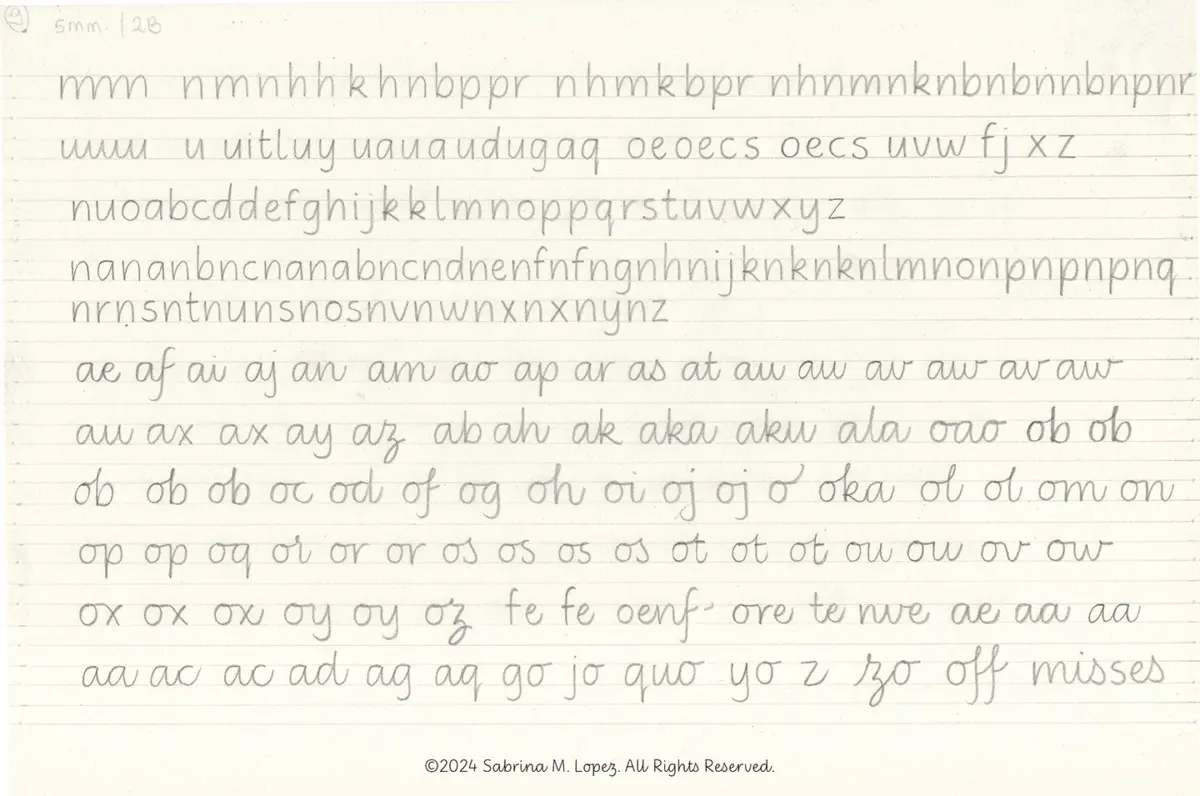
Initial sketching began on paper using pencils, following Gourdie’s methodological approach rather than his exact shapes. Lopez drew monolinear lowercase letters with generous counterforms and wide spacing, seeking a careful balance between triangular and oval eyes while retaining the deep bifurcations characteristic of italic hands. After experimenting with various lead hardnesses, guide heights, and connection strategies, she selected the most successful forms for vectorization.
During the digital refinement phase, vertical proportions were carefully established. The x-height was made generous enough to maximize legibility for young readers without compromising the clarity of ascenders and descenders.

The non-connected version of Didactica was published first, followed a year later by the release of Didactica Cursive. Both versions incorporate color fonts featuring directional arrows to indicate proper stroke construction, alongside baseline, x-height, ascender, and descender guide lines. For left-handed students, alternative stroke directions can be easily accessed by activating stylistic set 4.
Beyond the Classroom
While Didactica was conceived with educational materials in mind, its design parameters—rooted in rigorous legibility and fluid, clean lines—extend its utility far beyond children’s publishing. The super-family is commercially available through Typesenses and Typographer, both part of The Type Founders ecosystem.
Lopez notes that the simplicity and versatility of Didactica make it an effective tool for a wide range of visual communication contexts. Ultimately, the project reflects a deep appreciation for the physical act of writing as a fundamental human expression—one worth preserving and celebrating amidst an ever-changing technological landscape.