Once upon a time, YouTube was simply a quirky corner of the internet where people went to watch a cat play the keyboard, or to upload a home video of a child, still dazed and groggy from dental anesthesia, having a sudden and hilarious existential crisis in the backseat of a family car. In the twelve eventful years since the platform was first created, it has transformed far beyond its humble origins into an all-encompassing digital universe. Today, YouTube serves as a massive cultural hub for gamers, livestreamers, independent music videos, high-profile vloggers, Hollywood stars like Dwayne "The Rock" Johnson, global breaking news broadcasts, record-shattering viral sensations like "Despacito," feature-length films, and the unpredictable, boundary-pushing content creators who continually redefine digital media.
Yet, even as the service grew up, matured, and expanded to dominate the digital video landscape, the actual user interface of the app and the website remained largely stagnant. Both platforms could frequently feel cluttered, heavy, and unhelpful, presenting users with an overwhelming amount of navigation menus and cluttered design elements while failing to adequately highlight the actual content to watch. Recognizing these long-standing usability hurdles, YouTube rolled out a comprehensive, totally redesigned platform across its website and mobile applications. Whether users choose to watch videos on the desktop website or through the mobile app on their smartphones, they are now greeted by a YouTube experience that looks remarkably cleaner, substantially simpler, and far more focused on the core viewing experience. In both cases, the company has taken a long, hard look at how modern audiences actually consume video today and rebuilt its entire service from the ground up to match those shifting habits.
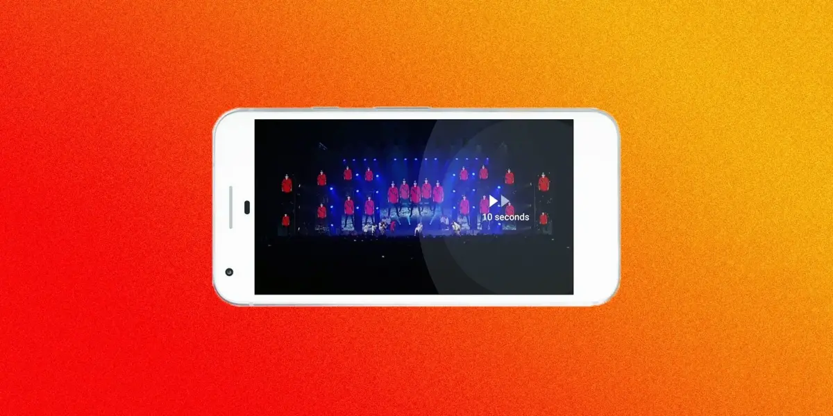
Consider the evolution of the mobile application, which has undergone a dramatic visual and functional overhaul. The new version of the app wisely trades away the traditional, heavy red header borders in favor of clean, minimalist white lines. This shift ensures that video thumbnails and the content itself remain the absolute focal point of the mobile experience, eliminating visual noise and allowing users to immerse themselves immediately in what they came to see. Furthermore, the mobile update introduces long-awaited playback controls that were previously restricted exclusively to desktop users. Viewers can now easily speed up or slow down a video directly from their mobile devices, and a simple double-tap on the left or right side of the screen allows them to seamlessly rewind or fast-forward through content in ten-second increments.
The mobile redesign also brings a much-needed modernization to how vertical video is handled on the platform. Acknowledging that users frequently record and watch vertical video naturally on their phones, YouTube has finally updated its player to display vertical videos properly. Gone are the frustrating black letterboxes and empty side bars; instead, the player now expands to fill the phone screen dynamically with a clean, immersive vertical video. Even when watching standard horizontal videos outside of full-screen mode, the player intelligently shifts and adapts to fit whatever size video is currently playing, breaking away from the rigid constraints of the traditional 16-to-9 aspect ratio. This new design philosophy explicitly recognizes that contemporary creators make, and modern audiences watch, countless types of videos in a multitude of different ways, empowering users with as much control and flexibility as possible.

Accompanying this massive mobile app overhaul is an updated corporate icon and brand identity. Since the earliest days of the platform, the official YouTube logo featured the black text "You" followed by the white word "Tube" encased inside a rounded red rectangular box. The newly updated logo modernizes this classic look by separating the company’s most iconic signifier—a bright red play button—and placing it neatly alongside the clean typography of the word YouTube. This refined branding establishes a bold, recognizable identity that scales effortlessly across different digital mediums, mobile app icons, and promotional materials.
On the desktop side of the platform, the redesign places a stronger emphasis on updating the visual aesthetic rather than fundamentally altering the core user experience. Moving away from the older design language of white content boxes layered against stark gray backgrounds, desktop users are now given the choice between a clean, bright white display mode and an entirely new dark, cinematic theme. Both display options feature fresh, simplified typography that gives the entire page room to breathe. The layout is noticeably more open and uncluttered than before, aligning its visual grammar closely with Google’s established Material Design guidelines for interactive software.
The underlying philosophy guiding this entire redesign is an ambitious attempt to take YouTube out of your experience on YouTube. When a user visits the platform, the interface is intentionally engineered to keep the focus entirely on the video being watched, rather than drawing attention to the surrounding user interface or the complex recommendation engine working quietly behind the scenes. Whether a user is casually browsing or driving up server loads by watching Taylor Swift’s "Look What You Made Me Do" for the fortieth time, these thoughtful interface changes feel like a major step in the right direction. By stripping away unnecessary design cruft, making diverse video formats feel completely native, and streamlining the discovery of new content, the platform offers a smoother, more engaging environment. For instance, turning on the newly introduced Dark Theme makes viewing high-production music videos feel even more dramatic and cinematic.
Behind these visible aesthetic and functional updates lies a fundamental shift in the platform’s engineering. YouTube notes that these new products are constructed upon a newly engineered technical framework, one that equips the development and engineering teams to build and deploy new features and updates significantly faster than before. Given that the broader digital video landscape changes constantly, with user behaviors, technologies, and formats evolving at a relentless pace, this agility is essential. Today, people are recording, streaming, watching, commenting on, and searching for content in entirely new ways every single day. In order for YouTube to maintain its position as the undisputed heavyweight champion of online video, its underlying architecture and user experience must be able to keep pace with the dynamic demands of its global community.