Despite achieving near-universal support across modern web browsers, CSS Container Queries remain surprisingly underutilized and widely misunderstood across the web development industry. While component-driven layout adaptability has consistently topped developer feature wishlists for years, recent industry survey data and speaker insights reveal a stark divergence between developer awareness and actual production usage.
According to data from the State of CSS survey, while 86 percent of responding web developers report being aware of container queries, only 41.4 percent actively implement them in their projects. This low adoption rate comes despite browser support reaching approximately 94 percent globally.
The adoption deficit was highlighted by prominent CSS educator Kevin Powell during his presentation at SmashingConf Amsterdam 2026, where he characterized the real-world uptake of container queries as surprisingly poor given the historical demand for container-based styling capabilities. Industry experts point to a fundamental misunderstanding of how container queries operate—specifically, a tendency among developers to treat them as direct drop-in replacements for traditional media queries—as a primary driver of this implementation gap.
Rethinking Responsive Design Beyond the Viewport Proxy
For over a decade, responsive web design has relied almost exclusively on media queries (@media), which evaluate the dimensions of the browser viewport. While this approach revolutionized multi-device web design, developers increasingly recognize that the viewport acts merely as a proxy for context.
When writing a traditional media query such as @media (min-width: 1024px), the browser is asked a singular question: How wide is the screen right now?
While this query effectively serves overall page layout adjustments, it falters when applied to modular, reusable components. For instance, if a standard card component styled via a desktop media query is inserted into a narrow 300-pixel sidebar on a 1920-pixel monitor, the media query evaluates only the 1920-pixel viewport width. Consequently, desktop layout rules are triggered within a cramped column, frequently causing text overflow, deformed images, and broken UI structures.
"Media queries are dumb," noted Kevin Powell in an analysis of smart layouts. "Not dumb in terms of the concept, but dumb in that they don’t know very much. In fact, most people assume that they know more than they do."
The reliance on viewport dimensions becomes further complicated by the extreme fragmentation of modern display hardware. Data from viewports.fyi, gathered across more than 120,000 data points, identified over 2,300 unique viewport sizes active on the modern web. Expecting viewport-based breakpoint rules to reliably govern nested layout behavior across this vast spectrum of screen dimensions has proven increasingly impractical for complex design systems.

Container Queries Look Inward for Micro-Layouts
CSS Container Queries shift the responsive paradigm by shifting evaluation from the external browser window to the immediate structural parent of an element. Instead of asking how wide the screen is, a container query asks: How much space is available in this specific container right now?
This shift establishes a clear operational distinction between "macro" layouts and "micro" layouts:
- Macro Layouts: Governed by
@mediaqueries, macro layouts handle high-level page architecture, including viewport-spanning headers, footers, primary grid systems, system user preferences likeprefers-color-scheme, and device hardware characteristics. - Micro Layouts: Governed by
@containerqueries, micro layouts manage the internal design of individual UI components—such as cards, form fields, navigation items, and media widgets—ensuring they adapt gracefully regardless of where they are placed in a layout.
Under the CSS Containment Module Level 3 specification, implementing a container query requires defining an explicit container context on a parent element using container-type and optionally naming it with container-name:
.card-wrapper
  container-name: card;
  container-type: inline-size;


@container card (min-width: 450px)
  .card
    display: flex;
    flex-direction: row;
In this model, the .card element remains completely decoupled from screen dimensions. It transitions to a horizontal flexbox layout solely when its parent .card-wrapper possesses at least 450 pixels of available inline space. If placed inside a constrained container, the component automatically falls back to its default stacked layout.
It is worth noting that while current production usage focuses almost exclusively on container size queries, browser standards bodies are also advancing container style queries. As detailed by web developer Juan Diego in research published by Smashing Magazine, style queries allow elements to adjust based on the computed CSS properties of their parent containers. However, container style queries remain largely experimental compared to the widely available size queries.
Fluid Typography Inside Component Boundaries
A common structural limitation of traditional media queries appears in responsive typography. Developers frequently employ viewport units (vw, vh) alongside the CSS clamp() function to achieve fluidly scaling text:
.card-title
  font-size: clamp(100%, 1rem + 2vw, 24px);
While functional for main page headings, tying typography scaling to viewport width creates severe visual defects when elements are moved into small layout regions, such as sidebars or modal dialogs. In those contexts, high viewport widths force typography to scale up despite the surrounding container remaining tightly constrained.
Container queries resolve this issue through specialized relative units: cqi (container inline size percentage), cqw (container width percentage), cqb (container block size percentage), and cqh (container height percentage). One cqi unit equals 1 percent of the container’s inline size.

By combining container units with clamp(), typography scales relative to its localized container:
.card-title
  font-size: clamp(1rem, 0.5rem + 3cqi, 2rem);
This ensures that the component’s font sizing remains entirely self-contained, fluidly expanding or contracting based on container space rather than screen dimensions.
Flexbox Wrap Detection Without JavaScript
Beyond simple dimension checks, container queries offer web developers a native CSS approach to detecting dynamic layout state changes—most notably, flexbox wrapping events.
Historically, standard CSS provided no mechanism to detect when a flex item wrapped to a new line under flex-wrap: wrap. CSS lacks a native :wrapped pseudo-class, forcing developers to rely on JavaScript performance observers like ResizeObserver to alter styles when elements wrapped. Media queries are structurally incapable of detecting wrapped states because wrapping depends on element contents and available row space, not viewport width.
By nesting container queries inside flex items, developers can execute pure-CSS layout state detection. A technique demonstrated by Kevin Powell leverages flex item expansion to trigger container break points upon wrapping:
/* The flex container */
.flex-layout
  display: flex;
  flex-wrap: wrap;


/* Register flex items as inline containers */
.flex-item
  container-type: inline-size;
  flex: 1 1 390px; /* Item grows to fill space, wraps at 390px */


/* Default card layout for narrow or side-by-side states */
.card
  display: flex;
  flex-direction: column;
  background: #f4f4f4;


/* Styles applied when item wraps and expands */
@container (min-width: 600px)
  .card
    flex-direction: row;
    align-items: center;
    background: #e2f0d9;
When multi-column layout space collapses, the flex item is forced to wrap onto a full-width line. Upon wrapping, flex-grow: 1 expands the item across the full inline width of the layout. This expansion pushes the element beyond the 600-pixel threshold, firing the container query and automatically updating the item’s layout to a horizontal configuration.
Technical Side Effects and Common Pitfalls
While container queries offer substantial benefits for component architecture, their underlying mechanics introduce unique technical constraints that can cause unexpected behavior if improperly applied.
1. Circularity Protection and Parent-Child Requirements
A container query cannot evaluate the dimensions of the exact element it is styling. Allowing an element to query its own size while changing its layout properties creates infinite browser evaluation loops—for example, switching an element from block display to flex display changes its size, which alters the query condition, which toggles display back.

Consequently, containers must wrap the target elements being styled:
/* INCORRECT: Infinite evaluation loop */
.card
  container-type: inline-size;

@container (min-width: 400px)
  .card  display: flex;


/* CORRECT: Ancestor query target */
.cards-container
  container-type: inline-size;

@container (min-width: 400px)
  .card  display: flex;
2. Layout Collapse When Querying Full Block Dimensions
When setting container-type: size (querying both inline and block dimensions) rather than container-type: inline-size, browsers must calculate container dimensions prior to laying out child content. Without explicit height, min-height, or aspect-ratio declarations on the container, the block height collapses to 0 pixels, hiding child content entirely. Developers are generally advised to rely on inline-size unless explicit height queries are strictly required.
3. Lack of Custom Property Support
Unlike standard utility declarations, container query breakpoint values cannot currently accept CSS custom properties (var() variables):
:root
  --breakpoint-lg: 1600px;


/* INVALID: Custom properties not permitted in query logic */
@container (min-width: var(--breakpoint-lg))
  .card  display: flex;
This limitation exists because custom properties depend on DOM tree inheritance cascades. Allowing container queries to evaluate custom variables that could themselves be modified within the query block creates invalid cyclical calculations.
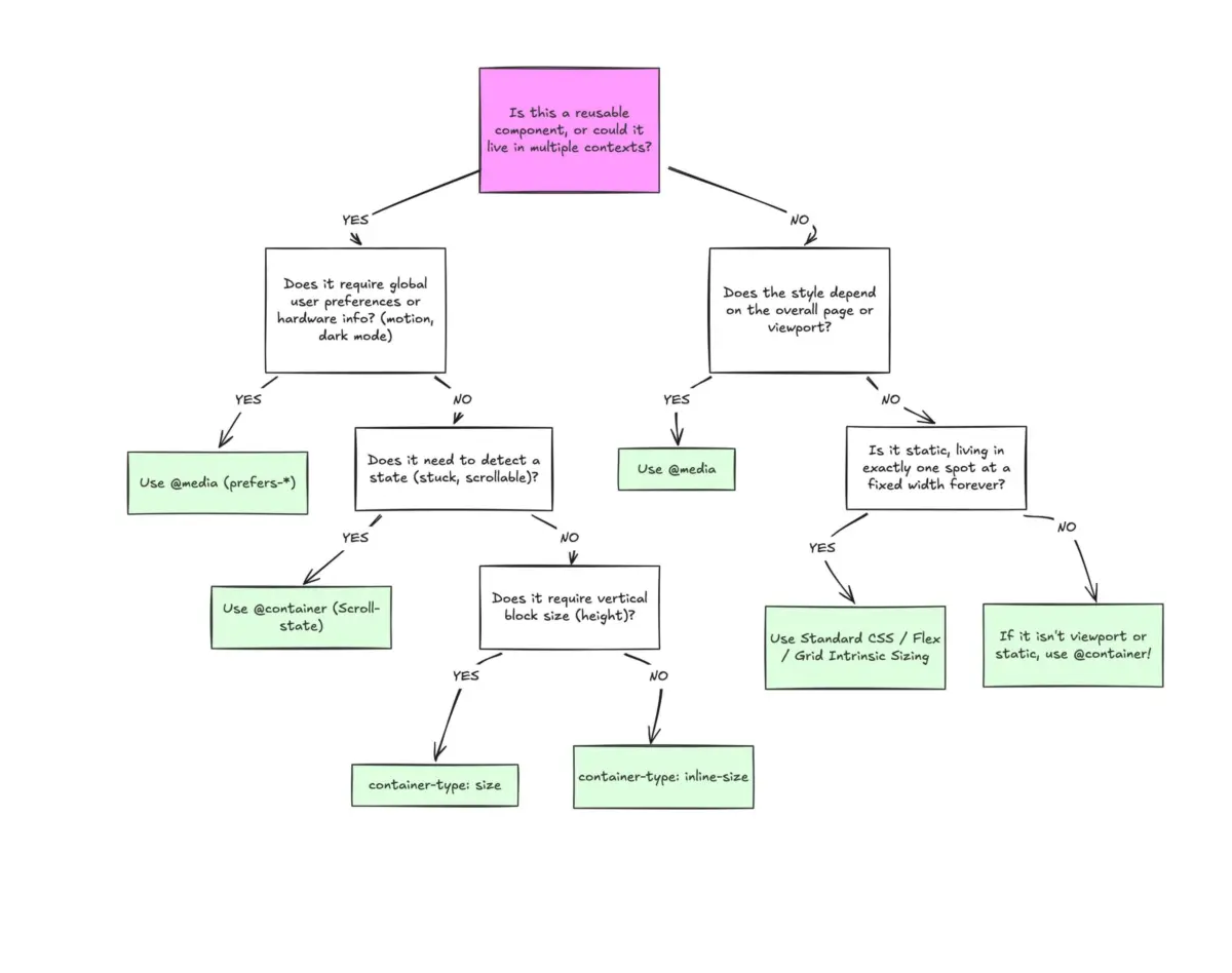
Determining the Right Layout Strategy
Engineers evaluating their styling architecture should approach media queries and container queries as complementary tools rather than competing syntaxes.
Media queries remain the correct primitive for top-level structural layout, viewport-dependent elements, device orientation, high-contrast settings, reduced-motion preferences, and screen-spanning navigation. Conversely, container queries serve as the ideal baseline for reusable UI design systems where elements are intended to sit interchangeably across varying column widths, grids, sidebars, and nested application views.