
The long-running web development publication CSS-Tricks has announced a major structural update to its publishing workflow: the current web-based column What’s !important is concluding its run on the main site to make way for the return of the official CSS-Tricks newsletter.
Scheduled to launch on November 10th, the resurrected newsletter marks the end of a four-year hiatus for the publication’s direct-to-inbox editorial format. The shift follows the recent ownership transition and site relaunch, signaling a renewed commitment to delivering hand-curated front-end development news, original commentary, and technical tutorials directly to subscribers.
To mark the conclusion of What’s !important in its web-article format, the final installment brings together a wide-ranging collection of breakthroughs, experimental properties, tool releases, and emerging specifications from across the web design ecosystem.
Interactive Web Experiences and Advanced Scroll Effects
High-profile promotional websites continue to push the boundaries of browser rendering, with Rockstar Games’ recently updated site for Grand Theft Auto VI drawing significant technical interest. The site features intricate, scroll-driven visual effects and layered animations designed to engage visitors as they navigate down the page. While the implementation exhibits technical quirks—most notably displaying rendering issues in Mozilla Firefox—it has sparked widespread breakdown and discussion within the developer community.
Educator Kevin Powell published an in-depth video walkthrough deconstructing the underlying mechanics of the GTA VI scroll animations. His analysis explores how modern browser APIs, transform stacks, and layout constraints intersect to create performant, cinema-inspired web transitions.
Alongside experimental promotional layouts, practical navigation patterns are also benefiting from modern CSS developments. Author Mojtaba Seyedi recently demonstrated how developers can build a fully functional "scrollspy" component using modern CSS capabilities. Historically, a scrollspy—which automatically highlights navigation links corresponding to the page section currently within the viewport—required JavaScript event listeners tied to scroll offsets. Seyedi’s approach leverages emerging CSS features to track viewport positioning natively, reducing client-side execution overhead while maintaining declarative styling rules.

Exploring Playful Imperfection with random()
In an article published by Smashing Magazine, developer Brecht De Ruyte explored the creative and structural possibilities of the proposed CSS random() function. Historically, layout design on the web has relied on rigid, deterministic declarations. Introducing controlled randomness into stylesheet rules enables designers to add subtle organic variance, programmatic layout shifting, and visual dynamicism without relying on heavy JavaScript generation scripts.
De Ruyte showcased several interactive demonstrations illustrating how mathematical randomness can influence properties such as rotation, scaling, color variations, and element positioning. By combining random() with CSS custom properties and grid layouts, developers can establish structured design systems that retain visual variation across page loads while staying entirely within the native styling layer.
Implementing Icons on the Web in 2026 and Beyond
Web architecture expert Lea Verou published a comprehensive technical deep dive examining the past, present, and future of icon implementation strategies on the open web platform. Icons remain a cornerstone of user interface design, yet developers continually weigh trade-offs between inline SVGs, SVG sprites, icon fonts, and CSS mask-image techniques regarding cache performance, styling flexibility, and DOM overhead.
Verou’s analysis outlines several upcoming CSS specifications designed to resolve long-standing friction points in graphic rendering. Key technologies highlighted include:
- Linked Parameters: Enabling external SVG assets to inherit context-specific values directly from host CSS selectors.
- The
ident()Function: Streamlining identity mapping for dynamic visual assets. - Native Mixins (
@mixinand@apply): Returning structured, reusable style blocks to vanilla CSS without requiring preprocessors like Sass. - Expanded
@propertySyntax: Offering shorthand definitions for typed custom properties, enabling seamless animation of custom paint and layout values.
These emerging specifications point toward an architectural shift where icon management becomes native, highly configurable, and decoupled from heavy DOM manipulation.
The Case for a Universal Pseudo-Selector (::*)
Developer Kilian Valkhof raised a proposal for the web standards community: the introduction of a universal pseudo-element selector, represented as ::*.
In contemporary web development, global CSS resets almost universally include a rule applying border-box sizing across all DOM nodes:
*,
::before,
::after
  box-sizing: border-box;
While the traditional universal selector (*) targets every standard DOM element, it explicitly fails to target pseudo-elements. As the HTML and CSS specifications have expanded, the list of supported pseudo-elements has grown far beyond ::before and ::after. Modern interfaces frequently rely on pseudo-elements such as ::backdrop for modal dialogs and top-layer elements, as well as ::details-content for collapsible disclosure widgets.
Valkhof argues that explicitly appending every newly introduced pseudo-element to global reset sheets is unsustainable. A native ::* wildcard selector would allow developers to target all present and future pseudo-elements in a single, elegant declaration.
New HTML and CSS Features Useful for Design Systems
Declan Chidlow published an evaluation of emerging HTML and CSS features specifically tailored for enterprise design systems and component libraries. As design systems prioritize consistency, maintainability, and accessibility, native browser features are increasingly replacing proprietary JavaScript utilities.
Among the standout features analyzed are:
text-box(formerly leading-trim): Provides precise control over vertical typography metrics by stripping unwanted glyph whitespace, aligning text elements flush against container boundaries.sibling-index()andsibling-count(): Functional CSS functions that allow components to dynamically alter their styling based on their exact ordinal position or the total count of sibling elements in the parent container.@scope: Delivers native style encapsulation, preventing rules from leaking outside designated component boundaries without requiring the overhead of Shadow DOM boundaries.@custom-media: Enables centralized definition of responsive breakpoint variables, simplifying media query management across enterprise codebases.
Dynamic Input Sizing with CSS Anchor Positioning
Chrome Developer Relations engineer Adam Argyle showcased a practical CSS technique that allows standard HTML <textarea> elements to automatically expand and contract based on their user-entered text content.
Historically, creating auto-expanding text fields required JavaScript resize listeners calculating scrollHeight on keypress, or swapping input fields with contenteditable elements. By leveraging the new CSS field-sizing: content property alongside CSS Anchor Positioning, text inputs can adjust their intrinsic dimensions natively within the rendering engine.
Anchor positioning continues to prove itself as one of the most versatile layout additions to the modern CSS specification, offering declarative mechanisms to position overlays, tooltips, popovers, and form elements relative to reference targets across the DOM tree.
Creating Wavy Dividers Using random() and shape()
CSS author Temani Afif introduced a method for generating organic, wavy section dividers using a combination of the experimental CSS random() function and the native shape() path syntax.
Rather than relying on exported SVG background vectors or heavy canvas rendering, this approach allows developers to describe complex geometric paths directly inside CSS clipping and masking declarations. By combining path mathematical coordinates with pseudo-random offsets, web pages can render unique background dividers dynamically, maintaining small asset payloads and full resolution independence across screen densities.
Advanced Accessibility and Visual Design Tooling
The front-end ecosystem has also seen notable releases in developer tooling designed to streamline web accessibility compliance and complex graphics creation.
Color Contrast Evaluation via This Hue Shall Pass
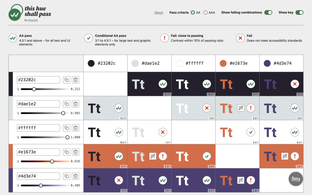
Digital agency Clearleft released a web-based accessibility utility titled This hue shall pass. Unlike basic color contrast checkers that evaluate isolated foreground and background pairs, this tool evaluates entire palette matrices simultaneously.

The application distinguishes between total compliance failure and borderline cases ("Fail: close to passing"), providing interactive lightness adjustment sliders that allow designers to fine-tune color tokens until they satisfy WCAG 2.1 AA and AAA contrast standards.
Complex Visual Layouts with Gradient Layers
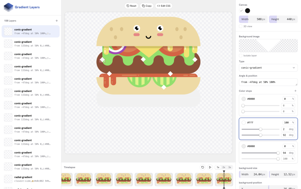
Developer Ahmad Shadeed launched Gradient Layers, a visual editor designed to simplify the authoring of complex multi-layered CSS gradients. Editing stacked linear, radial, and conic gradients directly in code often becomes cumbersome due to long, comma-separated functional syntax. The interface provides visual controls for manipulating individual gradient stops, angles, and blend modes, generating clean, production-ready CSS output.
The Next Generation of CSS Gradients: 2D Mesh and Freeform Gradients
Building upon visual design tooling, W3C CSS Working Group member Josh Tumath published an explainer detailing two new gradient types proposed for the CSS Images Module Level 5 specification: mesh-gradient() and freeform-gradient().
Currently, CSS gradients operate primarily along linear vectors or radial focal points. The proposed additions bring advanced two-dimensional color interpolation directly into browser stylesheet engines.
A basic mesh gradient construct allows developers to define a two-dimensional grid of color stops that smooth-blend across both axes:
background-image: mesh-gradient(red, blue; green, yellow);Similarly, freeform gradients permit color stops to be placed at arbitrary coordinate points within an element’s coordinate space, blending outwards organically:

background-image: freeform-gradient(red top left, yellow bottom right);These specifications aim to empower front-end engineers to render sophisticated, photo-realistic color transitions, mesh surfaces, and dynamic ambient background lighting natively within the browser, eliminating the need for heavy raster image assets or WebGL canvas setups.
Looking Ahead
As web technologies rapidly evolve—from native component scoping to multi-dimensional visual primitives—CSS-Tricks is positioning its editorial coverage to keep developers informed. With What’s !important completing its final installment on the website proper, readers are encouraged to subscribe to the revived CSS-Tricks newsletter ahead of its November 10th debut. The upcoming email edition, numbered Issue #21, will continue providing curated technical analysis, spec updates, and front-end engineering insights directly to the web development community.