Compounding this issue is the prevailing approach to product presentation within the industry. In many retail categories, brands leverage packaging as a primary tool to communicate the distinctive qualities, ingredients, and character of the product inside. Walk down the aisle of a grocery store or a cosmetics department, and you will find food labels, skincare bottles, and household goods covered in vibrant imagery, detailed ingredient lists, and functional explanations.
In stark contrast, the high-end perfume market has long taken the opposite route. Traditional fragrance packaging is frequently minimalist, stark, and deliberately opaque, often emblazoned with little more than a luxury fashion house logo and an enigmatic scent name. Consumers are routinely forced to rely on paper blotters, aggressive department store sales associates, or blind internet purchases based entirely on poetic guesswork rather than concrete information.
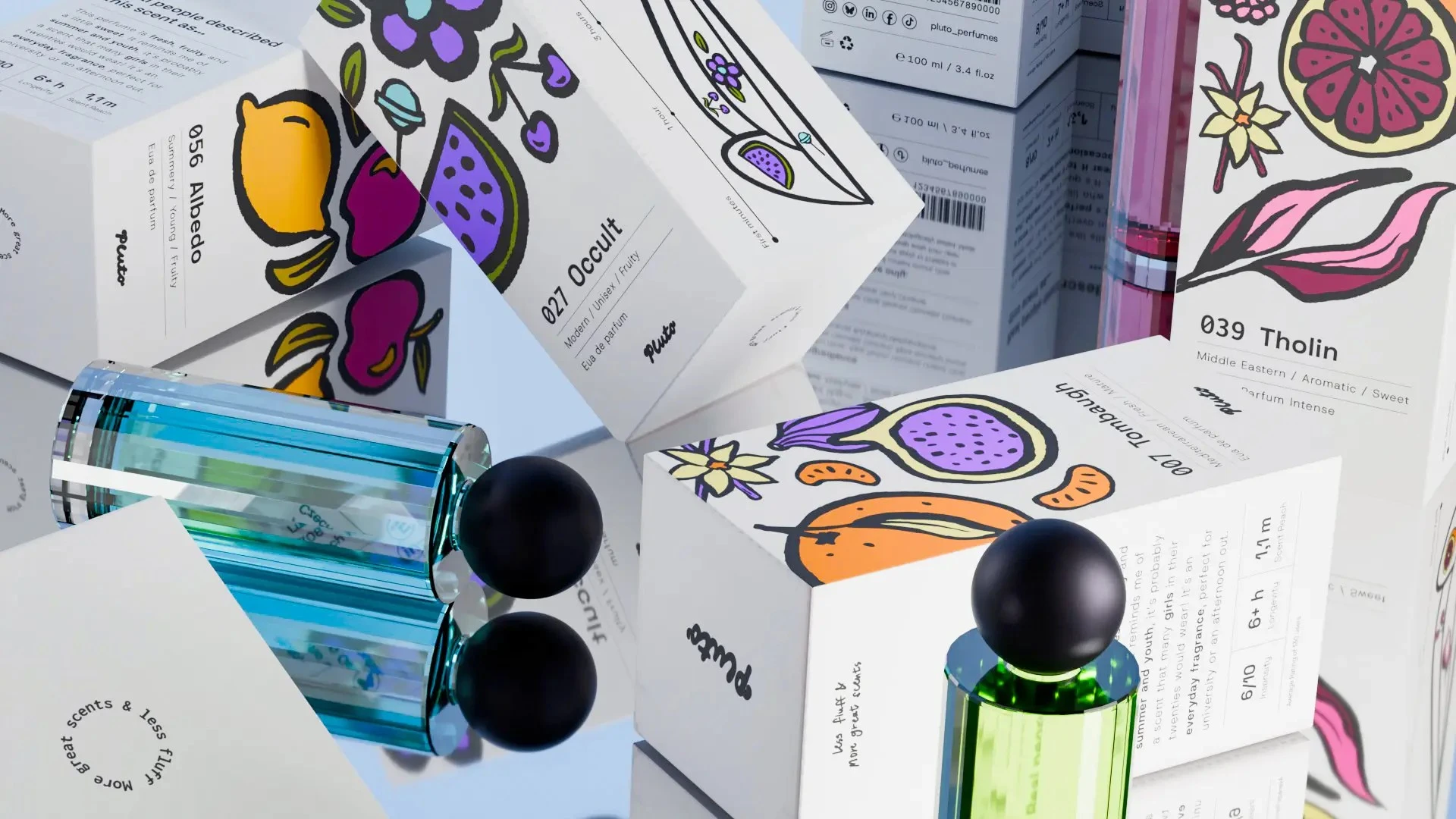
Enter Pluto, a conceptual design project that has been selected as the August Pack of the Month for upending traditional fragrance norms. Developed by student designer Kateřina Milatová as part of a student week feature, Pluto takes a radically different approach to how perfumes are presented to the public. Rather than hiding behind abstract branding and minimalist typography, the packaging uses the box itself to communicate what a buyer should expect both scent-wise and visually before they even open the bottle.
Pluto’s innovative packaging system is designed specifically to make the often-exclusive world of fine fragrance more accessible and approachable to everyday consumers. Instead of relying on cryptic poetry, Milatová introduced a clever system of illustrations that describe the perfume in a clear, easy-to-understand manner. On the exterior of the packaging, identifiable ingredients are prominently displayed and sized according to their prominence within the formulation. This allows buyers to instantly recognize core notes—such as citrus, vanilla, wood, or floral elements—at a glance, removing the guesswork that typically accompanies buying a new fragrance.
Furthermore, the packaging incorporates casual, grounded descriptors tailored to cover the diverse needs and preferences of different perfume buyers. Whether a consumer is looking for something light and fresh for daily wear or something deep and complex for an evening out, the exterior text provides straightforward context that speaks directly to the user’s practical desires rather than attempting to evoke an abstract mood.
Applying such a functional, consumer-friendly concept in an aesthetically attractive way to a product category that has long resisted change represents a breath of fresh air for the design and retail communities. By bridging the gap between sophisticated visual appeal and practical information, Pluto demonstrates how thoughtful packaging can solve real consumer frustrations. It is this successful blend of intuitive design, accessibility, and visual charm that makes Pluto a standout choice for the August Pack of the Month, offering a compelling glimpse into how the future of fragrance marketing and packaging might evolve to better serve the everyday buyer.