September delivered a compelling mix of unexpected collaborations, intellectual property drama, and broader industry soul-searching regarding the future trajectory of commercial design. From sustainability milestones that ended in courtrooms to ethical dilemmas surrounding generative AI tools, the past month demonstrated that packaging remains a powerful battleground for corporate identity, consumer engagement, and regulatory scrutiny.
Among the most significant developments of the month, oral care giant Colgate found itself facing legal action following a major packaging innovation. The company had engineered what many heralded as a substantial step forward for sustainability: a more environmentally friendly toothpaste tube designed to minimize waste and improve recyclability within a historically difficult-to-recycle category. However, this progressive leap forward was quickly overshadowed by legal complications, illustrating the complex landscape brands must navigate when introducing major structural packaging changes to the mass market. While the technical achievement of creating a better tube was widely acknowledged by packaging engineers, the ensuing legal dispute highlighted the intricate web of intellectual property, competitive claims, and regulatory hurdles that accompany modern sustainable design initiatives.
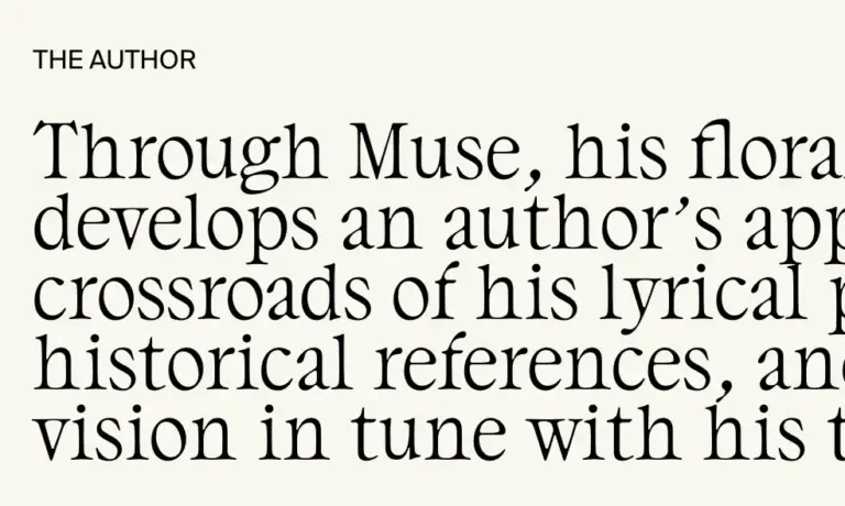
At the same time, the broader creative community was forced to confront the rapid integration of artificial intelligence into traditional design workflows. Noted lettering artist and designer Jessica Hische publicly weighed in on Meta’s Muse platform, offering a critical perspective that ignited deeper industry conversations about the ethical landmines of AI in design. Hische’s commentary tapped into mounting anxieties among creative professionals regarding copyright, compensation, and the erosion of human artistry in commercial packaging and branding. As tech giants and corporate entities increasingly turn to machine learning models to generate visual assets, the design world remains deeply divided over where to draw the line between efficiency and the exploitation of creative labor.
Innovation in product formats also captured industry headlines, spearheaded by Mike Cessario and the team behind Liquid Death. Known for upending traditional beverage marketing with their aggressively irreverent canned water, Cessario made a strong case during the month that American consumers are finally ready to embrace a traditionally sophisticated beverage in a decidedly unpretentious package: sparkling wine in a can. By challenging conventional expectations of how premium alcohol should be presented on shelves, the brand continues to push the boundaries of how packaging format can redefine consumer behavior and category norms.
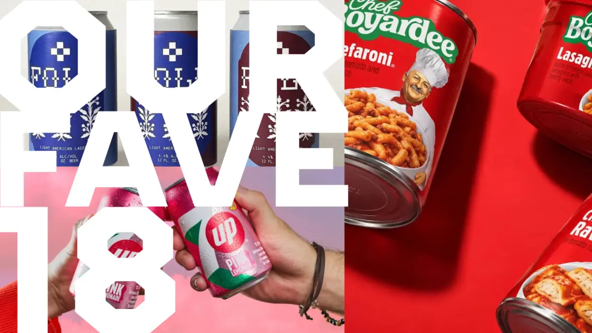
Beyond disruptive new entrants and legal battles, September also marked a period of introspection and reinvigoration for several beloved classic brands. Familiar grocery store staples received much-needed visual updates designed to resonate with modern consumers without alienating lifelong loyalists. Among these transformations, Little Big Brands undertook a fresh redesign for Chef Boyardee, injecting new life into a pantry icon that has dominated supermarket shelves for generations.
Beverage aisles also saw notable aesthetic shifts, as 7UP Lemonade debuted a striking visual update that went pretty in pink, signaling a playful departure from its traditional palette to capture seasonal and demographic trends. These refreshes point to a broader industry trend where heritage brands must carefully balance nostalgia with contemporary visual cues to remain relevant in an increasingly crowded retail environment.
Yet, these design overhauls also invited public scrutiny and lighthearted confusion among consumers. The updates prompted industry observers to raise a fundamental question that quickly became a talking point across design forums: why isn’t the Laughing Cow laughing? The subtle evolution of such iconic brand mascots often reveals the delicate tension inherent in corporate rebranding, where simplifying a logo or altering a character’s expression can inadvertently strip away the emotional resonance that made the brand a household name in the first place.