For years, element-level responsiveness sat at the absolute top of web developers’ wishlist for CSS. Designers and front-end engineers routinely voiced frustration over the limitations of media queries, arguing that page-level viewport checks were ill-suited for modern, component-driven design systems. When CSS Container Queries finally shipped across all major engines, the standard web development stack seemed poised for a permanent shift.
Yet today, despite enjoying roughly 94 percent browser support across the global web landscape, container queries remain surprisingly underutilized and frequently misunderstood.
Data from the recent State of CSS survey highlights a striking disconnect between developer awareness and real-world implementation. While 86 percent of surveyed web professionals reported knowing about container queries, only 41.4 percent actively use them in production projects. While survey samples carry inherent selection biases, the data serves as the industry’s clearest indicator of an adoption bottleneck.
The phenomenon was a major topic of discussion at SmashingConf Amsterdam 2026, where CSS educator Kevin Powell emphasized that container queries adoption has been remarkably poor. For a feature that front-end teams spent nearly a decade requesting, the slow implementation curve has puzzled industry observers.
The underlying problem, experts suggest, is not a lack of interest, but a fundamental misunderstanding of how container queries differ from traditional media queries. Because container query syntax closely mirrors media query syntax, many developers treat them as drop-in replacements for screen-level breakpoints. In doing so, they miss the paradigm shift that container queries represent—and often run into architectural friction.
Container Queries Look Inward
To understand why container queries are so frequently misapplied, it helps to examine how responsive design traditionally worked. For over a decade, responsive layouts relied almost exclusively on media queries. Media queries operate by querying the viewport itself—effectively asking the browser window how wide or tall the screen happens to be at any given moment.
A typical media query checks the viewport width and updates styles accordingly:
@media (min-width: 1024px)
  .card
    display: flex;
This approach works predictably when adjusting macro-level page structures. However, it relies on the viewport as a proxy for available space. Problems arise when modular UI elements—such as a component styled via the .card class—are placed inside tight layout containers on high-resolution displays.
If a card component is inserted into a grid sidebar that measures only 300 pixels wide on a 1920-pixel desktop screen, a media query checking for a minimum width of 1024 pixels will still evaluate to true. The card component attempts to render its wide desktop layout despite having only 300 pixels of horizontal room, leading to severe layout degradation, cramped content, or accidental overflow.
As Powell noted in an analysis on CSS-Tricks, media queries are fundamentally limited in scope because they lack insight into internal layout conditions. Most developers operate under the assumption that media queries possess context about component surroundings that they simply do not have.
Container queries solve this issue by changing the reference point entirely. Instead of querying the outer browser window, container queries look inward. They ask how much space is available within a component’s immediate parent container.
Using a container query, the layout logic shifts:
.card-wrapper
  container-name: card;
  container-type: inline-size;


@container card (min-width: 450px)
  .card
    display: flex;
    flex-direction: row;
Under this model, the viewport size becomes irrelevant to the card’s behavior. The component transitions from a stacked block layout to a horizontal layout strictly when its designated wrapper element provides at least 450 pixels of inline space. If the card is placed in a narrow sidebar, it remains stacked; if it is moved to a wide main content area, it switches to horizontal, regardless of whether the user is on a mobile device or a desktop monitor.
"Macro" Layout Vs. "Micro" Layouts
The distinction between media queries and container queries fundamentally comes down to macro versus micro layout architecture.
Media queries are designed for macro layouts. They govern top-level application structure, including main grid frameworks, persistent headers, site footers, global system settings such as dark mode preference (prefers-color-scheme), and broad hardware capabilities like touch inputs. These properties represent conditions that apply uniformly across the entire page.
Container queries, by contrast, are designed for micro layouts. They govern independent UI components that reside within those macro page structures—cards, widgets, form panels, embedded modules, and contextual navigation items. Micro layouts require elements to adjust dynamically to whatever space they are allocated by their parent container.
This architectural split aligns with the reality of modern web fragmentation. Recent data from viewports.fyi reveals that across more than 120,000 measured data points, there are over 2,300 unique screen viewport sizes active on the web today. Attempting to manage component layouts by crafting media queries for thousands of potential viewport sizes is unsustainable.
In the era of component driven design and framework-based development, layout logic belongs closer to the container than the viewport. When layout logic is bound to containers, content determines its own display rules based on available localized space rather than arbitrary screen thresholds.
Example: Fluid Typography Inside A Component
The practical advantages of container-level logic become clear when considering responsive typography. Historically, developers used viewport units like vw combined with CSS math functions to fluidly scale text relative to screen dimensions:
.card-title
  font-size: clamp(100%, 1rem + 2vw, 24px);
While this technique creates smooth scaling across screen sizes, it breaks down when components are relocated within a UI layout. A title component styled with viewport units will render at the exact same size inside a narrow sidebar as it does in a prominent page hero, simply because both sit on the same screen width.

Container queries introduce dedicated container query length units—such as cqi (container query inline size), cqw (container query width), and cqb (container query block size). By combining container units with the CSS clamp() function, typography can scale fluidly based on component dimensions rather than global screen metrics:
.card-title
  font-size: clamp(1rem, .5rem + 3cqi, 2rem);
By switching from vw to cqi, font scaling becomes entirely self-contained. The title scales naturally when the component expands, while remaining appropriately sized if the component is constrained inside smaller sub-containers.
Example: Flexbox Wrap Detection
Container queries can also serve as a native CSS mechanism to detect internal layout shifts that traditional media queries cannot capture.
While Flexbox natively handles content wrapping via the flex-wrap: wrap property, CSS has historically lacked a direct selector or state query—such as a hypothetical :wrapped pseudo-class—to detect when flex items break onto a new line. Media queries are incapable of detecting this shift because flex item wrapping occurs as a result of internal space constraints, not direct changes to browser window thresholds.
Previously, tracking item wrap events required JavaScript execution via ResizeObserver. However, nesting container queries inside flex items creates a purely declarative workaround. By assigning flex-grow: 1 to a container query target, developers can trigger conditional styling precisely when flex items wrap and expand to fill new rows.
/* The flex parent container */
.flex-layout
  display: flex;
  flex-wrap: wrap;


/* Register each flex item as an independent container */
.flex-item
  container-type: inline-size;
  flex: 1 1 390px; /* Item expands to fill available space, wrapping at 390px */


/* Default card styling for narrow conditions */
.card
  display: flex;
  flex-direction: column;
  background: #f4f4f4;


/* Styles applied when the item expands after wrapping */
@container (min-width: 600px)
  .card
    flex-direction: row;
    align-items: center;
    background: #e2f0d9;
When available space shrinks, the flex items wrap onto separate rows. Upon wrapping, each item grows to occupy the full width of the newly created line. This growth pushes the container’s inline size beyond the 600-pixel threshold, triggering the @container query and applying the horizontal layout styles automatically—all without a single line of JavaScript.
Container Queries Do Have Side Effects
While container queries offer major design advantages, they also introduce technical caveats that differ significantly from media queries. Understanding these limitations is critical for avoiding layout bugs.
1. Containers Cannot Query Themselves
Unlike media queries, which can apply conditional styles directly to any element on the page, container queries require a strict parent-child DOM relationship. An element cannot be evaluated by a container query that it defines on itself.
For example, attempting to declare container properties on an element and query those same properties within the same rule block will fail:
/* THIS WILL NOT WORK */
.card
  container-name: card;
  container-type: inline-size;


@container card (min-width: 400px)
  .card
    display: flex;
This restriction exists to prevent circular layout evaluation loops. If an element’s container query changes its display state (e.g., switching from block to flex), that change could immediately alter the element’s own size, invalidating the container query condition and creating an infinite recalculation loop.

To work around this, layout structures must separate the container declaration from the queried component by utilizing an outer parent element:
<div class="cards">
  <div class="card">
    <div class="card-content">...</div>
  </div>
</div>
.cards
container-name: cards;
container-type: inline-size;
@container cards (min-width: 400px)
.card
display: flex;
2. Block-Axis Size Queries Can Collapse Layout Height
A common pitfall occurs when developers configure containers using container-type: size rather than container-type: inline-size.
/* May cause container height to collapse to 0px */
.hero-banner
  container-type: size;
When container-type: size is specified, the browser must calculate both the horizontal (inline) and vertical (block) dimensions of the container independently of its child contents to prevent circular dependencies during layout rendering.
If the container does not have an explicitly defined height, min-height, or aspect-ratio, its calculated block height instantly collapses to 0 pixels—even if it contains rich nested content. For the vast majority of responsive UI patterns, developers should default to container-type: inline-size, reserving full size queries only for scenarios where block height is explicitly constrained by fixed CSS declarations.
3. Container Queries Cannot Evaluate Custom Properties
Another architectural limitation is that container query conditions currently cannot evaluate CSS Custom Properties (variables) within their syntax:
:root
  --breakpoint-lg: 1600px;


/* THIS WILL NOT WORK */
@container (min-width: var(--breakpoint-lg))
  /* ... */
This restriction is tied to how custom properties cascade down the DOM tree. Because custom property values can be overwritten at any point in the element hierarchy—including within container query blocks themselves—allowing custom variables inside @container expressions would introduce dynamic specificity loops that browser engines cannot safely resolve during layout passes.
Navigating the Shift in Web Layouts
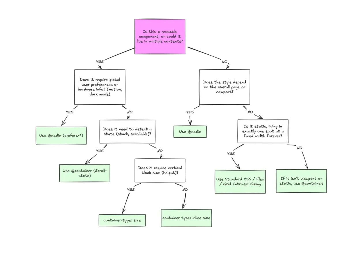
Container queries were never intended to make traditional media queries obsolete. Instead, modern CSS architecture relies on establishing a clear separation of concerns between top-level viewport queries and localized container queries.
Media queries remain the correct tool for macro page architecture: structural navigation wrappers, global page grids, display orientation checks, and user preference media features. Container queries are the optimal tool for micro layout architecture: standalone components, content cards, localized widgets, and design system primitives built for reuse across varying contexts.
As front-end development shifts further toward modular design systems, closing the adoption gap around container queries requires moving past initial impressions of syntax familiarity. By recognizing that container queries look inward rather than outward, web developers can fully leverage element-level responsiveness—delivering components that adapt naturally to their surroundings across any UI context.